#TransformTuesday: 2 January
Every week, Transform examines recent rebrands and updated visual identities. This week's picks are below. For more from #TransformTuesday, follow @Transformsays.
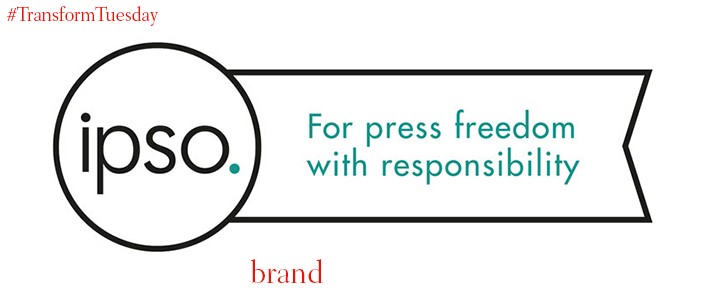
IPSO
The 2016 presidential election introduced both Donald Trump to the world of politics, and the term ‘fake news’ to the global lexicon. Yet while banded around almost as parody, ‘fake news’ and the issues it brings have proved a threat to media and press freedom standards. To tackle the complications brought by ‘fake news,’ the UK’s press watchdog the Independent Press Standards Organisation (IPSO) has launched a new kite wordmark and logo. Designed by advertising agency McCann London, the visual is optimised for use across digital and print, aiming to enforce an ethical code across publications.
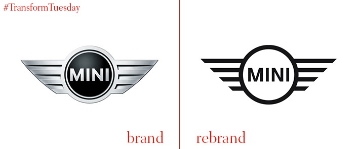
Mini
Germany-based consultancy KKLDBerlin has collaborated with Mini’s in-house design team to create a new logo for the iconic car brand. Originally launched in 2015 as the brand’s corporate logo, used for inhouse events and marketing materials, the new brand will be seen across Mini’s vehicle suite, replacing its previous visual identity. However, iconic features of the identity remains, for example the ‘wings’ of its wheel icon; the new design is tradition-conscious, yet propels the car brand’s identity into a contemporary digital-first world.
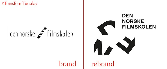
The Norwegian Film School
Norway’s national film school, the Norwegian Film School (Den Norske Filmskolen) offers university-level education in subjects from screenwriting to sound to documentary directing. The school has released a new identity which reflects its student and staff passion to the continual development of, and new directions for, films. Conceptualised in a frame, the rebrand plays homage to the most basic level of film production – the story – while suggesting the potential of both film and the university to further society. The new visual identity was created by Oslo, Norway-based design agency Neue Design Studio.
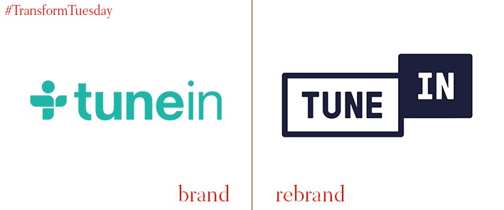
TuneIn
US-based audio streaming service TuneIn, which offers music, podcasts and radio shows on an almost unlimited number of topics, has unveiled its latest rebrand. Introducing a new app icon as well as a new logo, TuneIn’s updated identity aims to reflect the increasing use of voice-controlled digital platforms – it lends the user a certain amount of brand ownership. Moving away from a colour palette based on turquoise, the navy and white application references the ‘On Air’ signs used in traditional radio.
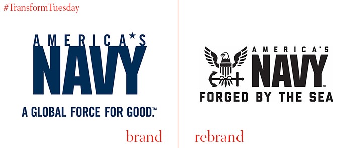
US Navy
On 9 December in Philadelphia, the most famous annual college football game took place – the US Army vs the US Navy. Won by the army for the second year in a row, the game also signalled the unveiling of the US Army’s new brand identity which, crafted by global agency Y&R, aims to appeal to a new generation of ‘Gen Z’ recruits. Encompassing a new tagline ‘Forged by the Sea’ and new brand guidelines, including an updated eagle logo and optimisation for all platforms, it aims to communicate the actual mission behind the US Navy’s activities. In a blog post, the commander for Navy Recruiting Command, says, “[Forged by the Sea]… conveys the notion that every sailor is shaped and strengthened into a more capable version of themselves. It also describes the Navy as a team that has been forged, tempered and toughened over 242 years of maritime dominance. Most importantly, it acknowledges the Navy’s unique and fundamental relationship with the sea.”
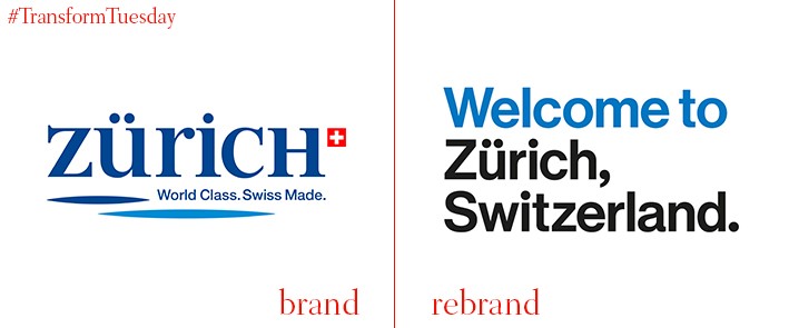
Zurich Tourism
While not its capital, Zurich is the largest and busiest city in Switzerland. Well-regarded for its standard of living and rich cultural heritage, the city’s destination marketing board Zurich Tourism is tasked with encouraging visitors to sample its offering. Zurich-based design agency Studio Markus Kraft has given Zurich Tourism a new visual identity, encompassed through a new logo and wordmark. Based on the concept of storytelling, the new logo system encourages a flexible approach to application in its simple use of the Helvetica font while highlighting the merits of Zurich to people from all over the world.
For more from Transform magazine, follow us on Twitter @Transformsays


