Peer perspectives: US Open
With the launch of a streamlined, modern identity for its 50th anniversary, the US Open prepared a full set of brand applications. How does the new approach match up against the previous iteration? Marco-Paul de Jeu examines US Open’s logo, typeface and implementation
Project: US Open rebrand by Chermayeff & Geismar & Haviv
Reviewer: Marco-Paul de Jeu, founder and strategy director, CapeRock
A big step: First of all, the new logo design and identity of the US Open is a big step forward compared to the previous design. The new design embraces the current design trend of simplicity with its new, simple, straight-lined and italic lowercase logo, created by New York-based Chermayeff & Geismar & Haviv. Built upon the original iconic brand mark, the new logo shows a modernised version of the flaming ball and ‘us open’ written in italic lowercase letters. It feels energetic and dynamic.
In a practical sense the redesign seems effective: The new logo is more recognisable, more memorable and more striking. But, does the logo with its lower-case letters represent the biggest pro tennis event in the United States?
In my opinion the typeface used in the US Open wordmark could have been stronger and more unique. It feels a bit soft and small to represent one of the four Grand Slam tournaments in the world. Personally, I would have chosen a direction with an integrated brand mark and brand name to create a solid, strong and comprehensive property. The separation in the logo design between the brand mark and brand name makes the logo a bit loose.
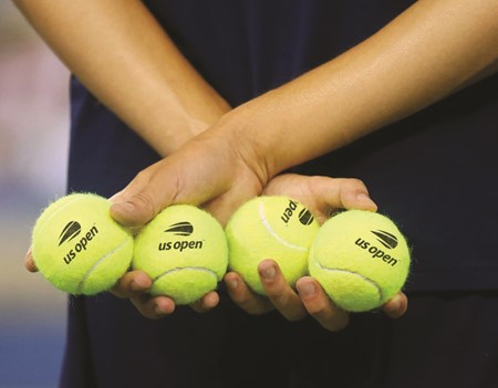
Visualising emotion: The feeling the tennis championships evoke in its audience is that of excitement and energy. Visualising these attributes has resulted in a design that is playful, dynamic and engaging, which is done very well. The simplified tennis ball and italic lettertype capture movement and give the logo a somewhat dynamic feel. An even stronger connection to tennis could have been made by choosing a yellow with a greener hue that would create a stronger connection to a real tennis ball and would have added some vibrancy in the colour scheme.
In application: What adds a dynamic and playful feel, is the design application on the flags. The yellow-white curved and bended lines refer to the movement of the tennis ball, creating a strong connection to the sports and movement. This is an interesting visual element that can be embraced more strongly.
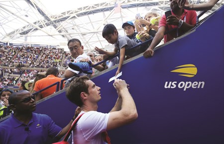
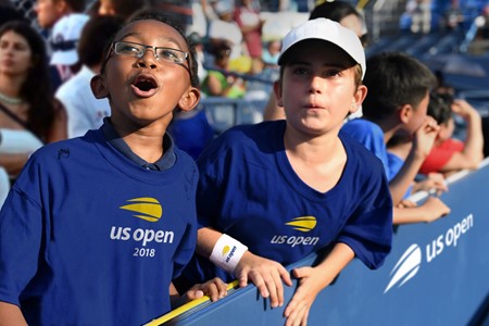
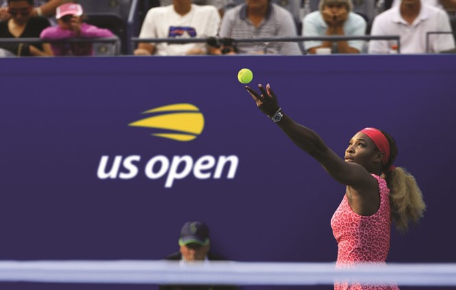
Aside from the flags, there don’t seem to be brand guidelines that offers advice on how to express the identity across all its applications, which include online, outdoor, print, on screen, etc.
As a result there are already two kinds of flags, which
communicate the brand in different ways. This damages the
brand’s consistency, whereas the aim of the rebrand was to
create a consistent brand image.