Pair of Scottish Roberts inspire luxe single malt branding
Whisky has been a Scottish tradition for centuries. It flows through the nation like the peated waters of its many rivers and streams. For Scottish distillers, however, heritage is not always enough to succeed in a world dominated by international corporate brands like Diageo and Pernod Ricard. Independent distilleries need a dram of bravery and a strong brand to compete.
For Annandale Distillery on the England-Scotland border, whisky has been in the water since 1830, but was purchased by an entrepreneurial duo in 2007 and reopened in 2014. Now, with its first single malts taking to the shelves, Annandale has unveiled new branding for two of its lines.
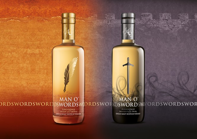
Working with London-based brand agency Springetts – which also developed the distillery brand – Annandale focused on two whiskies, one peated and one non-peated. Instead of focusing on heritage and provenance – two chief characteristics of Scotch whisky branding – Springetts instead highlighted flavour.
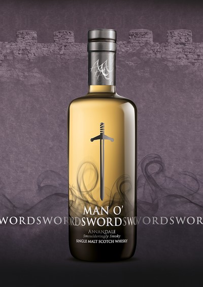
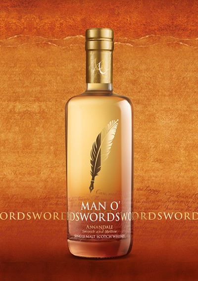
But to do so, the agency turned to Scotland’s own history in order to develop the single malts’ characters. The smoky whisky was named for Robert the Bruce, not only a king of Scotland, but also a past earl of Annandale. The fruity malt was named after another famous Robert – poet and excise man Robert Burns. Thus the Man O’ Sword and the Man O’ Words single malts were brought to life.
“In MOS and MOW we have created two brands, which are inspired by the character of the whisky, rather than based on provenance, yet they are still clearly from Annandale Distillery with a strong ‘house’ look. They are also distinctive and have good shelf standout whilst still remaining credible within the category,” says Springetts.
The packaging is luxe with brushed gold and steel colours and an almost vodka-like approach to bottle design. Many whiskies use labels as their primary brand touchpoints on the bottle, whereas the Annandale single malts feature design elements screened directly onto the bottle. They both rely on a wordmark and a strong graphic element – a feather for Man O’ Words and a sword for Man O’ Sword – to bring the brand to life.
The bottle itself, Springetts calls “contemporary” and “broad shouldered,” and was chosen to emphasise the products’ masculine elements. They are then contained in triangular boxes with visual links to the Annandale masterbrand.