Food and drink rebrands: Corporate, consumer and coffee
From Oregon to the Ukraine, food and drink companies are updating their brands. For some, it's a matter of growth and relevance, for others its a reflection of their values writ large
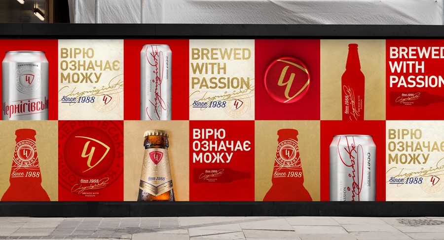
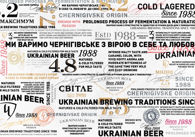
Chernigivske
Owned by AB InBev, Chernigivske is the most prominent Ukrainian beer deriving from northern Ukraine city Chernihiv Oblast. Having used the capital ‘C’ – in the Ukrainian alphabet this looks almost like a Y – as its primary logo since 2003, the icon was updated in a modern shape and gold colour. The wordmark too – traditionally rendered in red and white was streamlined and is now in a more interesting shape.
The brewery worked with Kiev-based agency Reynolds & Reyner on the rebrand. The agency says, “It is quite evident that design required transformations toward the more stylish and European look. The new authentic font is totally handcrafted. The dear old known palette of golden, red, silver and black colours combined with a concise updated logo makes the favoured brand as visible as possible on the counters.”
Adopting change and modernity has led to fresh packaging and a more international-friendly visual identity.
General Mills
General Mills first adopted its now-iconic cursive, capital ‘G’ in 1963. The logo has changed over the years, but for the first time, the company has introduced a strapline alongside its corporate brand – ‘Making food people love.’
The 1963 logo, designed by Lippincott, was intended to support the company’s growth. Then-president Edwin Rawlings said, “As General Mills continues to grow, it becomes increasingly important to establish the use of a single, consistent, graphic corporate symbol which will register immediately, and favourably, upon customers, stockholders, suppliers, farmers, labor and people in the business and financial world.”
The new logo doesn’t diverge from this ethos, but adds to it. “The updated logo and branding nods to our tradition – the big blue G – and adds a splash of red to make our passion clear: Making Food People Love,” Mary Lynn Carver, chief communications officer for General Mills, says in the company’s blog post on the rebrand. “And the logo is just the beginning. Our corporate brand is about telling the General Mills story thoughtfully, proactively and consistently.”
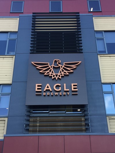
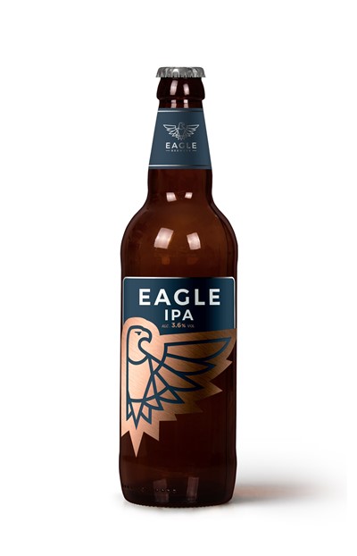
Marston’s Eagle Brewery
After purchasing the Charles Wells brewery last year, Marston’s turned to brand agency Bonfire to rebrand the Charles Wells Bedford site and brands. Bonfire transformed the traditional eagle logo into an emblem ready for a new generation of brewers and drinkers. Last week’s grand opening marked the official launch of the new identity, which will include digital and physical assets, including truck livery and point of sale material.
Gordon Keen, marketing manager at Marston’s says, “The Eagle Brewery brand will be the flagship of Marston’s new venture in Bedford. We wanted a new visual identity that was representative of our innovative and future-facing approach to brewing but that also remained true to the brewery’s enviable heritage as a master brewer and its long-standing relationship with the town of Bedford and wider area. Bonfire have captured all these elements with the bold, striking new eagle logo.”
The new eagle is rendered in matte navy and copper across the various brand touchpoints.
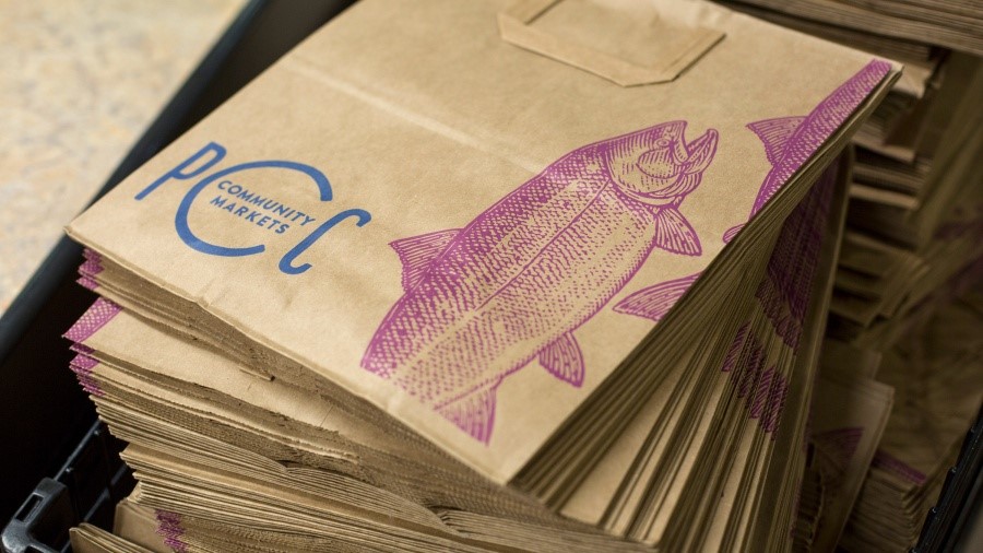
PCC Community Markets
With a co-op model and a dedicated community base, PCC Community Markets eleven sites’ form a central part of their communities across the Seattle area. Founded as the Puget Consumers Co-op in 1953, the supermarket chain has since grown to earn a yearly revenue of nearly £280m.
But, with competition from other healthy and quality-based supermarkets, like international player Whole Foods, has meant PCC needed to focus on its brand. CEO Cate Hardy told the Seattle Times, “Maybe we’ve had a little bit of northwest humility around us and assumed the people who care about what we do will find us. I think it’s OK to talk to people about who we are and what we do.”
The co-op turned to Seattle agency Wexley School for Girls for a new visual identity. The result was a shift in name from PCC Natural Markets to PCC Community Markets and the introduction of woodcarving-like illustrations of foodstuffs into the visual identity alongside the PCC monogram for a lovely, yet mature approach.
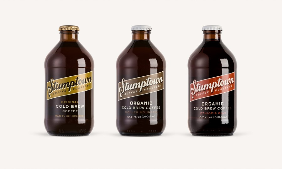
Stumptown Cold Brew Coffee
In October 2017, Stumptown Coffee Roasters unveiled a new brand, alongside Texas design firm LAND. This week, it has updated its Cold Brew sub-brand, with the help of Seattle-based Column. The Cold Brew range is Stumptown’s most prominent consumer products and has helped take the company from a small Oregonian startup to a national brand.
Column writes, “The primary goal for the redesign was to amplify the Stumptown brand name while retaining the spirit of the original packaging.” Originally, the packaging featured Stumptown’s horseshoe brand icon and an ‘old west’ feel to the wordmark. The new brand retains the original’s brassy label and unique bottle shape, but puts forward a more modern wordmark and family of typefaces. The many different products in the range are identified through a palette of earthy tones.
The Stumptown Coffee Roasters rebrand can be found here.


