#TransformTuesday: 5 December

Every week, Transform examines recent rebrands and updated visual identities. This week's picks are below. For more from #TransformTuesday, follow @Transformsays.
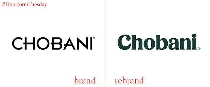
Chobani
Launched officially in 2007, US-based yoghurt brand, Chobani, has enjoyed a decade of business success. First founded by Turkish immigrant, Hamdi Ulukaya, the brand is now considered one of the most successful yoghurt producers in the US. Releasing its newest brand identity developed in-hosue, the yoghurt-makers’ decision to depart from its previous visual style comes as it introduces an entirely reinvigorated identity, favouring the popular serif typography. Introducing a rounder, softer and cleaner look, Chobani also released an accompanying catalogue of rich, nostalgic photography.
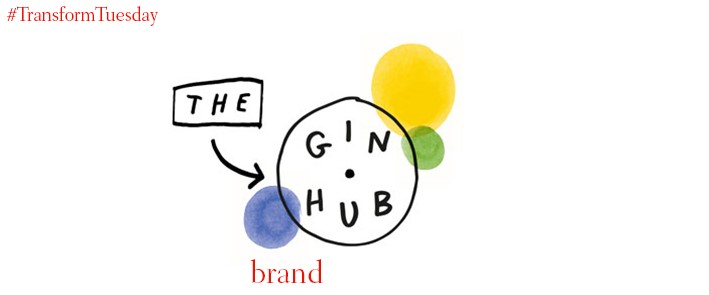
The Gin Hub
Recently established by French drinks company, Pernod Ricard, the Gin Hub was created to represent the manufacturer’s top gin brands, notably Beefeater, Plymouth and Seagrams. Designed by London-based brand agency, NB Studio, the aesthetic was developed to resemble a sketchy, unrefined look that might be found scribbled on a barroom napkin. Yet the new identity features a bold colour palette that cleverly references the intricate gin-making process, taking after the numerous botanicals used in the production of gin.
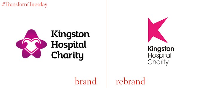
Kingston Hospital Charity
Pushing back against the often-uncompromising public-sector environment, Kingston Hospital Charity’s work with creative agency, Offthetopofmyhead, sought to realign its forward-facing non-profit entity with a more ‘distinctive’ visual portfolio. Producing a collection of multi-coloured, geometric graphics, the collaboration pushed forward a future-facing identity, principally channelling a star-like design. Working in collaboration with typographer, Alan Meeks, and designer, Claire Lythgoe, the result has led to realigned visual collateral, now accessible across several touchpoints.
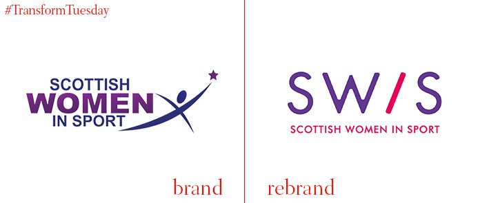
Scottish Women in Sport
After an inward-looking brand workshop revealed a need for Scottish Women in Sport to be repositioned within the marketplace, international brand agency, Brand Oath, developed a dynamic and integrated redesign of the organisation’s core identity. Incorporating new brand architecture, an injection of speed, energy and culture captures the essence of the organisation, typified in an italicised 'I' in the logo symbolising momentum. In addition, a creative campaign entitled ‘Girls do sport,’ was introduced to highlight the need for greater representational gender parity across sports.
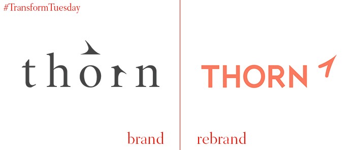
Thorn
Founded in 2009 as the DNA Foundation by Hollywood actors Demi Moore and Ashton Kutcher, Thorn’s creation as a charity aims to protect vulnerable children. Working alongside several NGO’s, tech companies and public officials, its network today reaches the likes of Facebook, Microsoft, Google and Twitter, affirming its ongoing commitment to ending the abuse of children, particularly across digital platforms. Changing its name to Thorn in 2012, the charity has recently undergone a rebrand, undertaken by global brand consultancy, Wolff Olins, refocusing its charitable approach to channel a more ‘optimistic’ visual aesthetic.


