#TransformTuesday: 3 October
Every week, Transform examines recent rebrands and updated visual identities. This week's picks are below. For more from #TransformTuesday, follow @Transformsays.
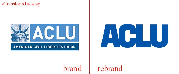
American Civil Liberties Union (ACLU)
Founded 97 years ago in 1920, the American Civil Liberties Union (ACLU) is a US-based non-profit, nonpartisan organisation which exists to provide legal assistant in defence of American citizens. With a membership of around 1.5 million, the organisation needed a renewed identity to strengthen its fight against issues posed by the Trump administration. Led by New York, NY-based consulting firm Open, the new logo was drawn by Tobias Frere-Jones and is based on strategy work by NY-based Co:Collective. Its refreshed identity is a departure from the logo it has held since 2002; now led primarily by the ACLU acronym, it dropped the statue of liberty image which perhaps tied the nation-wide organisation too closely with just New York. The rebrand sees a unified identity across all 50 states in which the ACLU operates.
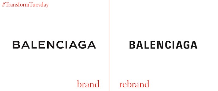
Balenciaga
Balenciaga is an originally Spanish fashion brand founded by Cristóbal Balenciaga in 1919. Currently based in Paris, the House of Balenciaga brand was bought in 2001 by French multinational company Kering. Under the helm of Georgian fashion designer Demna Gvasalia, Balenciaga has launched a new logo and brand identity which departs from its previous classically black and white brand – instead, the new logo is based on a grey background. However the black font is retained to allow Balenciaga’s bespoke, avant-garde fashion to be at the forefront of the brand’s creativity.
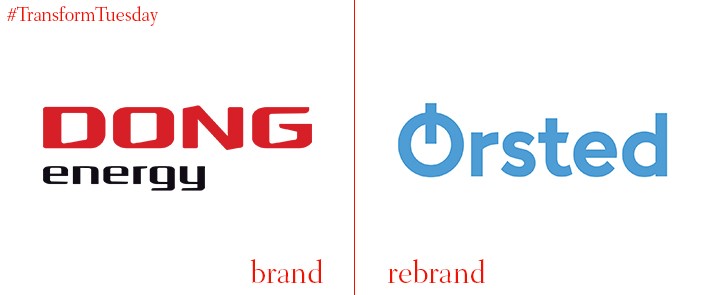
Ørsted
The largest energy company in Denmark is to undergo a rebrand and name change, it has been announced. Previously known as DONG Energy, and prior as Danish Oil and Natural Gas, the brand has updated its moniker to better reflect the company’s transition to a green energy-led output. A more traditional name also reinforces its Danish heritage, being named after the 19th century scientist who discovered that electric currents create magnetic fields, named Hans Christian Ørsted. Such a unique story behind the name is an important signifier in a North European market that is increasingly looking to fossil fuel alternatives – and branding itself as such.

Moonpig
Guernsey, Channel Islands and London, UK-based company Moonpig sells and distributes greetings cards, flowers and gifts across the UK. Founded in 2000, for 17 years the brand’s main signifier was an eponymous ‘space pig.’ However, in a rebrand project led by its in-house design team and input from Ian Styles, Simon Smith and Stuart Hammersley, Moonpig has dropped this – as well as the ‘.com’ domain moniker ubiquitous across its adverts. Its new pink typeface, named Moonpig Lift-Off, was developed by type design Rick Banks’ foundry, Face37. It reflects the light-hearted pig links, while being optimised for Moonpig’s solely online presence.
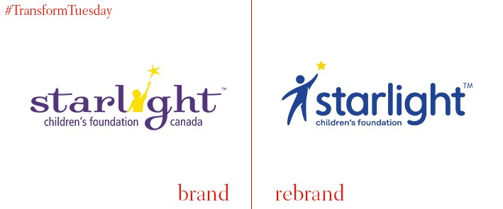
Starlight Children’s Foundation
A charity with operations in the US, UK, Canada and Australia, Starlight Children’s Foundation has been active since 1982. Aiming to grant wishes of children with rare, life-limiting or terminal illness, the non-profit organisation relies on donations to achieve its goals. In a project led by Charlottesville, Virginia-based branding agency Convoy, the US-based branch of Starlight has recently unveiled a new identity which simplifies its font and better optimises the charity’s identity for a digital platform. Rodger is used as the primary typeface, with a supporting sans serif font that extends across its marketing collateral allowing for better legibility and highlighting the admirable work Starlight does.
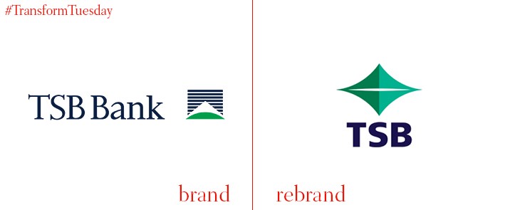
TSB
The sixth biggest bank in New Zealand has rebranded for the first time in 28 years, changing its name from TSB Bank to simply TSB and updating its corporate logo. Growth in the New Zealand regions of Auckland, Hamilton and Tauranga has seen the bank go from strength to strength in the seven years since 2010. This is also reflected in the new TSB logo; the image of Mount Taranaki has gone to ensure TSB is recognised as a regional brand, something with which TSB Bank previously struggled. A new colour scheme of indigo, mint and green also optimises the brand’s image across digital.
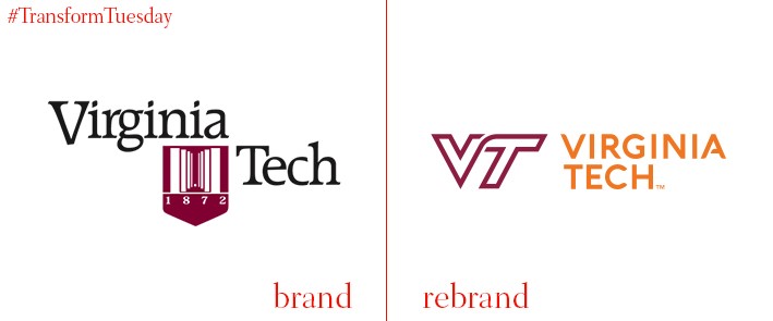
Virginia Tech
Based in Virginia, US, the Virginia Polytechnic Institute and State University – commonly known as Virginia Tech – has revealed a new, contemporary logo to reflect the forward-facing attitude of its college community, or ‘Hokies.’ With the university colours of Chicago maroon and burnt orange a dominant feature of its new identity, the update brings Virginia Tech’s logo into dominance across its various outputs, digital platforms and marketing materials. While the sports team logos will remain the same, its ‘official’ university seal will be used only for serious documentation such as degree certificates. The university says, “By aligning our institutional and athletic identities, we have created a bold, simple, and recognisable logo that strengthens our overall brand. When the university logo and the athletics logo are in a related brand family, we can more effectively position Virginia Tech in a competitive higher education environment.”


