#TransformTuesday: 12 September
Every week, Transform examines recent rebrands and updated visual identities. This week's picks are below. For more from #TransformTuesday, follow @Transformsays
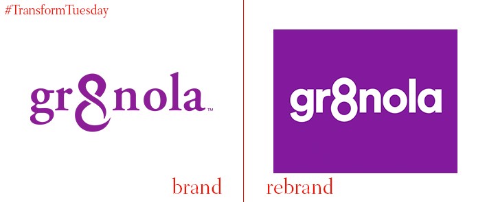
Gr8nola
Gr8nola began four years ago as a response to entrepreneur Erica Liu Williams’ inability to source healthy granola, free from additives and extras like dairy, wheat and soy. The product has recently undergone a visual identity overhaul in a project carried out by London-based creative design and brand studio, Deuce Studio. Basing the rebrand on the number ‘8,’ Deuce Studio wanted to ensure Gr8nola would stand out and be remembered on a shelf increasingly crowded with challenger brands. Deuce Studio says, “The visual style is simple and bold, reflecting the ‘Delicious & Clean’ ingredients and their benefits. The playful and empowering tone of voice reinforces Gr8nola’s core beliefs – that you can do anything that you put your mind to and being healthy should be one of those goals.”
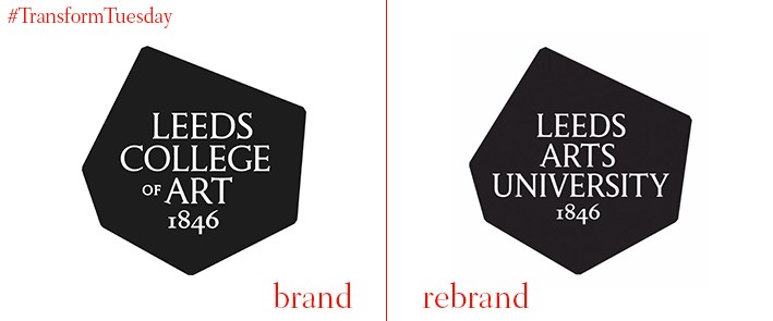
Leeds Arts University
The northern UK city of Leeds welcomes its fourth university after the 2000-student strong former Leeds College of Art became Leeds Arts University. The development includes a £14 million expansion, with a five-storey building being developed to house facilities such as an auditorium and film and photography studios, as well as a library. Speaking to the BBC, Chris Clements, chairman of the board of governors, says, "As a specialist arts university we have a strong reputation for delivering excellent teaching in a close-knit creative community, and will continue to nurture this environment in this new phase of growth.” Heritage is a strong focus for the university's brand, reflected in the logo's continued inclusion of its 1846 founding date.
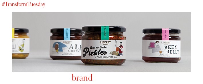
Liberty London food range
Liberty London is an iconic, high-end department store situated just off Carnaby Street in London’s West End. Famed for its fashion, fragrances and home wear departments, it also houses a mini food hall stacked with artisanal products. Its first British food range, which launched on 1 September, featured exclusive packaging designs and illustration by a plethora of distinguished British designers. London-based branding agency & SMITH led the product design project, ensuring each illustration reflected the packaging’s unique contents and origins while pertaining to one cohesive brand. Speaking to Liberty London, & SMITH creative partner Dan Bernstein, says, “We felt the best way to make it interesting (and different) was not to ‘white label' the suppliers like most other department stores do. Instead we thought bringing the suppliers and their stories to the front of pack was a good way to make it much more interesting and more Liberty. Behind the scenes we referred to the range as 'an emporium of creativity.’ As a top line, it was always there to make sure we kept everything as interesting and creative as possible.”
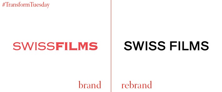
Swiss Films
The promotional agency for Swiss filmmaking, Swiss Films, has unveiled its updated visual identity and logotype, designed by Zurich-based agency Studio NOI. Taking minimalist graphic design cues from bespoke font ‘Heidi Maria,’ the new identity for Swiss Films is functional and applicable across its variety of touchpoints. It is designed to be instantly recognisable, while signifying the unique approach Switzerland takes to its filmmaking. In a newsletter, Swiss Films says, “The new logo is characterised by both sleekness and a wide scope. A compact version will be used as the logo, but in SWISS FILMS publications the words SWISS and FILMS can be set apart, analogous to brackets. As a result, the logo allows for varied contents whilst creating space for clever puns and campaigns.”
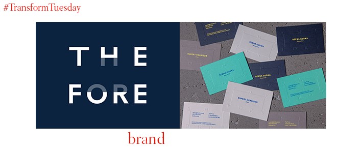
The Fore
London-based retail and brand consultancy Fitch has designed the branding for a new funding organisation which pairs charities with suitable mentors. With bigger charities more likely to find corporate or charity partnerships thanks to their prominence, the Fore aims to champion smaller charities and find suitable funders which provide grants of up to £30,000, as well as offering business and skills advice. A simplistic logo comprised of a sans-serif type in Regular leads the organisation’s brand, along with a navy, white, grey, aqua and yellow colour palette. Fitch creative director, Matt Michaluk, says, “The aim of the branding was to differentiate the Fore from the friendly, colourful charity sector but also not be too traditional or corporate. This brand is about changing the charity sector for the better, and create on-going relationships between charities and professionals.”
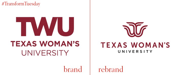
Texas Woman’s University
Texas Woman’s University is a co-educational state-supported university with a female population of around 90%. Situated in Denton, Texas, the university also boasts two health science centre branches in Dallas and Houston. Partnering with Dallas, Texas-based integrated advertising agency Commerce House, the university has unveiled a new graphic logo design, primarily based on the library fountain in its Denton campus. It also resembles the ‘T’ and ‘W’ of the Texas Woman’s University initials, with its new strapline, ‘Boldly go,’ reflecting the role played by the institution in advancing and championing women’s education. Texas Woman’s University chancellor, Carine M. Feyten, says, “This distinctive graphic identity unites our university community’s past, present and future.”


