New-look eBay eyes contemporary era of commerce


Founded in 1995 as AuctionWeb, multinational e-commerce corporation, eBay, has long been a key player in online B2C and C2C sales – largely defining the most integrated and secure space for the latter. Comfortable amid the numerous success stories of the dotcom bubble, its purchase of PayPal in 2002 for $1.5bn would set the pace for the next decade, spurring lucrative deals with brands such as Skype and StubHub along the way.
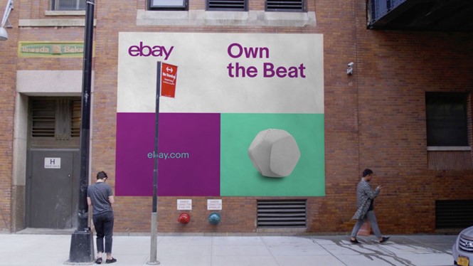
In 2012, eBay made the decision to redefine its visual identity, favouring a cleaner, clearer reflection of its well-established multicoloured logo. Five years later, the brand aims to further its appeal, introducing a new, dynamic identity designed by NY-based design agency, Form&.
Incorporating a grid approach to its visual offering, the new identity places eBay’s core wordmark across a variation of aesthetic touchpoints. Form& says, “For more than 20 years, eBay has defined a new era of commerce through the art of connection – placing people at the heart of the experience. We partnered with eBay’s leadership to define a new language for those experiences, highlighting eBay’s diversity, depth and dedication to people. The result was a revolutionary brand system that is redefining a new era of connection.”
The wordmark, although appearing unchanged from the 2012 rebrand, welcomes a new typeface, designed in collaboration with Swiss Typefaces. Aptly named ‘Marketing Sans,’ the new typography manifests a fusion between neo-grotesque style and geometric shapes, collating both classic and experimental aspects of eBay’s new brand direction.
With rollout underway across the brand’s digital offering, including public advertisements and a short TV spot, eBay’s new era of commerce has begun.


