It's a woman's world
Branding in the feminine hygiene category is undergoing a transition. Some brands are pioneering a new approach based on realistic imagery, sophisticated branding and on rejecting clichéd visual tropes. Brittany Golob discusses the impact of this transformation
A girl, dressed in a white jumpsuit, sashays onto the street with her friends. She hops up on her friend’s back and they carry on down the road, celebrating. The advert ends with a comparison between one sanitary napkin and another, with the omnipresent blue liquid poured onto the pad. This is just one of hundreds of TV spots, print ads and campaigns that play up the clichés of the feminine hygiene category. Girl having fun? Check. Women wearing all white? Check. Girl being active despite her period? Check. Blue liquid instead of blood? Check.
The ad in question ran in 2015, a year after Always ran its groundbreaking ‘Like a Girl’ campaign. Like countless peers, ads like this have, over time, reinforced the idea that menstruation is shameful or something to be overcome. This ethos has translated to the brand development and packaging design within the category. Flowers and ‘girly’ designs abounded as brands vied for shelf space and awareness. But, with a new breed of feminine hygiene products on the market, and with a reimagining of period branding by traditional players, change is occurring within the sector. And it even features something conspicuously missing from feminine hygiene marketing before this year – blood.
“The feminine hygiene category, and the brands and products within it, used to be positioned as apologetic, secretive and somewhat shameful – a functional and largely un-designed category. Now, we’re moving into an era of female empowerment and a celebration of femininity and female
strength. Brand design and advertising are helping to drive that,” Rebecca Pender, communications content creator at global
packaging design firm Pearlfisher, says.
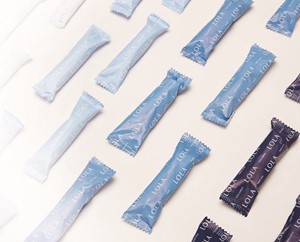
One of those brands is an American subscription-based newcomer called Lola. The company, founded in 2014 by Jordana Kier and Alex Friedman, sends organic hygiene products to subscribers across the US. The packaging was crafted by Karen Messing, a New York-based designer, who sought to create something aligned to the brand’s ethos. The Lola brand is sophisticated, beautiful and something women would be proud to have on their bathroom shelves or in their handbags. Messing says, “It’s just about being frank and open and forthcoming about what’s going on with your body; not trying to gloss over anything. Everyone appreciates clarity.”
That clarity is not only exhibited in a simple colour palette of blues, but also in the brand’s positioning. It’s sophisticated, but it’s also openminded. One of its products is a starter kit for first periods that contains the same clean, modern Lola packaging, but also a straight-talking guide to periods for young girls. It’s a far cry from the aged pamphlets given out in schools and has a tone of voice that seeks to empower girls, rather than make them feel shameful. But functionality is still one of the most important aspects for branding in the sector. Messing says the blue palette allows for a simple means of navigating the range and identifying products.
This simplicity, though, is facilitated partially through the subscription model. Because Lola doesn’t vie for retail shelf space, it can be bold with its approach. That has allowed Lola to eschew some of the clichés inherent in the category – the garish patterns and brash imagery – in favour of a modern, sophisticated feel.
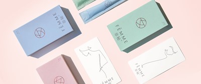
That, too, has been the approach taken by Pearlfisher when working with Chinese company Yoai on the Fémme brand. Yoai, founded just two years ago, is a product of China’s young and large Millennial contingent. It sells Fémme products through WeChat and is trying to succeed in what has become something of a fool’s errand – selling tampons to Chinese women.


Pender says only 2% of Chinese women use tampons – as opposed to 70% of western women – due to a cultural stigma related to misunderstood notions of virginity. “Our creation of Fémme, was about uprooting ingrained perceptions and using the power of branding and design to drive the kind of revolutionary cultural change that young Chinese women have been waiting for,” she says. “The key challenge was an obvious one: to avoid making assumptions about the Chinese marketplace and create a brand that young women would want to use.”
To achieve that goal, Pearlfisher adopted a modern, luxe visual style. Using the Chinese character for ‘womanhood’ as the logo, alongside line drawings on the pack and in educational material, the packaging not only rejects traditional notions of femininity and negative connotations of menstruation, but so too rejects traditional packaging design in the feminine hygiene category. Pender, like Messing’s outlook on Lola, says Fémme is, “something you feel good about but also an item you’d proudly carry with you in your handbag.”
The concept of pride is relatively new in feminine hygiene. Until only recently, most language and visual design avoided overt frankness about periods and leant heavily on visual clichés about femininity.
For heritage brands, the mould may be even harder to break. Most – the Tampaxes, Libresses and Kotexes of the world – are owned by large FMCG companies. They have to vie for shelf space. They have to adhere to advertising norms and regulations. They have to avoid, in short, rubbing people the wrong way when talking about a sensitive subject.
But that doesn’t mean they’re standing still. This year, Libresse, owned by Swedish FMCG company Essity, unleashed a new kind of period ad on the market in support of Bodyform products. The #bloodnormal campaign and advert are the first in the UK to show ‘real,’ red, menstrual blood.
Nadia Mendoza, co-founder of the Self Esteem Team, which works with young people, said in Essity’s announcement, “The use of blue liquid to represent period blood can be damaging. It not only suggests that period blood is unsightly, shameful and something that should live firmly behind closed doors, it also paints a wholly unrealistic picture for young girls who are yet to start their periods.” The decision to depict red blood was supported by a survey Essity, which found that 61% of UK women think period advertising is unrealistic. Mendoza adds, “Showing a true-to-life representation of period blood might seem like a small step, but it’s one that will be hugely beneficial in helping a new generation of young women to understand that periods are nothing to be ashamed of.”
In 2014, Kotex – owned by Kimberly-Clark – worked with New York agency CBX on a project that, like Bodyform, sought to make branding more realistic. The result, U by Kotex, is a colourful, bold and slightly outrageous approach that breaks with the more pastel-themed, staid packaging of the category. The new packaging was coupled with an up-front tone of voice and more approachable advertising.
The big name in brand heritage in the feminine hygiene category, though, is Earle Haas, who invented the tampon. Marketed through the Tampax brand, Haas’ invention has revolutionised the lives of countless women since the 1930s. Tampax is still the market leader in US tampon sales.
With that heritage, Scott Popham, feminine care communications manager for Northern Europe at Procter & Gamble, says the brand in constantly evolving. “Tampax products have been empowering millions of women to live without limit since they first appeared on the market in 1936. As a global brand, Tampax cares about all women, which is why its ethos and values remain the same throughout the world, and we’re committed more than ever to educate women – no matter their geographic location – on tampons and menstrual health,” he says.
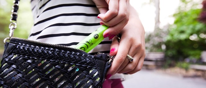
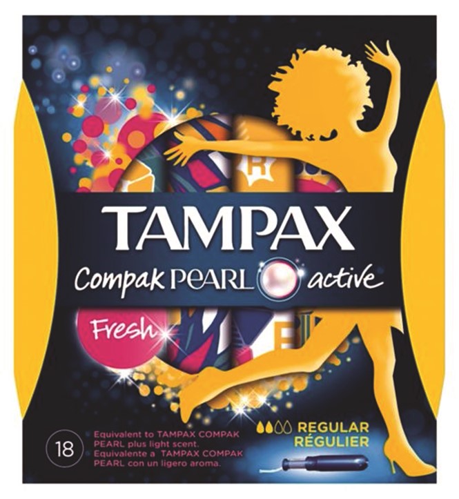
The category has changed over the past few years, Popham says. This has allowed Tampax to evolve its brand and packaging to “help women feel more comfortable about carrying around their sanitary items, with the overarching intent being to remove the stigma that periods are something that shouldn’t be spoken about or addressed in public.” Through puberty outreach and confidence programmes, and an approach to packaging that has introduced the colourful, diminutive size and confident brand language to the ‘Compak’ and ‘Pearl’ lines, Tampax is working to counter the existing narrative.
But there is work to be done. Through different positioning and vastly varied packaging from brand to brand, each company working in this sector has a unique role to play. Pender says, “It’s a tough category with dominant international players and a very defined aesthetic but there is increasingly minimal real difference between brands in terms of actual product performance and specific product benefits. Thus, attempting to own the emotional benefits and drivers of the category is a huge opportunity for brands to try and differentiate themselves.”
With cultural shifts toward femininity and feminism occurring alongside branded efforts like Dove’s Real Beauty campaign and Sport England’s #ThisGirlCan, the era of outdated feminine hygiene branding and packaging may be coming to an end. Newcomers and seasoned brands alike are recognising the power they hold toward building self esteem, changing the tone of the conversation around periods and revolutionising the positioning of the category itself.
For more from Transform magazine, follow us on Twitter @Transformsays


