Häagen-Dazs unveils refreshed visual identity
The year is 1961 and New York’s South Bronx is a poster for working-class poverty. Hollowed-out buildings trace a skyline interrupted by sneaker-ridden telephone lines. Below, children caper in the spritz of fire hydrants until, as per tradition, the sonorous chimes of ice-cream trucks ignite the Pavlovian yearnings for something sweeter. Yet for Reuben and Rose Mattus, the widescale, frantic distribution of ice-cream was missing a key ingredient – luxury. Through a sentimental ode to the Danish culture, Häagen-Dazs was created. Over half a century later, the brand has repositioned its visual identity, tapping into the youthful essence present at its core.
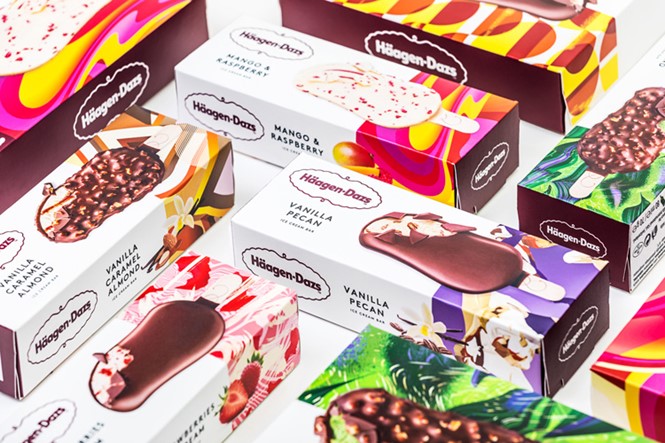
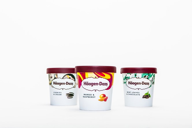
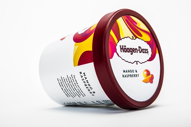
The rebrand was undertaken alongside UK-based design consultancy, Love Creative, and sought to reimagine the breadth of Häagen-Dazs’ visual portfolio, from packaging to logos. Yet for the wider ice-cream sector, developments in the last decade have seen sales rocket. The commercial ice-cream arena is now home to wide-ranging flavours, marrying convenience and indulgence at affordable price points. With 46 flavours available, Häagen-Dazs’ rebrand infuses a refreshed colour palette to compliment the growing position of the brand as a key competitor in the market.
Yet with Unilever’s Magnum ice-creams leading the competition in brand value shares through its hand-held offering, Häagen-Dazs, under the direction of General Mills and Nestle, has stood firm in its journey to the upper echelons of the sector. The rebrand however, signifies a new direction for the company, tapping into its historic beginnings as a pioneering manufacturer and allowing its originality to surface through a vibrant colour spectrum that adds character to its growing range. Aiming to appeal to a younger audience, each flavour is now accompanied by abstract visuals, completed by 13 different contemporary artists and bringing to life the diversity present in the brand.
David Palmer, executive creative director at Love Creative, says, “From vanilla through to coffee or caramel ice cream, you’re in a beigey world. But when you taste it, there’s a completely different experience and we wanted to get that across. The burgundy and gold design was also hard to navigate in the freezer; once people familiarise themselves with each illustration style, the flavours will become easy to find. We wanted to simplify everything and make it more vibrant and modern, and less fussy and olde-worlde. Häagen-Dazs had allowed itself to age, and had lost contact with the younger end of its audience.”
The rollout, which includes the brand refresh and new packaging, is set for release in the UK this week, with a TV advertising campaign scheduled alongside.