Designing a deletion for charity rebrand

In some foetuses, a genetic mutation occurs in which a piece of one chromosome is deleted. This results in a disorder known as Prader-Willi Syndrome (PWS). For UK charity that works with people affected by this disorder, the Prader-Willi Syndrome Association UK (PWSA UK), deleting a small piece of its new logo was what made the brand instantly meaningful for its community.
The charity worked with London-based creative agency Cubo to reexamine its tired, “old-fashioned” and “grubby-looking" brand. By donating its time, Cubo allowed the PWSA UK to roll out a rebrand that reinvigorated its staff, its members and its community behind a new visual identity and the strapline, ‘Hungry for life.’
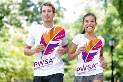
The previous brand was denoted by a jigsaw piece. When CEO Susan Passmore asked the charity’s trustees what the jigsaw stood for, no one could respond confidently about its symbolism. “It really worries me when you’ve got a logo and nobody quite understands why you’ve got it,” she says. Cubo worked on a new logo comprised of a single feather, with a single piece missing. This evokes the single chromosome deletion that causes PWS. It also allowed the PWSA UK to sit comfortably alongside other national and global charities working with PWS – many of whom have flight motifs in their brands.
“The rebrand was about saying, ‘This is who we are. We are a vibrant charity, full of positivity,’” says Passmore. “We felt it gave us the credibility that the old-fashioned look was lacking.” That kind of credibility was a benefit to working with parents of newborns with PWS as it confers a sense of authority on the PWSA’s work and its advice. Its hopeful nature counters the “doom and gloom” of the previous brand.
But Cubo didn’t stop there. The brand was redeveloped across all of PWSA UK’s touchpoints, including its strapline. Previously, ‘We help awareness,’ was used by the charity, though less so in recent years. Passmore says it was replaced because, “It just didn’t mean anything. It didn’t sum up what we did. It didn’t sum up Prader-Willi Syndrome.” The words ‘Hungry for life’ had begun to be used before the rebrand and Cubo turned that into the brand’s strapline. It too, has al link with the disorder in that most people with PWS have an insatiable appetite. Thus, ‘Hungry for life’ is a play on words that reflects a zest for life as well as a genetically interminable hunger.
“It’s been incredibly successful because we haven’t had to explain what the logo means. Our parents, who really need to buy into this, have instantly seen the small bit that’s missing on the feather and completely understood why the piece is missing. It makes absolute sense to them. That’s a huge success for us,” Passmore says.
She adds, “I think the biggest success for us is reputational and about credibility. Because our old branding made us look very old fashioned, we felt that hit at our credibility. Our reputation and credibility have absolutely leapt up in leaps and bounds.”
In other aspects, though, the charity is changing along with the disorder. Throughout its website and publications, photographs of people afflicted by PWS abound, yet most are of children or infants. To ensure the right message is communicated to parents, adults – who are also often unable to give consent for their image to be used – look differently from what today’s children will look like when they are adults. Modern therapies and treatments are improving the outlook for those with PWS and depicting adults who had drastically different treatment plans in their developmental years is a false representation of the syndrome’s future.
The next steps though, will be to begin campaigning on behalf of those with PWS. Currently, funding is being cut for special needs education and healthcare by local authorities. Additionally, residential care – which most PWS patients will require in their later years – is suffering from cutbacks. The PWSA is seeking to ensure that local authorities are aware of the need to assess people with PWS and provide the right kind of care for their mental and physical wellbeing. Having a professional, modern brand, will help the PWSA ensure that its reputation is determined by the force of its work, but also by its messaging. “It was really important for us that we looked the part, so that when we start shouting our message, we don’t get people looking at us and thinking, ‘Oh yeah, kitchen-table charity, bit old-fashioned.’ We needed our credibility to be established to be able to campaign from a good platform,” Passmore says.
Though PWS is the result of a single missing piece of a chromosome, the PWSA UK is making up for that white space with a new brand, an invigorated outlook and quality services for its community.


