Changing times in Turin
Cradling industrial prominence, Savoyard royalty and automotive ingenuity, the city of Turin is also home to one of the world’s most successful football clubs, Juventus FC. A recent rebrand of the club’s well-known logo marks the beginnings of a new era in 119 years of global and domestic success, despite the reimagined identity doing away with the iconic crest of old.
Commonly known in Italian as ‘la Vecchia Signora’ (the Old Lady), for its longstanding history as one of Italy’s oldest football clubs, the word ‘Juventus’ ironically derives from the Latin word for ‘youth’. After spending many years as one of Europe’s top locations for footballing success, the last year has seen Juventus move further into super club status with the high-profile sale of French forward Paul Pogba for a world record fee of €105m, and the acquisition of Argentine striker Gonzalo Higuain for €90m.
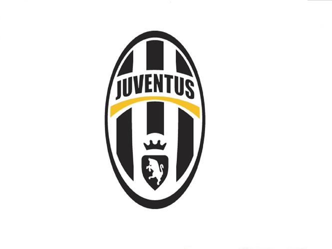
Yet away from big spending, the club’s colloquial moniker’s ‘I Bianconeri’ (The White and Blacks) and ‘Le Zebre’ (The Zebras) plays on the alternating criss-crossing of the club colours. Its new identity offers a redesigned imagery that, since the club’s 1983 adoption of the all-black stallion as its principle signage, proposes the biggest design change to the club identity in recent years. Undertaking the transformation, global brand consultancy, Interbrand, removed the Turin city symbol of the rampant bull to make the logo more international.
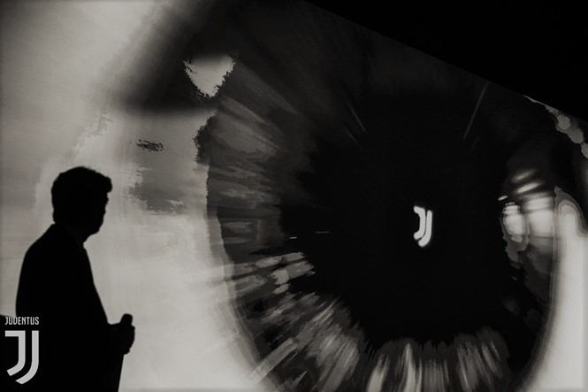
Developing the conceptual theme of ‘Black and White and More’, Manfredi Ricca, chief strategy officer for EMEA and Latin America at Interbrand, says, “No club in Europe has so far been able to transcend sport and convey the philosophy behind that, if there is one club capable of taking that step, it’s Juventus – the brand is synonymous with ambition and excellence and these are principles that can inspire truly unique experiences. The new visual identity has been designed to boldly take the club’s spirit into new, unexpected realms.”
With the new visual representing many folds of Juventus’ history, the new logo symbolises the famous words of revered Italian industrialist Gianni Agnelli, “I get excited every time I see a word beginning with J in the papers.” In addition, the new visuals unhinge the Juventus name from the footballing realm, allowing for it to be applied across a growing range of alternative initiatives and cross-sector campaigns.
Yet with the process taking a year of research and the redesign moving away from the traditional crests known across the footballing landscape, many Juventus supporters have expressed their dislike across various social media platforms. However, with the new identity set to be implemented in July 2017, the question of whether Juventus’ choice to foster a new, minimalist and all-encompassing identity can translate throughout the footballing world is yet to be answered.


