Writing patterns
Early stage geometry was used by the Ancient Egyptians to develop surveying methods, and eventually construct the famous pyramids.
Developing in sophistication over time, geometry is often now associated with such distinguished philosophers as Descartes, or design such as the 1920s art deco movement.
London-based type foundry, Fontsmith, has used a combination of the classical principles applied in mathematical geometry with the bold, intricate design inherent to geometric patterns, to create a new, unique font.
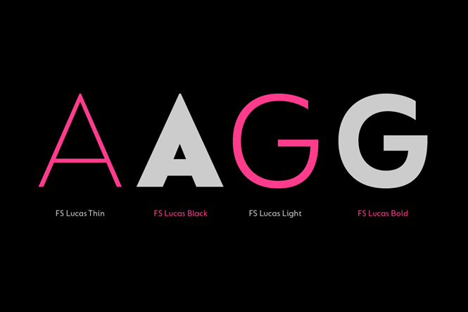
Named FS Lucas, it has been developed by type designer, Stuart de Rozario. The font is intended to meet the demands of modern brands for a clear, bold typeface, which conveys the product clearly to customers.
Yet FS Lucas moves away from traditional notions of geometric font first employed by organisations such as the Bauhaus, which pursuit of modernity through design. Despite its art deco credentials, a reflection of the era in which the design movement flourished, the Bauhaus was sometimes criticised for prioritising design over legibility.
Rendering geometric font into readable script is challenging, particularly in long passages of text, where individual letterforms seem bold and defined, yet work less well en masse. De Rozario, who also designed wayfinding font FS Millbank, says, “To appear geometric without being perfectly geometric, you need a relatively large x-height, which also happens to be great for legibility and accessibility.”
A slight undercurrent of deceit, in order to ensure FS Lucas can be implemented in as many situations as possible, is therefore a feature of FS Lucas. Fontsmith has ensured the typeface appears geometric, yet FS Lucas is rendered in a way that enhances legibility for the reader.
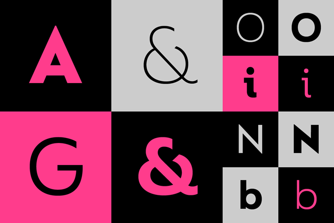
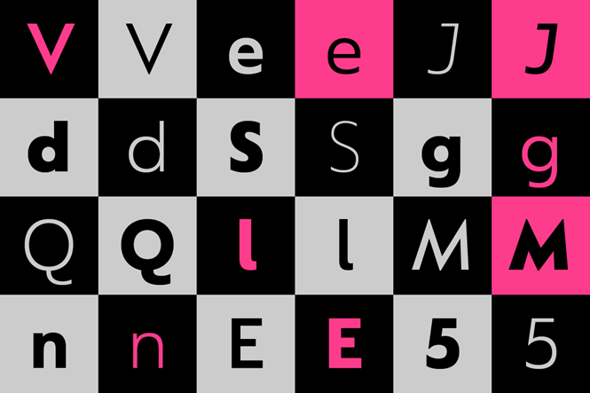
Sharp axes have been gifted to the more angular letterforms, such as A and K, forming a contrast between the more rounded, ‘soft’ letterforms of O, or C. Ensuring each letter contained an individual quirk also formed an important part of the FS Lucas development.
Such idiosyncrasies were, Jason Smith, founder of Fontsmith, says, “The product of sketching the letterforms in the first instance by hand, rather than mapping them out mechanically by computer. They give FS Lucas the built-in humanity and character that make it a better, easier read all-round.”
Based on an iconic style, yet rendered with simplicity, FS Lucas will surely prove popular among brands looking to enhance their visual identity through sophisticated means.


