#TransformTuesday: 14 June

Every week, Transform examines recent rebrands and updated visual identities. This week's picks are below. For more from #TransformTuesday, follow @Transformsays
TECOM Group is a Dubai-based conglomerate, and a parent company of many real estate developments across the emirate. One of its housing complexes, formerly also known as TECOM, has been renamed Barsha Heights – apparently overnight. A nearby area will also be rebranded as Sufouh Gardens. The redesign is thought to be part of TECOM’s continual effort to provide holistic living in welcoming environments, and create a brand more attractive to visitors. This is as well as a securing Barsha Heights as a lucrative opportunity for investors. Fareed Abdulrahman, chief commercial officer at TECOM Group, says, “The new brands will better resonate with all our stakeholders, and with the value added services of TCM, investors will be more confident in the value of their assets.”
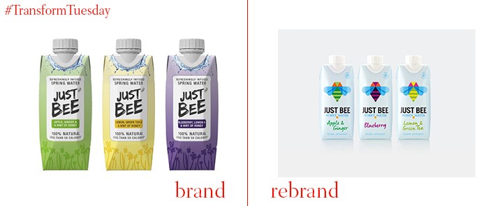
The market for soft drinks is diversifying as customers seek healthier alternatives to traditional offerings, which are often laden with sugar and additives. The latest contribution to the healthier soft drink revolution is Just Bee. The product is a honey water, available in three flavours, that uses one drop of honey to add sweetness. London-based creative design studio B&B Studio has updated the Just Bee visual identity into an iconic style, creating colourful graphics to ensure Just Bee stands out in a competitive market. The bee icon adorning the front of each drink carton changes colour according to flavour, with uniform blue wings remaining consistent across the flavour variations. Embracing ‘The power of honey’, B&B Studio has emphasised traits of the drink which make it unique.

Miami-based Florida Panthers is a professional ice hockey team, playing in the National Hockey League (NHL). Designed by global sports brand Reebok, its new emblem and typography has forgone the assertive and somewhat aggressive panther leaping out at its audience, in favour of a more traditional, staid crest. This is the first new jersey design and emblem rebrand for the team since 1993, with the redesign intended to reflect a more contemporary, progressive era for the NHL. The jersey design retains the Panthers alternate home mark on the sleeve; a sophisticated colour palette, dominated by red, white and gold, lends seriousness to a well-established and respected team.
Around 2 million UK employees use Personal Group, a financial services company which has recently had its visual identity redesigned by London-based design agency, SomeOne. Playing on the idea of the software already provided by Personal Group, called Hapi, the new design focuses on the notion of happiness – the SomeOne design mantra is, for this project, ‘Work Happy’. A bright yellow colour palette differentiates Personal Group in a financial services sector dominated by teal, grey and blue logos and iconography. It appeals to customer preference, and provides an accessible identity which can be applied across all Personal Group brand architecture.
Brand consolidation and a name change are the most striking changes occurring for Warwick Hotels International, now known as Warwick Hotels and Resorts. The individual branding which spanned across its 50 hotels, distributed in 25 countries, is eschewed in favour of adopting a single universal identity, with a consistent logo present across all hotels in the chain. Its visual identity, which includes an abstract yet interlinked gold crown, aims to reflect a luxurious visitor experience, while affirming Warwick Hotels and Resorts global credentials.
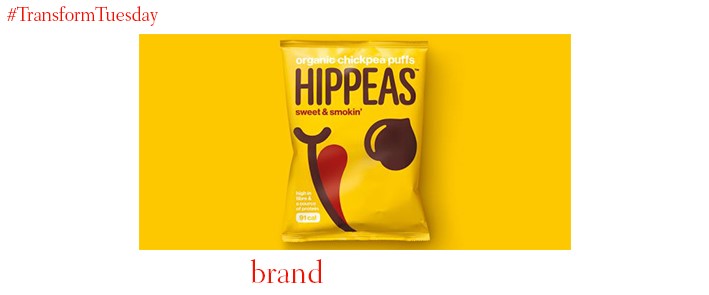
Marrying taste with nutrition has, in the snacking market, been a consistent challenge. Yet, it is something that new chickpea-flour based snack, Hippeas, has embraced. Global design agency, jones knowles ritchie (jkr), was tasked with creating a unique visual identity and brand message for the new product. Centred around the theme of hippy culture, the packaging design is based around a Hippeas smiling face and is available in a range of colours, according to flavour. An upbeat and active tone of voice is consistent across the Hippeas brand implementation; jkr has ensured the Hippeas brand values, ambition and aspiration, are central to its new design.


