#TransformTuesday: 5 April
Every week, Transform examines recent rebrands and updated visual identities. This week's picks are below. For more from #TransformTuesday, follow @Transformsays
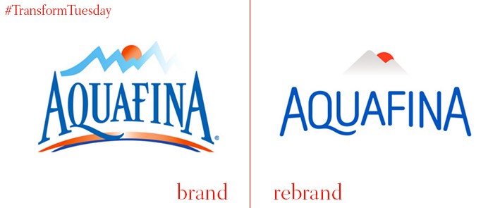
The new, simple sans serif adorning the front of Aquafina’s water bottles is the most notable change in this brand redesign, carried out by an in-house team at PepsiCo Design & Innovation. While retaining the fairly generic bottled water graphics sunshine and mountains, as well as a dark blue/light blue/grey colour scheme, the new visual identity is more assertive than the old – it also employs a wider colour gradient palette in its application. Likely now more conspicuous among similar products, the design remains relevant to contemporary label compositions. There is no doubt its previous iteration belongs firmly to an early 1990s soft drink brand design.
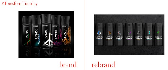
Lynx deodorant, once the focus of an advertising campaign based around what its creators dubbed ‘the Lynx Effect’, has been granted a new visual identity by PB Creative. With the aim to embrace its ‘dark’ roots, PB Creative utilises black as the Lynx leading colour – the imagery on its new packaging design now focuses on a single element, which changes in relation to the scent. Accordingly, the previous, more elaborate design has been eschewed to favour a more simplistic style, reflecting notions of “Progressive masculinity” and sophistication. Its black packaging is also offset through the application of silver text; like the imagery, different colours are attributed to each scent, reflecting the new Lynx ‘individuality’ philosophy.
Part of Spanish IT company Indra, Minsait is a new business unit which unites Indra’s consultancies and solutions services. Led by a design brief focusing on the digital environment, the Madrid branch of branding agency Interbrand created the Minsait visual identity. Driven by the line ‘Impact to go’, technology and light are the foremost themes in the design. Light pastel colours are made bold across the Minsait branding, resulting in a sense of collaboration and unity across the brand, while optimising it for a digital platform.
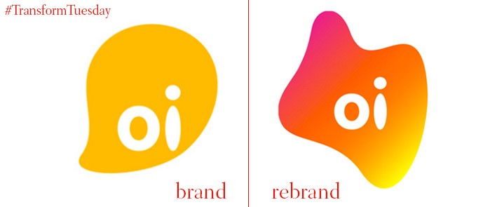
Oi, which means ‘Hi’ in Portuguese, is the largest provider of telecommunications in Brazil and South America. With 74.7mn customers already loyal to the brand, Oi hasn’t strayed too far from its original logo, instead building on the six variations previously in use. Flexible identity is an overriding theme in the latest iteration of the Oi identity, reflecting the approach of international brand consultancy Wolff Olins, which also paired with the Sao Paulo office of Futurebrand to redesign Oi, and develop its 70 logo variations. In a manner fairly restrained given the techno vibe of the Oi brand, its new colour palette includes only three gradients of purple, green and yellow, though all are bright. Yet, with Arial and Simplon the leading fonts in the brand implementation, Oi’s sunny visual identity is complemented through a simple application.
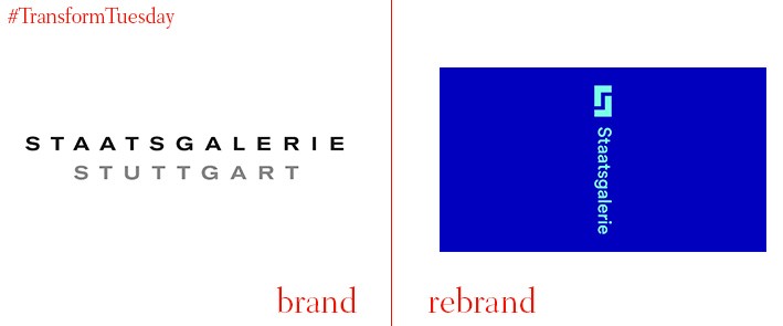
Staatsgalerie Stuttgart is one of Germany’s most important museums, with a collection spanning an 850-year period. Its new visual identity, developed by Munich-based corporate design and branding agency KMS Team, intends to “Present the museum as an open frame for art”. The diversity of the art on display at the Staatsgalerie is reflected in flexibility gifted to logo’s design; while its image remains consistent across its applications, its iteration is applicable to a wide colour spectrum. Furthermore, the ‘S’ monogram atop the text is applicable as branding in its own right, even without the text below. The ‘S’ design, based on the solid concept of a painting’s frame, emphasises the history and innovation offered in Stuttgart’s cultural space.
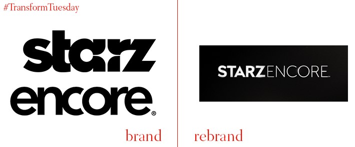
The premium US-based cable network, Starz, has announced a rebrand, set to be rolled out across its channels and sister station, Encore, which will be renamed Encore Starz. Beginning 5 April, the redesign will reflect the Starz role as a provider of original television series and films, and has been carried out by Hollywood-based branding agency Troika. The new logo retains elements of the previous Starz and Encore monikers; its overall effect reflects the sophisticated audience Starz aims to capture. The capitalised lettering reflects the dominant position of Starz on the cable network, as well as its applicability on a digital platform such as streaming services. Its new strapline, ‘Obsessable’, was chosen – or created - to highlight the addictive nature of the programmes Starz shows.


