#TransformTuesday: 22 March
Every week, Transform examines recent rebrands and updated visual identities. This week's picks are below. For more from #TransformTuesday, follow @Transformsays
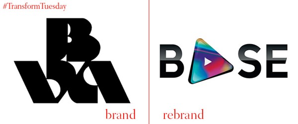
British Association for Screen Entertainment
The former British Video Association has announced a rebrand to the British Association for Screen Entertainment to better reflect the country’s audiovisual industry. Consumption of entertainment via digital media rose by 30% last year, outpacing physical DVD and other sales. The trade body’s new wordmark integrates a play button and depicts the variety of screens and media types it represents.
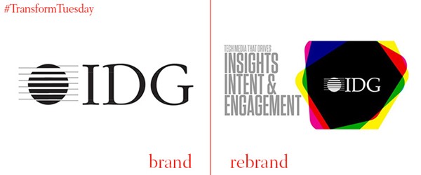
International Data Group
Major magazine publisher International Data Group, responsible for titles such as MacWorld, ComputerWorld and PCWorld announced a corporate rebrand and marketing push. The new corporate visual identity and strategy will put the corporate brand first, eschewing the title-based positioning it had favoured. The publisher worked with London-based agency Doremus on the brand development and strategy.
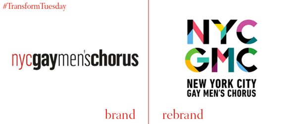
NYC Gay Men’s Choir
Charlie Beale, NYCGMC’s artistic director says, “We’ve also evolved with our community. Our conversation is no longer just about being gay and male – we are champions for a variety of sexual orientations and gender identities. This flexibility of identity is at the heart of our new brand and logo.” The brand system, devised by Brooklyn-based Hieronymus takes inspiration from the shapes found on a musical staff and introduces a world of colour to the choir’s brand. The angular look of the new wordmark is reflective of New York’s cityscape.
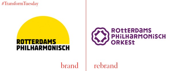
Rotterdam Philharmonic Orchestra
The past year has seen a host of orchestra, opera and ballet company rebrands as fine arts organisations attempt to appeal to new audiences. The latest to rebrand is the Rotterdam Philharmonic Orchestra. The orchestra’s marketing manager says the new logo was needed to better define the orchestra and the direction in which it is going. Dutch agencies Enchilada and Bureau Bunk collaborated on the rebrand.
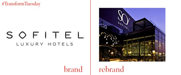
So Sofitel
French creative agency W has relaunched So Sofitel, the premium arm of hotel group AccorHotels which is positioned as the brand of choice for affluent Millennials. Although a uniform identity has been created in order to effectively align the So Sofitel brand across the international market, each individual hotel has been given its own theme based on an international designer. The squared-off font gives the overall design a more sophisticated look, with the gold and black colours of the logo contrasting effectively with each other, as well as with the patterned branding adorning the hotel products.
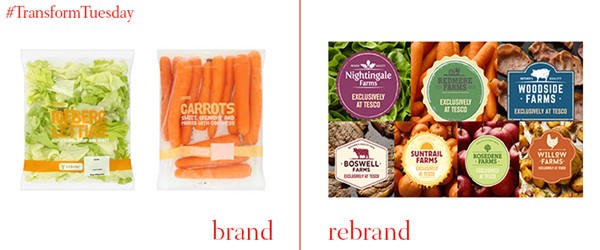
Tesco
In the past decade, the range and market of UK supermarkets has been shaken up, with the introduction of European chains posing a challenge to traditional models. In a bid to compete with the popularity of these shops, UK supermarket Tesco has launched a range of own-brand products, named after a selection of fictional farms. The names of these range from Rosedene Farms for berries, apples and pears, to Willow Farms for chicken products, to Boswell Farms for beef. Where the new products overlap with the original Tesco Everyday Value budget selection, the rebrand will replace them – its colourful, image-heavy frontage marks a departure from the single coloured, patterned styles which characterised the previous product range.


