#TransformTuesday: 13 September
Every week, Transform examines recent rebrands and updated visual identities. This week's picks are below. For more from #TransformTuesday, follow @Transformsays
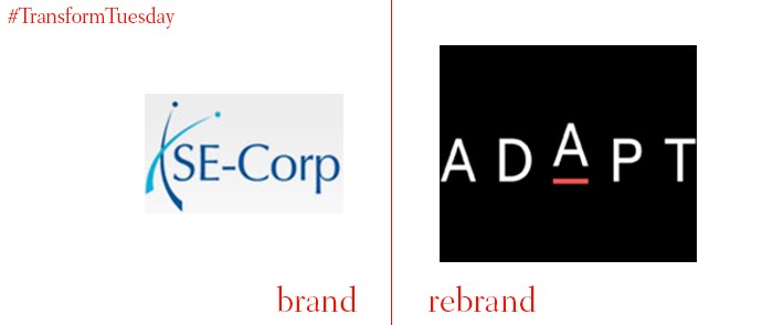
Adapt Ventures, founded five years ago as SE-Corp, has rebranded with the help of global creative agency, Futurebrand. The new identity aims to inject vitality into the brand direction, with Adapt Ventures embracing change, multiplicity and capaciousness as cornerstones of business. The new orientation looks to focus on what business offers to clients. With a more polished visual, Adapt Ventures seeks to equip C-level executives with 'the edge', naming its experiences CIO Edge, CFO Edge, and Digital Edge accordingly.
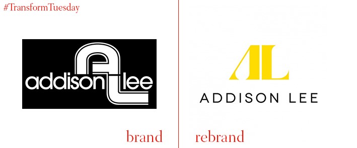
Addison Lee, the premier vehicle hire company, has updated the visual identity of its fleet in order to compete with other taxi alternatives such as Uber. A black, yellow and slate colour palette will be rolled out across the 5000-strong Addison Lee fleet, which includes cars, motorcycles and vans. A new mobile app has also been launched in five UK cities, with the intention to extend this to 25 by the end of 2016. Andy Boland, CEO of Addison Lee, says, “We are very excited about our new branding. It’s a bold new look with a premium feel. It says that we are committed to offering our passengers quality and service, all of which consumers can access at the touch of our app.” This is the first brand updated since Addison Lee launched in 1975.
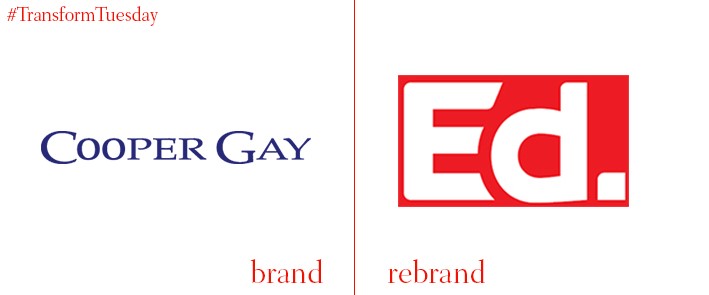
Independent London-based broker, Cooper Gay, is rebranding as Ed. Operating from Lloyd’s, the firm has long been a key figure in insurance broking as part of Cooper Gay Swett & Crawford. The new venture aims to redefine broking as an international, boundless and expansive enterprise. Ed CEO, Steve Hearn, comments, “All around us, the world is changing. Ed is the embodiment of that change in the world of wholesale broking.” Its updated visual identity uses vibrant colours punctuated with professionalism, which Ed hopes will provide a renaissance in the sector.
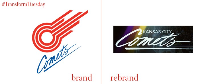
American soccer team, the Missouri Comets, has rebranded as the Kansas City Comets. The team originally played under the name when it first entered the Major Indoor Soccer League in 1981, but changed to the Missouri Comets in 2010. The throwback aims to garner future success with a new direction, one that goes back to the organisations roots. Vice president of business operations, Scott Levinson, says, “The Kansas City Comets have a long history in this town, and the name really resonates with longtime fans who attended Comets games at Kemper years ago.” The team will enter the 2016-17 season in the Major Arena Soccer League, with games starting in October.

Founded in 2001, Potential Plus is a leadership development consultancy with a global reach. A rebrand, led by London-based design and branding agency Kimpton Creative, has updated Potential Plus’ visual identity to create a streamlined and more professional feel to the brand. Kimpton Creative’s use of black and gold in the updated monogram reflects that of a luxury brand. The global reach of Potential Plus is emphasised through the updated website, which features various skylines from across the world.
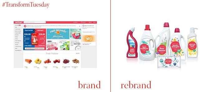
Singapore-based start-up, RedMart Ltd is described by its co-founder and CEO, Roger Egan, as “A tech and logistics company that does grocery retail.” RedMart Ltd has extended its private label packaging offering in a rebrand carried out by global brand creation and identity agency, Love Mondays. Imagery on the updated packaging now reflects a common reference to Singapore as ‘The little red dot’ country on a map, and aims to continue generating revenue at its current rate. Happiness is also an integral part of the packaging rebrand, with items carrying messages such as ‘flower power’ for packets of flour.

A collaborative effort between advertising agency McCann Erickson, Mumbai-based creative advertising agency, Famous Innovations, and creative design and branding strategy agency, Design Studio, has led to a comprehensive rebrand of India-based ecommerce site, Snapdeal. The rebrand, which includes a logo change and integrated marketing campaign, aims to create emotional connections with its customers. It has been rolled out across its website, mobile site and app, and ultimately aims to connect Snapdeal with a potential 100 million additional customers across India. A shade of red named Vermello is the new brand colour. This will extend across all brand touchpoints, including the colour of the shirts for employees who deliver products to the customers.


