The type writer: American presidential race

Bruno Maag examines how the branding of the American presidential race inspires modernity, revolution and dread
Barack Obama’s 2008 presidential campaign set a new standard for political graphics in the U.S. It was a fresh visual identity built around a stylised logo with a classic serif type style for the name. Campaign posters maintained the stylised visual language supported by sans serif typography.
In 2012, the design was used again to great effect, although the serif typeface was dropped for an all sans approach. Its clarity and simplicity expressed the clear brand value proposition, his political agenda and allowed followers to identify with the campaign.
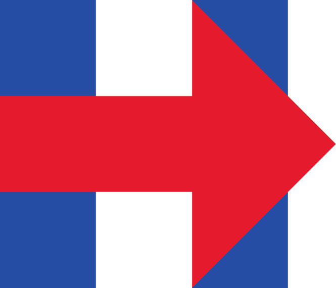
In the current presidential race, Hillary Clinton has the most striking identity, with a typographic solution for a logo that can be flexibly used. The geometric sans serif typeface expresses progress and modernity, but the identity needs to be filled with a clear proposition.
Bernie Sanders is clear in his proposition. He unapologetically presents a left wing agenda and the look and feel of his visual identity expresses this. The logo and serif typeface are reminiscent of the industrial revolution. The proposition and identity have attracted younger supporters who may see an artisanal element in his campaign.
That leaves the mystery of Donald Trump. Compared to the identities of Clinton and Sanders, this could be termed non-design. There is nothing refined or considered in the visual identity, yet it is the perfect vehicle for his brand value proposition of cheap, loud and shallow. Maybe this will be the new standard for political graphics, once all is done and dusted. I hope not.
Bruno Maag is chairman of Dalton Maag


