Spotlight on JustProperty
UAE property website, JustProperty.com, was faced with the opportunity to captivate the sales and rentals market, it just needed a new brand. Emily Andrews reports on the site’s friendly new look and unique brand positioning
By putting home and belonging at the heart of its new brand proposition, JustProperty.com has borrowed an idea that is already popular in Western markets, notably with Airbnb in the property sector, but has applied it to the unique Middle Eastern environment. By adding multilingual language, inviting images and videos, a new, friendly logo and by improving its user experience, JustProperty.com hopes to communicate a clear brand proposition and to become the UAE’s go-to property portal for those looking to build a life in the region.
Within the crowded property sector, a new brand differentiates JRD Group-owned, UAE-based JustProperty. com. Listing properties for purchase, the online portal had grown to become one of the oldest and largest in the region, yet it had not yet cultivated a distinctive brand persona. JustProperty.com also merged with its sister online rentals platform, JustRentals.com in October 2015, and it needed an overarching brand that was representative of this combined offering. The brand refresh also coincided with the portal’s regional expansion into Qatar and Saudi Arabia and with an injection of growth capital from iMENA Group, an organisation that operates online and mobile businesses in the region. The rebrand was therefore, according to Natasha D’Souza, head of PR and communications at JustProperty.com, “Both an overarching long-term imperative and an immediate business prerogative.”
D’Souza says, “It was vital that we defined, communicated and distinguished what we are as a brand in order to support and enhance our immediate and future growth efforts. The UAE is a small and saturated marketplace when it comes to property portals and it was high time we claimed and cultivated our distinct voice and value proposition in the market, through our brand.”
Many of those who visit JustProperty.com in search of homes to rent or buy are expats looking to begin a new life for themselves. It is this that makes JustProperty.com’s new brand proposition so effective. Its users are looking for somewhere that they can call home; a property that will make the individual or family feel as if they belong. JustProperty.com aims to be the enabler of that goal, and by extension, that feeling of belonging, which makes for a powerful brand proposition.
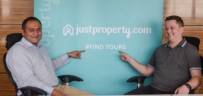
Alex Nicholas, co-founder of JustProperty.com, says, “In the coming months, we will work with a spirit of service and innovation to elevate the property search experience, transforming the process through technology and empowering you with the tools and expertise you need in your search to find something so important, unique and vital to each one of us: a home. No matter our diverse backgrounds and life experiences, the cultures and places that have influenced us, we are united by the universal, fundamental, essential human desire for a home; for our own place in this world.”
JustProperty’s brand proposition thus transcends nationalities, a quality that is important in a region as culturally and ethnically diverse as the UAE, and one that sets it up for future expansion. The ability to transcend geographical borders is a modern brand quality, and one that is particularly valuable for brands that predominantly operate in the online space.
“It was vital that we defined, communicated and distinguished what we are as a brand in order to support and enhance our immediate and future growth efforts”
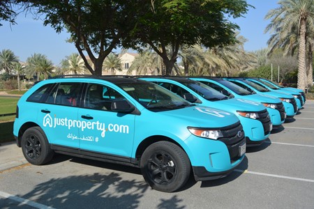
With a short turnaround time to complete the rebrand exercise (two months), the team at JustProperty.com had to prioritise the brand aspects that they felt were the most crucial; they decided upon the elements that would be external or consumer-facing. The logo, for example, was identified as being of upmost priority. Unusually, the in- house team conceived a draft logo before approaching an agency. D’Souza says, “A lot of our initial logo ideas were developed in-house, post a scan of existing logos used by property portals worldwide. We had a backlog of logo options that had been built up over the course of some months and when it came time to kick-off the branding exercise, we had to narrow it down.” The product, design and marketing departments, as well as the co-founders of JustProperty.com, settled on a draft version of the logo. It included the full brand name in cursive font, a blue-green colour palette – which was chosen for its connection to nature – and a home icon. The company’s old logo, in comparison, was busy, outdated and over-complicated.
The agency selected to refine and develop the preliminary JustProperty.com logo was Bock Creative which, helmed by former Nike marketer, Robert Bock, had just set- up in Dubai, the city where JustProperty.com first launched.
D’Souza says, “[Bock’s] feedback was invaluable, and the ultimate logo we developed reflected exactly the kind of cool, contemporary spirit we were looking for.”
JustProperty.com decided upon the logo’s main components; its colour scheme, icon and typography, but Bock Creative removed the gradient to simplify the design, make implementation easier and reduce printing costs. The home icon was also softened so as to fit better with Sari, the new font. The colour palette was reduced down to one shade of turquoise with sienna red accents.
Another typeface was chosen for use across the rest of JustProperty.com’s brand collateral. D’Souza says, “We had a number of font options presented by Bock to utilise as part of our visual identity and settled on Museo Sans, which is regarded as a sturdy, low contrast, geometric, highly legible sans serif typeface, very well suited for display and text use.” It was important that all of the fonts could be applied in both Arabic and Latin since both would appear across the new JustProperty.com site and in marketing and advertising copy.
The new logo contributes to the rebrand’s overriding theme of homeliness and belonging. In this way, it is similar to one of the most talked about new logos of the past few years – that of Airbnb. It has the same friendly and approachable feel and a similar style of icon; a continuous line that looks as if it could have been hand drawn, which makes it more informal. The soft but bright colour palette is also similar, as is the prominence of videos and photography in the mobile-ready website design.
The videos and photography that feature on the new Justproperty.com site show diverse families running into their new homes, sitting for a meal or enjoying other day- to-day activities. In this way the imagery alludes to a home that is lived in, and a service for ordinary people, rather than property investors, for example. This also alludes to the user-friendly intentions of the new site. The website is also entirely multilingual for the first time and is more relevant to the region in which it operates and better suited to JustProperty.com’s expansion plans.
Despite any similarities to western property sites, D’Souza points out that JustProperty.com is the first Middle Eastern property portal brand to put themes of belonging, home and community at its heart.
The new microsite also communicates this message through testimonials from people who have already found a home in the UAE. Rather than referencing JustProperty. com directly, the testimonials speak about the reality of life in the region. The new brand is therefore in line with a popular trend among digital-first brands that promise an experience first and foremost, rather than the product or the service in and of itself.
D’Souza says, “I think it’s an approach that works well if you’re working in a fast-moving dynamic marketplace, and especially if you’re in a start-up or small business.” The campaign, which accompanied the launch of the new brand, included billboards and featured the ‘find yours’ slogan in both Latin and Arabic. The slogan speaks to the idea of providing somewhere where an individual can belong.
Though the new site is still in its infancy, JustProperty. com reports good results with regards to brand recognition. D’Souza says, “Of the hundreds of conversations I’ve had, both in business and social settings, more often than not people remember seeing or hearing about us. It’s something several of my colleagues have experienced as well.”
She adds, “The fact that our new branding has resulted in recall is very promising and now that we are on people’s radar, we can proceed to further strengthen our identity and promise to our valued customers.”
JustProperty.com is monitoring and measuring brand awareness and social media engagement, to see if its consumers are actively seeking and connecting with it. The organisation hopes to see increased brand awareness, site traffic and social media engagement.
Peer review
David Beare, design director, Dragon Rouge, London
The UAE property market has been one of the world’s most volatile. Its landscape is awash with contemporary high-rise buildings and as a result there is an abundance of properties for rent and sale. So the idea of developing a business dedicated to making the most of this potential makes a lot of sense. The challenge is developing a brand that stands out in an incredibly overcrowded marketplace.
Justproperty.com is the newest player to take on this challenge. A brand dedicated to sales and rental property in the UAE. On paper, this feels like a dream opportunity, but the logo and visual identity for Justproperty.com really miss the mark.
For a start, the logo is incredibly derivative of the market leader, Airbnb, as well as one of its competitors, HomeAway. The execution is far less sophisticated and certainly lacks the craft that you would associate with many other brands in the region. Alongside the logo, the type style for the name feels naive – almost childlike – with an awkward ‘y’ more befitting of a cosmetic or baby brand (I immediately thought of Pampers – not a great association) – perhaps the one positive thing it conveys is friendliness.
In contrast, the headline font is always set in capital letters – is the brand now shouting at me?
The use of colour certainly works – a vibrant turquoise – which feels optimistic and opulent. In combination with this, the supporting graphic pattern plays to the historical and cultural cues of the region, but it feels a little uncomfortable against the logo.
Overall, I don’t get a sense of what this brand is trying to say to me. What is its point of difference and what makes it stand out in the marketplace? It currently feels like a random mix of many other brands with the overall impression leaving me feeling confused about what this brand truly represents. Given the rich culture and wealth of inspiration this region has to offer, it’s a real shame that this brand hasn’t capitalised on what could have been a dream branding opportunity.


