Peer perspectives: Ahold Delhaize


In July 2016, the $29bn merger of Ahold and Delhaize was signalled by the introduction of a new visual and corporate identity by FutureBrand. David Martin, Food retail and grocery sector brand expert and co-founder of M Worldwide, examines the success of the brand consolidation
Project: Ahold Delhaize visual and corporate identity by FutureBrand
Reviewer: David Martin, co-founder and joint managing partner, M Worldwide
Branding in food and grocery: Food and grocery brands globally have been seeing seismic changes and have been facing big challenges. Changes in shopping habits (smaller baskets and more frequent shopper visits), more pressure for ‘fresh’ and ‘ready to go’ products, a greater desire and need for a more rewarding in-store experience, the growth of challengers (the discounters), too much space and on going growth of online (including Amazon Fresh) are reshaping the sector.
In the past the food and grocery sector have focused on size and continued store openings combined with a drive for corporate and territorial dominance. This is now shifting to a focus on being more friendly, welcoming and locally relevant – and less corporate.
Consolidating the Ahold and Delhaize brands: The Ahold Delhaize corporate identity consolidates the group and its many long-established and well-known brands operating under it. Corporate branding and change of identity is always a hugely emotive subject; in this case there is the added dimension of a merger, two lots of heritage, two teams, different opinions, two long established existing identities.
In this context, the merger of the two brands is a success. It feels like an even and fair morphing of the regal icons – Delhaize’s lion and Ahold’s crown.
From a design point of view, the fonts, line, colour and imagery, reflect freshness, refinement and a lightness of touch (despite comments from some about pretzels, Don Corleone cheeks and the lion from the wizard of Oz!).
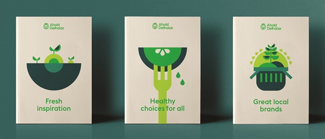
The future of the sector: Fresh food is still where it’s at for the consumer combined with shopping ease. This is nicely reflected in the new brand mark which has a refined, sophisticated and
restrained approach. This visual identity is not, however, a retail brand mark. The real challenge now follows is for this ethos to filter down to the group’s end market retail brands – including Belgium’s Delhaize, the U.S.’s Stop & Shop and its numerous other local brands across Europe – to rebrand an entire retail estate and to ensure the shopper experience and environment is reimagined to reflect the high level of corporate aspirations and values as set out by the new visual identity.


