Qatar National Library’s hybrid identity
By Amelia Gundersen-Herman
A new building can benefit from a complete brand that reinforces its identifying features and purpose.
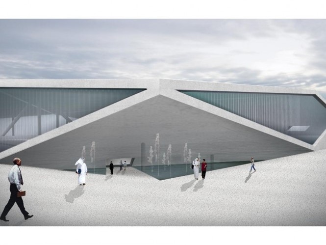
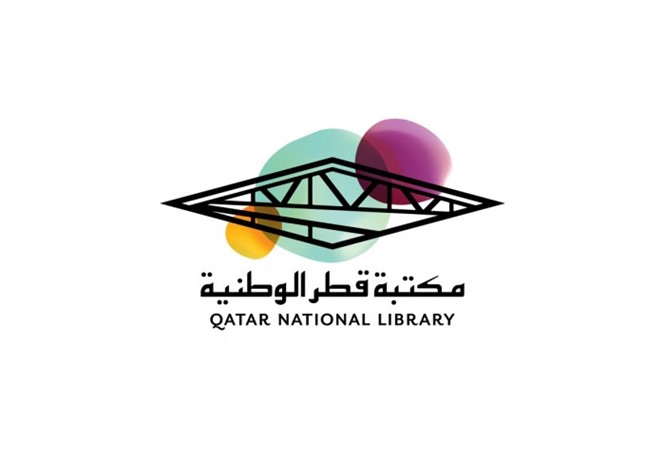
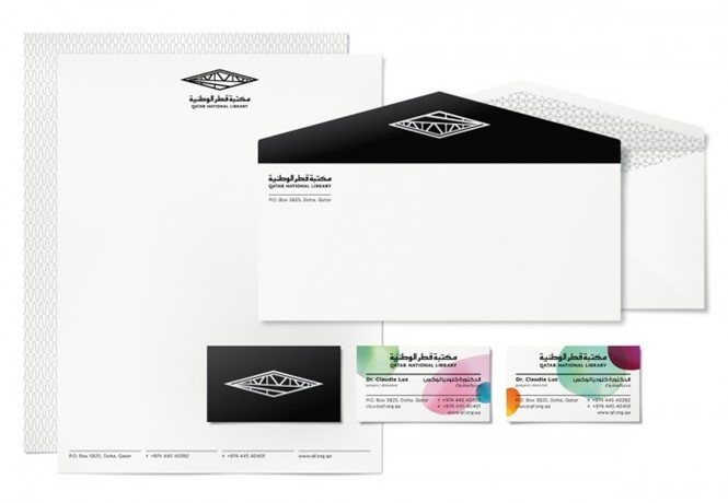
The new Qatar National Library (QNL) in Education City has a striking architectural style that requires a befittingly stylish brand. The Duffy and Partners logo and identity is as modern as the building itself, and is designed to communicate both the structure and its purpose.
The QNL logo comprises of hard black architectural lines that intersect with soft colourful orbs and an angular Arabic script. The architectural icon replicates the building itself, designed by Rem Koolhaas. The intersecting colourful orbs are less solid, and represent a space for ideas and creativity.
The coming together of distinctly separate design elements could be a reflection of the mishmash of cultures, knowledge and histories that will come together under the QNL roof.
QNL’s project director Dr Claudia Lux says, “Qatar National Library is supporting Qatar on its journey from a carbon-based economy to a knowledge-based economy by providing information resources to students, researchers and the community in Qatar.”


