Making Poplar popular
SIMON SMITH – 8 MAY 2014
Are there any forgotten areas of London left? We didn’t think so either, that was until we got a call from Poplar HARCA.
Situated between the shiny towers of Docklands, the Olympic site in Stratford and the East End’s heartland of Bow, Poplar is unknown to many yet is slap-bang in the heart of the fastest growing region of East London.
More than simply the location for BBC drama Call the Midwife, Poplar boasts a proud history stretching back hundreds of years that includes the early seeds of the Labour movement, a host venue for the Festival of Britain in 1951 – which saw the construction of Poplar’s Chrisp Street Market, the UK’s first pedestrian shopping centre – and which can boast an equally iconic Ernõ Goldfinger building in the sizeable shape of the Balfron Tower.
Today, Poplar’s community is strong and people love living there. They are excited about its current transformation and are benefitting from a £1.7 billion reshaping programme. It was time to put Poplar back on the London map.
Poplar HARCA (Housing and Regeneration Community Association) manages around 9,500 residences and focuses on community regeneration to reshape Poplar by improving housing, developing new homes, businesses and employment opportunities, adding parks, and establishing health, education, and community facilities for young and old.
To achieve this mission, it created a local strategic plan that met the regeneration aims of the London Borough of Tower Hamlets and the wider regeneration aims of the London Plan. The Poplar plan was shaped by the ideas of local residents, young people, developers, local businesses, teachers, doctors, Tower Hamlets Council and other local housing associations and has already made significant in-roads to Poplar becoming a different place by 2016.
Having set out a local strategic plan which outlines the actions Poplar HARCA will undertake over the next five years to make Poplar a better place, it was felt that this would be best communicated through the development of a distinctive brand for Poplar, one which attracts people to live, visit and work in the area and which reflects Poplar HARCA’s goals as the driver agency for developing the area.
Enter Stream…
As the strategic plan was created in consultation with the local community, it was important that the brand for Poplar was not only created in consultation with the same community, but also owned by them. From autumn 2012 to summer 2013, workshops were conducted with hundreds of people living, working and investing in Poplar.
It became rapidly clear that Poplar wanted to establish an identity that is developed by the people who know Poplar, that celebrates its confidence, heritage, culture, community and individuality. The brand needed to establish Poplar’s location and positive role in Greater London and create the desire for people to want to live, work and play there.
Using this wealth of information Stream created a brand framework that defined a purpose, vision, values and personality for Poplar. The framework is the foundation for how Poplar should be presented to people inside and outside Poplar and how it should act as a part of Greater London.
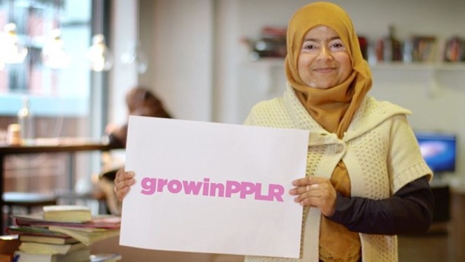
It was important that the brand celebrated Poplar’s heritage, but was confident enough to do something different than all the other London place brands. Instead of creating a strapline (Made in…) or renaming the area (Shoreditch Village) we chose to ‘disemvowel’ Poplar, creating PPLR, a social-friendly word that reinforces the confidence of Poplar by providing a clear and confident campaign identity.
PPLR is energetic (youthful), open (it is a social-first campaign), challenging (not the sort of thing areas of London usually do), personable (ppl is the shorthand for people) and optimistic (looking to the future without forgetting the past). It is contemporary without being flippant, authentic without being corny, refers to the heritage of the area while demonstrating its independence. We believe that it is a celebration of Poplar that shows appreciation without denying who it is.
We then created a bold typographical treatment for the text, to ensure thatit became a part of the fabric of whomever is using it. To this end, we did not define a colour palette, instead PPLR can be used as a container, an overlay or as an affiliate brand taking on the colour palette of the brand it is being used with.
To complement this we created a graphical device based on a stylised version of a map of Poplar that can be used where appropriate on marketing, advertising or communications materials to further reinforce the brand of the area.
The brand framework was used to create a tone of voice for Poplar. The local community has a very strong voice and this heavily influenced the tone that was defined. The overriding aim is to keep the language authentic, PPLR isn’t pretentious, it’s for everyone. The language should feel comfortable and make sure everyone understands it.
Both the framework and the identity are now readily available to the local community to reference, use and own. We have built a brand website that provides guidance on how to use PPLR, rather than issuing strict guidelines. The goal is for the local community to take ownership of PPLR, evolving it through use.
For the brand launch, we created examples of how the branding can be used as part of fictional campaigns, with downloadable versions of the artwork. This section of the website asks whomever is using the brand to send us case studies demonstrating how they have implemented it, so we can build a library of PPLR in the real world and the brand can start to take a life of its own.
In addition, we developed the myPPLR campaign across social media channels, encouraging local residents to let us know what Poplar means to them. This will be complemented on the website with a series of videos of local residents speaking about their Poplar and a social media aggregator which will collate and display all #PPLR and myPPLR mentions in real time.
The aim of this whole project was to give Poplar its identity back and put it back on the map.
We are confident that once the PPLR brand is embraced by the local community and key stakeholders contributing to the area and is used in ways that we haven’t even imagined, it will define Poplar as a respected area of London, with a clear and confident identity, where people want to live, work and visit. Don’t just take our word for it, why not visit the website and make your own mind up? Visit www.myPPLR.com


