Forwarding address
The journey the Deutsche Post and DHL corporate identities have taken over the past half-century, have seen the two companies join together harmoniously. DHL’s reputation as a reliable post carrier allowed it to branch out successfully into logistics while Deutsche Post’s network seamlessly integrated DHL’s brand and subbrands into its corporate structure and visual identity.
1. The Deutsche Post logo features a post horn – an 18th and 19th century instrument used to signal the arrival of a post carrier. The post horn has been used as an indicator of the German national postal provider since its inception – as Deutsche Bundespost –in 1947. The horn still adorns the Deutsche Post World Net and corporate wordmark, but the Deutsche Post DHL logo has been modernised and simplified to just those three words upon a yellow banner.
2. DHL was founded in 1969, taking its name from its trio of founders – Adrian Dalsey, Lrry Hillblom and Robert Lynn. The initial DHL Worldwide Express visual identity bears not a dissimilar resemblance to the modern iteration. It’s white background, bold, upper-casec characters and triple lines are nearly identical to the visual identity after its 2011 redevelopment.
3. In 1985, the brand attributes were more effectively integrated into the corporate visual identity system through the streamlined laser lines – reflecting speed and forward motion. The year of 1985 also marked that in which DHL opened an international hub in Brussels and began focusing on its international business following a doubling of its customer base worldwide.
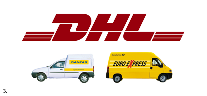
4. 1997 marked a change for DHL in terms of brand and corporate structure. It was acquired by Deutsche Post World Net. Between 1997 and 2002, DHL lost its identity in favour of Deutsche Post branding.
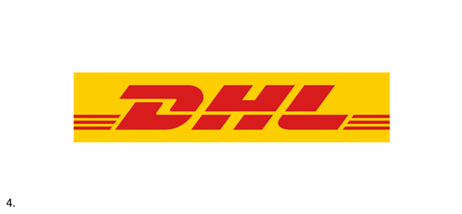
5. DHL was back and stronger than ever in 2002, when it was fully integrated into Deutsche Post. The ‘post yellow’ colour was added to DHL’s longstanding wordmark, signalling a shift to DHL’s position as a full-service logistics provider. The three brand values with DHL from the beginning – speed, quality and service – were retained.
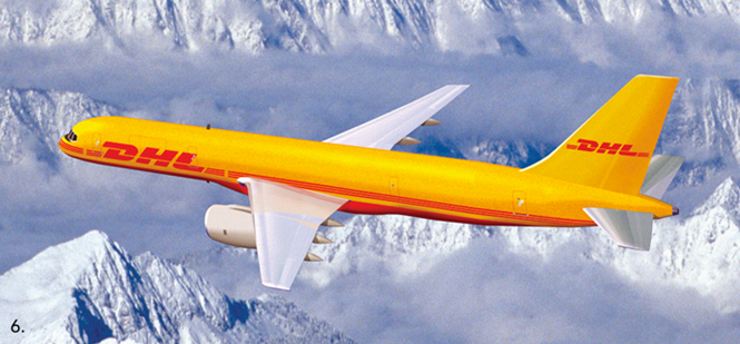
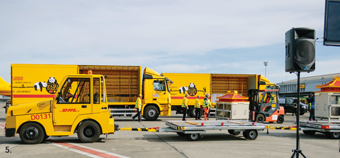
6. In February, DHL assisted in the transportation of two giant pandas from Chengdu, China to the Pairi Daiza animal sanctuary in Belgium. The 8,000 kilometre journey of Hao Hao and Xing Hui was facilitated by DHL’s Boeing 767 and fleet of ground transport vehicles – all outfitted with the DHL livery and the branding for the Pandtastic Journey campaign featuring a caricature of the Chengdu duo.
7. DHL’s subbrands – including global mail, supply chain and freight – are implemented alongside the DHL wordmark. The three laser lines, dating all the way back to 1969, complement the subbrands and tie DHL’s brand values and corporate reputation to the subbrands visual identities.


