Children’s charity adopts positive imagery
The face of charity branding is evolving away from negative imagery and messaging.
Instead of highlighting the shocking nature of the issue at hand, charities are finding it more lucrative to focus on the positive work that they do.
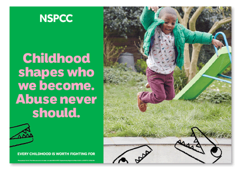
The latest major charity to rebrand in this model is NSPCC, a charity that fights to end child abuse. The NSPCC previously operated under the Full Stop branding. Developed over a decade ago, the campaign was both a financial success and a key contributor to increased awareness of child abuse issues. However, NSPCC’s latest research showed that there was some general misunderstanding of its work, with the public largely feeling that the charity was not relevant to them.
NSPCC creative director, Mark Tobin, says that, “The people who the NSPCC wanted to help were reluctant to use services from what they perceived to be the ‘cruelty charity’. This is what the new brand addresses.”
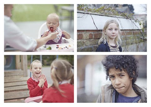
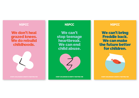
The new identity uses imagery that is heavily evocative of childhood; bright colours, and a crayon illustration style communicate what the charity is trying to protect. The black and white photography of the former brand is replaced by colourful images that photographer Tom Hull says, “Offer a glimpse into childhood”. The visual identity communicates the childhood innocence that the NSPCC aims to protect.
NSPCC art director Sue Hornsby says, “Abuse doesn’t just happen to a certain ‘type’ of child – it could happen to any child, from any background. Our brand needs to convey that in order to make our cause feel more relevant.”
The new brand was created by the NSPCC’s in-house team. Tobin adds, “Our new brand allows us to move the conversation on, and talk about the solutions we offer rather than just the problem.”


