Vault49 develops branding and packaging design for new RTD tequila range
Brand experience and packaging design agency, Vault49, developed a new brand identity for Casatera, a new ready to drink (RTD) premium tequila range. Vault49 created the brand from the ground up, including developing a wordmark, visual identity, brand guidelines and packaging designs.
The challenge for Vault49 was to create a brand world around the product, re-imagining the premium Tequila experience for a wider audience, explains Jonathan Kenyon, co-founder of Vault49. “In such a busy category with no real design rules to play by or break, ensuring shelf standout was crucial,” he says.
Inspired by the name, which derives from casa, meaning ‘house’ or ‘home’ in Spanish, and tierra, Spanish for ‘ground’ or ‘land’, building authenticity into the Casatera name became Vault49’s creative springboard.
“We started to think of the brand as the ‘House of Tequila’; a warm and inviting social space connected to the land, a place where everyone is invited to share the experience. Noticing a recurring theme in the use of archways in Mexican architecture, we were inspired by how they welcome people in to explore and connect with others in their homes. Viewing these traditional architectural shapes and forms through a contemporary lens was the key to unlocking our creative vision for the brand,” says explained Gali Lucas, design director at Vault49.
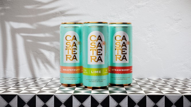
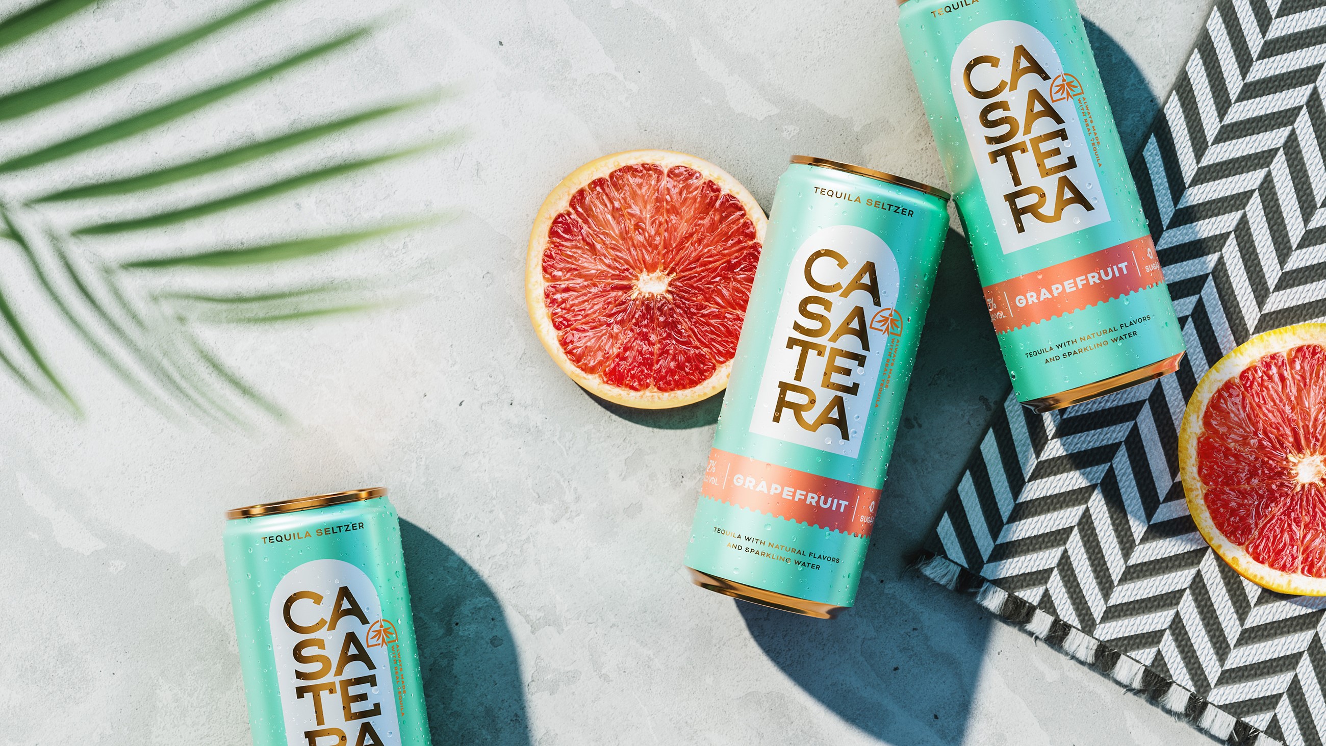
The brand’s archway device became a focal point for the clean and simple pack architecture. This shape is also a prominent feature in the wordmark lockup with arches incorporated in the letterforms of the bespoke Casatera typeface, hand-crafted by Vault49’s in-house team.
Vault49 decided to create an additional hand-drawn key brand asset for the toolkit, the hummingbirds. “A strong and positive symbol in Mexican culture, hummingbirds are also part of the Tequila-making process. To represent their role in pollination and giving life to agave plants, turn the hummingbird illustration upside down and it transforms into a blue agave plant; the base ingredient for Tequila, and the heart of Casater,” says Jennifer Yelk, senior designer at Vault49.
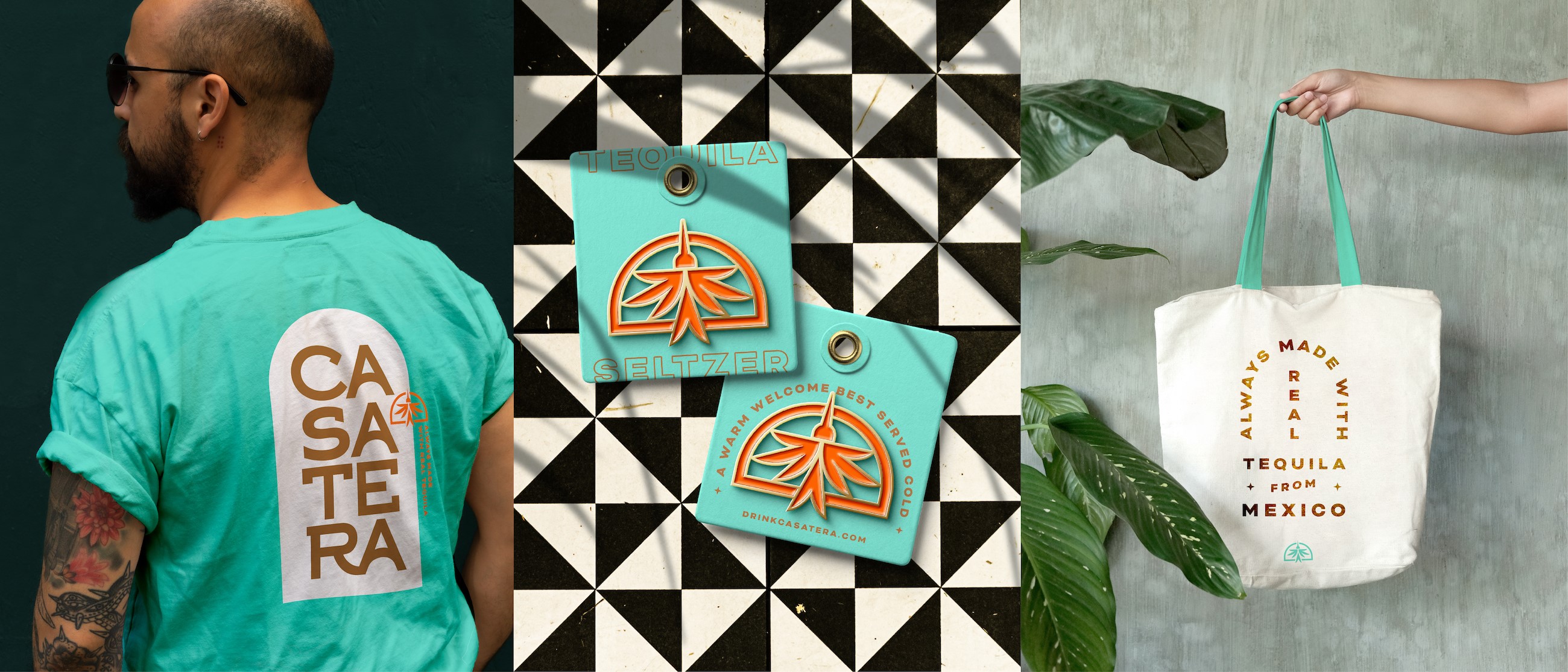
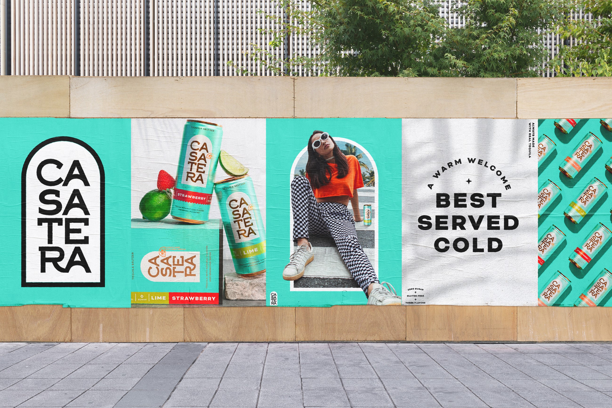
The ‘agave blue’ primary brand colour aims to achieve shelf standout and differentiate Casatera from other tequila-based products. A complementary copper colour was chosen for the wordmark and other on-pack details, adding a touch of tactility and encouraging people to pick up a can.


