Turner Duckworth gives Campbell’s Soup its first redesign in 50 years
UK and US- based design agency, Turner Duckworth, worked with Campbell’s Soup, the American processed food and snack company, to reassert its status with a refreshed logo and packaging portfolio that aims to celebrate the brand’s design heritage.
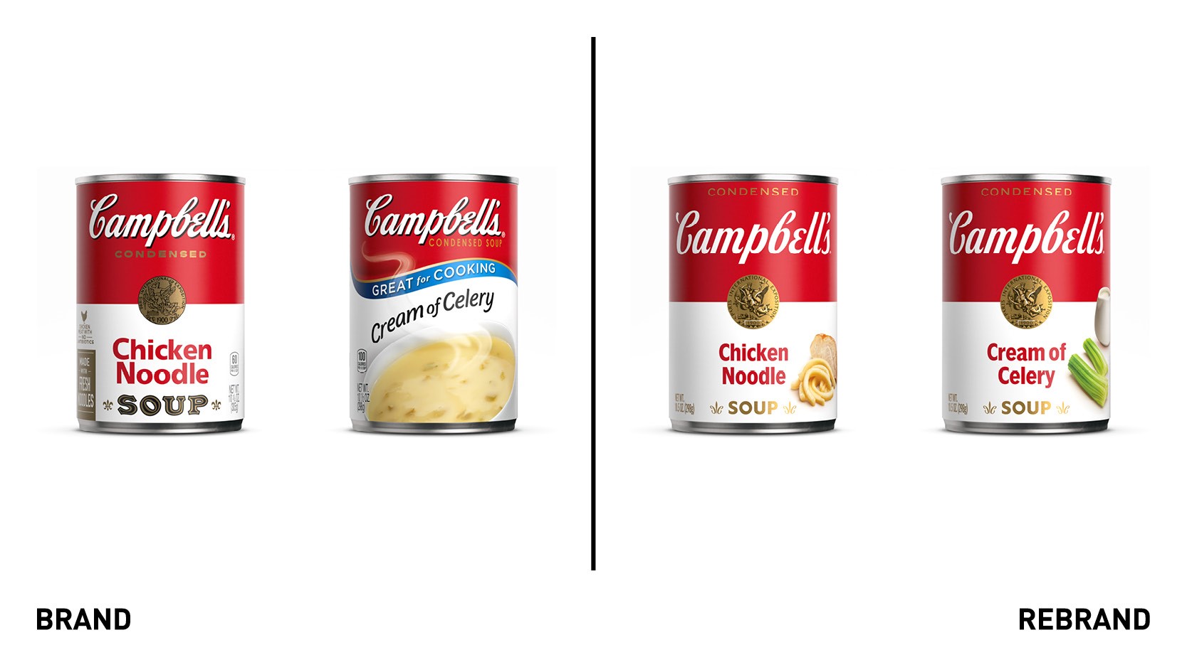
To ensure relevance to a growing millennial audience both in-person and online, Turner Duckworth aimed to modernise the brand, allowing it to stand out against competitive alternatives. Over the years the portfolio had adopted generic category codes—swooshes, ribbons, big undifferentiated bowls of soup — all at the expense of brand affinity. The update removed category generics in favor of its most renown brand assets.
“We’ve been on a journey to reimagine this iconic brand and appeal to new generations of consumers who are cooking at home more than ever, while still honoring our rich history,” says Linda Lee, CMO of Meals & Beverages at Campbell Soup Company.
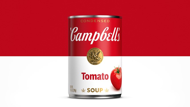
Turner Duckworth anchored the redesign in the familiar architecture of the red and white split. It aimed to bring back simplicity while retaining the important navigability of a 100+ SKU offering with redrawn assets from top to bottom. The new design seeks to reassure buyers that this is not just another product in one's shopping cart — this is Campbell’s Soup.
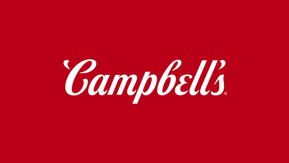
The new logotype, drawn in collaboration with typographer Ian Brignell, is a departure from the historic Campbell’s script. While still based on founder Joseph Campbell’s signature, separated characters give logo the ability to condense and expand (just like the product itself) in a dynamic way, making it appropriate for all channels, from physical to digital. It also increases the legibility required in a digital shopping environment. The new fleur-de-lis borrows the letter ‘C’ from the script in an effort to reinforce the brand in different details.
“While it’s still a close reference to Joseph Campbell’s original signature, the new script gives us the ability to condense, expand and function in any medium, a nod to the elasticity of condensed soup,” says Andy Baron, executive creative director of Turner Duckworth.
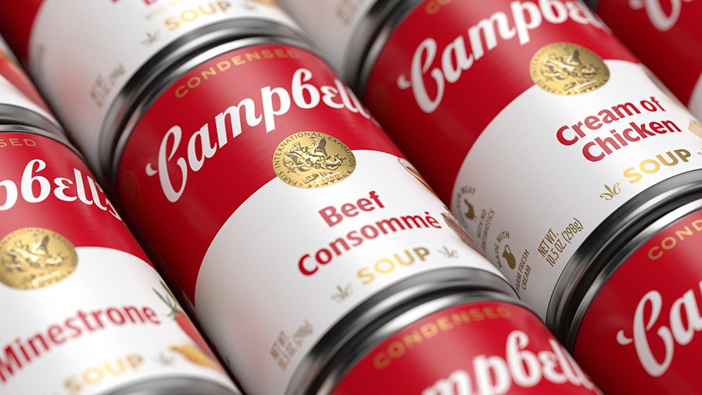
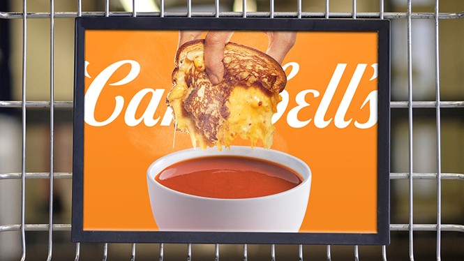
The shift from bowls of soup on-pack to shots of ingredients is a hint that a spoon isn’t the only way to enjoy the product. Beyond packaging, the Turner Duckworth team designed a broader visual identity that aims to reinforce the warmth and goodness of the well-known American soup.
“The Campbell’s name itself brings a sense of nostalgia and comfort. We carefully contemporised every detail so that the can feels at home on any kitchen counter,” says Drew Stocker, design director at Turner Duckworth.

