Turner Duckworth celebrates history of Brotherhood Sister Sol with brand refresh
Global brand design agency, Turner Duckworth, worked with Harlem-based black and brown-led social justice organisation, The Brotherhood Sister Sol (BroSis), to create a new visual identity for the non-profit to celebrate its history and legacy.
Inspired by images and protest signs from the civil rights movement, the agency aimed to create a robust visual identity that would help advance the organisation’s mission to challenge. Inequality and champion opportunity for all. BroSis aims to provide black and Latinx youth the power to claim their history, identity and community to be able to build the future they want to see.
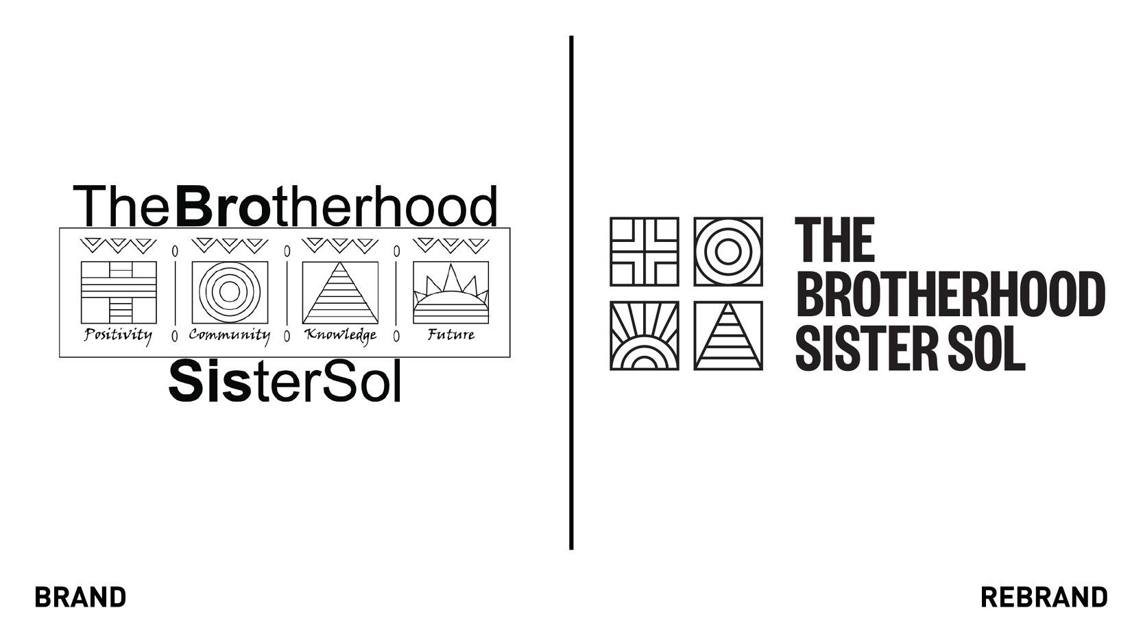
“It was important to maintain the heart and soul of the current logo (and what it stood for). But equally important, was to make it more digital-friendly, and surround it with a kit of parts that could flex its voice in new ways — and reach new people,” says Turner Duckworth creative director, Robert Williams.
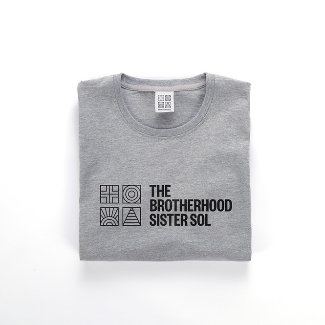
The agency began interviewing staff, board, youth members, and supporters of the organisation to understand how unconditional love (a foundational attribute of BroSis) drives all action. Together, they identified the four legacy symbols — positivity, knowledge, community, future — as the pillars of the visual identity.
"We are very proud of the work BroSis has accomplished over 26 years since our founding – our image and reputation and consistency to mission - and so we did not want to move away from our roots but to celebrate where we came from and speak to our next big step as an organisation,” says Khary Lazarre-White, executive director and co-founder of BroSis.
To give voice and cadence to the message, Turner Duckworth used a bold font and layout approach inspired by posters from the civil rights movement. The final touch was an expanded palette which, inspired by the vibrancy of Harlem, aimed to better represent intersectional youth.
“With a new HQ symbolising the organisation’s increasing influence and renewed vigour, we hope the clarity, ease and simplicity of the new system will give a visual voice and tone to a brand that deserves a megaphone,” Williams says.


