True North designs new identity for the College of Optometrists to revitalise its future
True North rebranded The College of Optometrists, the UK’s professional body for practitioners of primary eye health care, founded in 1895.
The sector and profession faced a range of different challenges, including: the rapidly evolving nature of optometry due to technological advances and an ageing population; and a regulatory change that saw the College no longer be the only body to qualify Optometrists. The rebrand aimed to tackle these challenges and render the College future-proof.
True North discovered how motivated the College is by the impact it has on individual patients, but also how often the staff is dismayed for being misunderstood as technicians, rather than as healthcare professionals. This is becoming increasingly important as the role evolves and requires ever more collaboration with other clinical professionals.
The new brand strategy repositions College membership from being a badge of qualification to reflecting the College’s work in supporting excellence in eye health care.
“What Optometrists can now discover through the eye is incredible, and their role keeps expanding. But because of that rate of change, Optometrists really value being recognised as part of the long, progressive lineage of the profession. So making the brand more relevant in the changing professional and health landscape and embracing the College’s heritage as the professional body,” says Stuart Barnes, strategy director at True North.
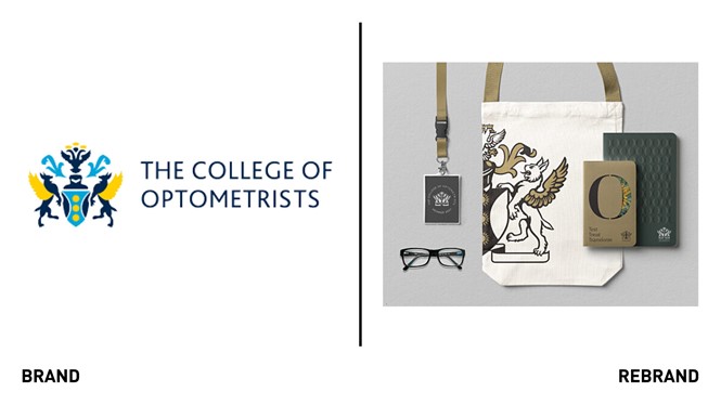
The new visual identity is built around a hand-crafted representation of the College’s heraldic achievement, including crest, mantling and helm. The illustration was drawn by Chris Wormell, who collaborated with the College of Arms to ensure the interpretation remained true to its origins.
“The real challenge was in weaving historical and contemporary aspects together so that the identity is both cohesive and timeless. Being truer to the official heraldry in the branding than the College had in previous iterations allowed us to create something more confident and more inspiring for members.” Victoria Pinnington, senior designer at True North.
True North developed a purposefully small core colour palette of gold, black, white and silver to reflect the colours given in the original grant of the heraldic achievement. In the new identity, the palette is complemented with bright highlight colours and contemporary typefaces.