#TransformTuesday: 26 January

Here is this week's selection of rebrands from around the world. For more from #TransformTuesday, follow @Transformsays on Twitter.
Club de Foot Montreal
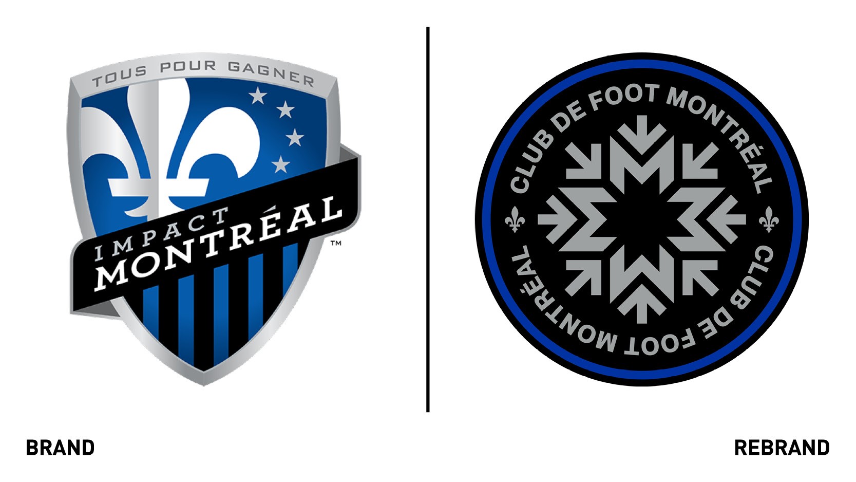
Montreal football club, formerly known as the Impact has rebranded to Club de Foot Montreal or CF Montreal, while also launching a new logo. In the latter, the arrow are a wink to the Montreal metro, which connects all the city’s citizens, and the city’s rich design history, while also symbolising that everyone who comest to Montreal is welcome. Those same arrows, together with the ‘m’s form a snowflake, which represents the idea of intercultural. The blue border circling the log shield symbolises the water around the island. While no snowflake is identical, they can all come together as a blizzard and a force of nature. The design itself was inspired by icons that propelled Montreal to be recognised as a true global city and open to accepting the world. The logo typeface, made by Pangram Pangram, pairs a grotesque that is reminiscent of the Montreal olympics, early metro signage and grid-based design theory, with a clean-cut monospaced typeface that was inspired by industrial design and architecture, encapsulating the aesthetic spirit of the city. The strapline ‘Droit devant,’ has a double meaning: on the field, it means all the team’s efforts are focused on the other goal, while away from the feel, it symbolises innovation and forward thinking.
Cornovii Homes
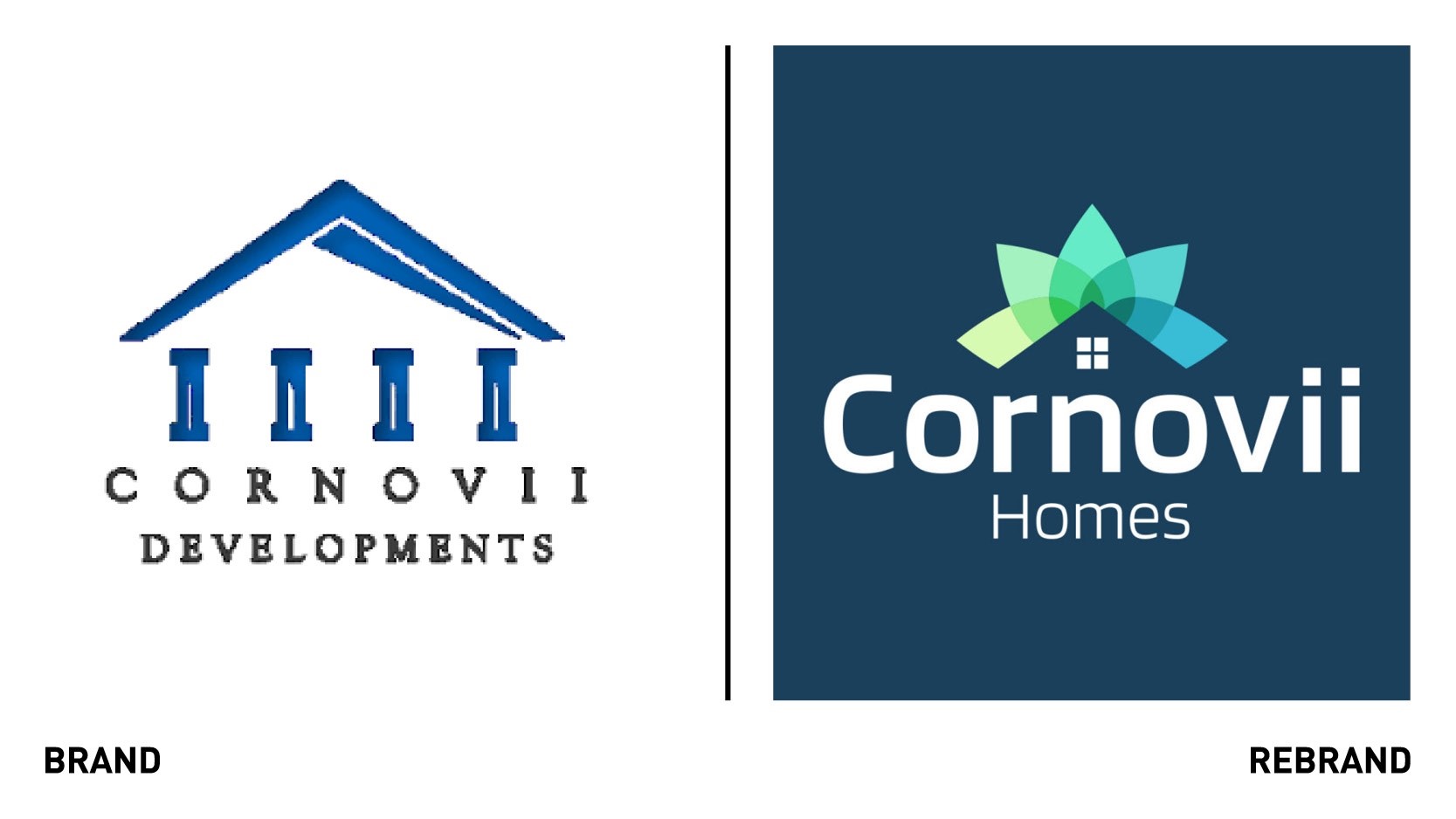
Shropshire Council’s wholly-owned local housing company Cornovii Developments, formed to address unmet housing need and generate income for the council, worked with Reech Media launched a new brand in light of announcing the creation of new developments in the heart of Shropshire, comprising of two to four bedroom homes. The name has changed from Cornovii Developments to Cornovii Homes, always maintaining the central symbol of Cornovii, a name which was inspired by Celtic people of the Iron Age and Roman Britain who lived in Shropshire. The new logo adopts a completely different colour palette, ranging from ranges of blue to green, and a bolder typeface, in white on a blue background that renders it instantly recognisable. The graphic illustrations sitting atop of the four squares in the logo resemble the two dimensional image of a house, already present in the old logo but this time modernised, simplified and made more colorful. The new strapline ‘Designed for life. Built in Shropshire,’ which will dominate the upcoming website, pays homage to Shropshire, and ties back to Cornovii’s mission of ‘making Shropshire a great place to live, building homes in which people can thrive and from which they can enjoy the many benefits of the area.’
Hampers.com
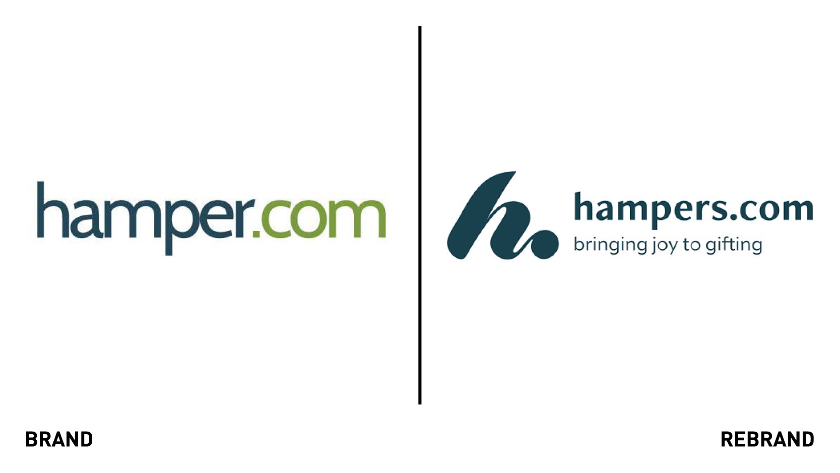
Hampers.com, one of the UK’s largest hamper companies, launched a rebrand that would help the company build on the emotional aspect of gifting within the hamper industry, allowing it to focus more on the customer journey and build an emotional connection between the buyer and the end user. The new brand encompasses the feeling of bringing joy and togetherness. hamper.com became hampers.com, as a result of an extensive market research that found UK consumers were more likely to search for ‘hampers’ than the singular version, as well as helping to eocnpmpass the brand’s wide range of luxury food and drink gift boxes available. The brand worked design studio Vitamin London to create a new logo, a hand-written, soft calligraphic-stroke style ‘H’ which allows for flexibility in application. Vitamin London also created supporting illustrations and a vibrant colour palette which adapts with the season and to the products, personalising the customer’s experience.
“I knew the business had a proud heritage and a loyal customer base, but I felt it needed to be reinvigorated. The buyout, combined with the Covid-driven shift towards ecommerce meant the time was right for a rebrand. It has breathed energy and purpose into our business, and has provided a rallying cry for our team as we drive the business forwards,” says managing director at hampers.com, Patrick Gore.
Hercules Inc
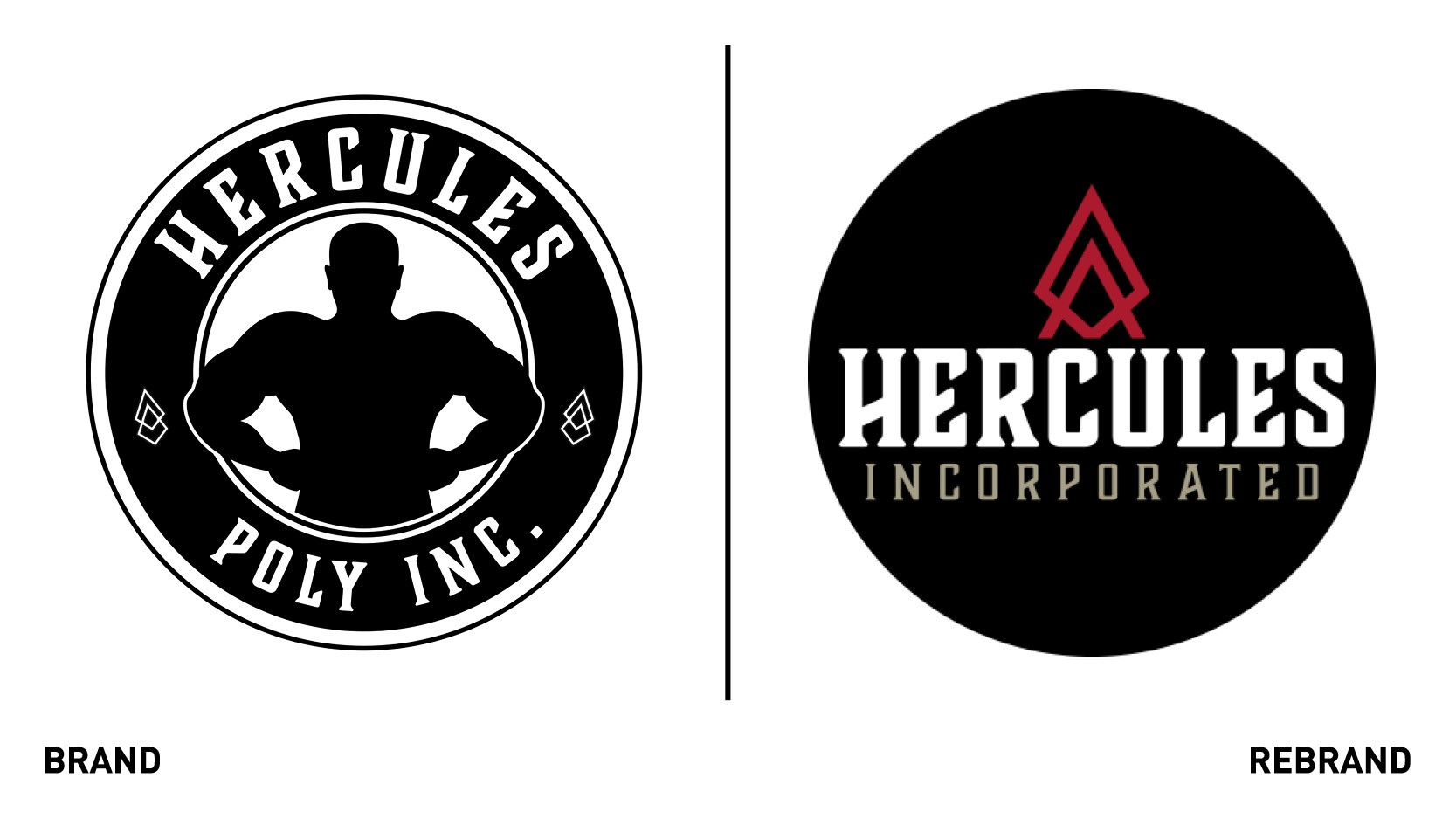
Hercules Incorporated, formerly known as Hercules Poly incorporated, developed a new logo and visual identity to make room for future growth and reflect its evolution beyond the poly bag to gloves, safety products and dog parks. The simplified and modernised new brand reflects the need to celebrate both the company’s past successes and vision for the future. Under the Hercules Inc. rebranding all subsidiaries will rebrand according to the Hercules Inc. branding and function as divisions rather than separate entities, resulting in a cohesive brand inclusive of all products backed by a strong central visual identity. The new brand identity, which will culminate with a new website, encompasses the principles and solution-driven approach that have characterised Hercules Inc and results in a strong central vision.
"Over the years, design tastes and trends change. The new brand identity is current and modern, and it continues to reflect the core spirit of our organization. As a market leader, our brand evolution and future innovations will always be centered around our relentless drive to see our clients succeed,” says Scott Gardner, Hercules Inc.’s director of marketing.
My Global Home
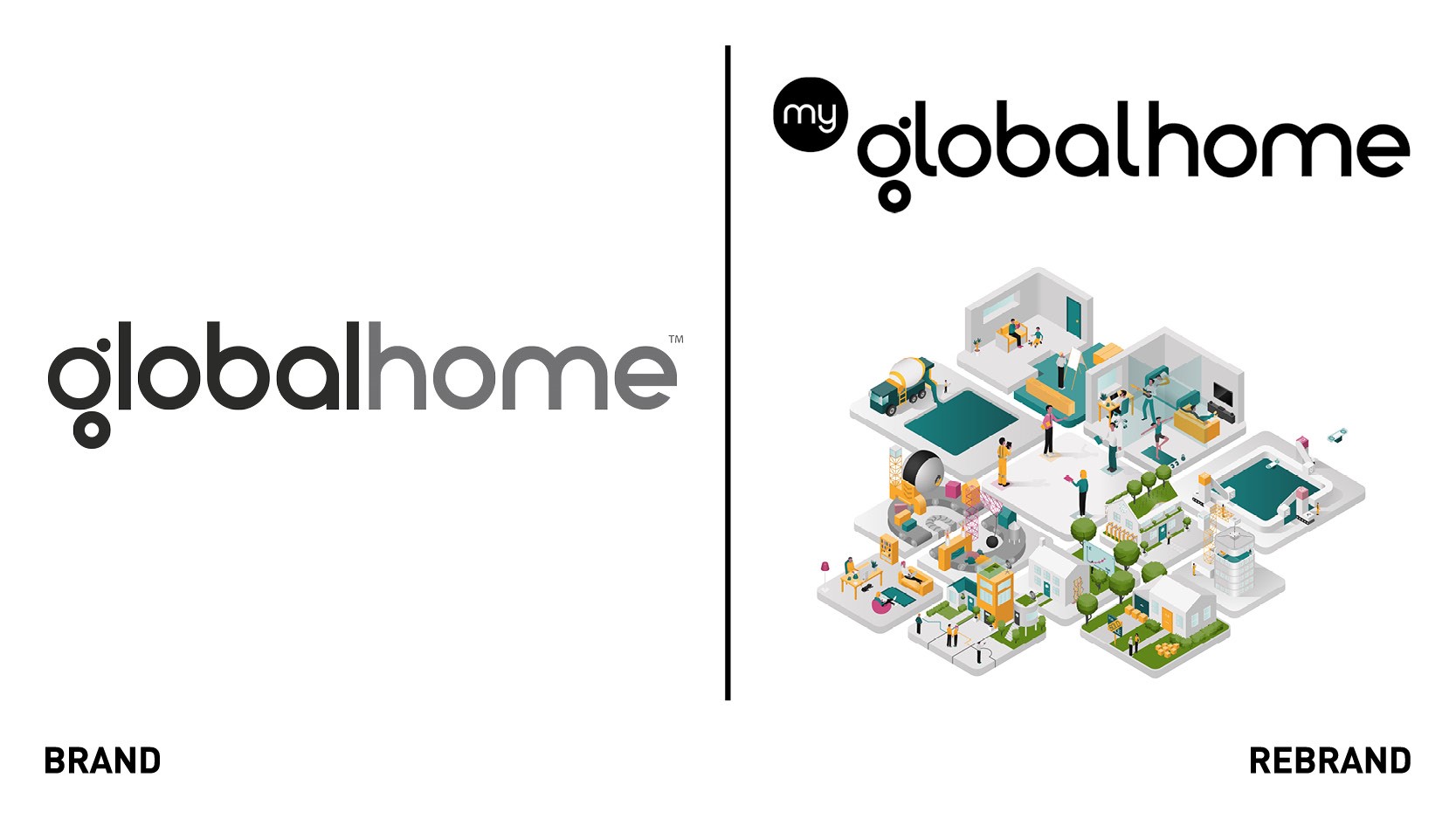
Design and innovation consultancy Recipe Design worked with MyGlobalHome, a collective of experts driving partnerships between innovators in the living space, to deliver a new vision for the ‘future of living,’ including a new brand identity and strategic positioning for the company, and a refreshed website. The resulting brand identity and strategic positioning delivered by Recipe Design centres around a single vision for the future in which homes look after people, not the other way around. The brand’s tone of voice and visual assets work to convey a sense of collaboration and approachability. Short animated vignettes of smart home scenarios were created to show how the complex can be made simple; in the illustrations, isometric tiles conveying various elements- from a kitchen to a living space- move together to reveal a bold new vision for ‘living.’
“MyGlobalHome recognised how a meaning centred approach would help them avoid deployment of technology for technology’s sake; we immediately connected over the opportunity to imagine a new ‘future of living’ that would avoid gimmicks and overcome fragmented thinking to deliver holistically considered solutions,” says Simon Browning, chief operating officer at Recipe Design.
Ninjas in Pyjamas
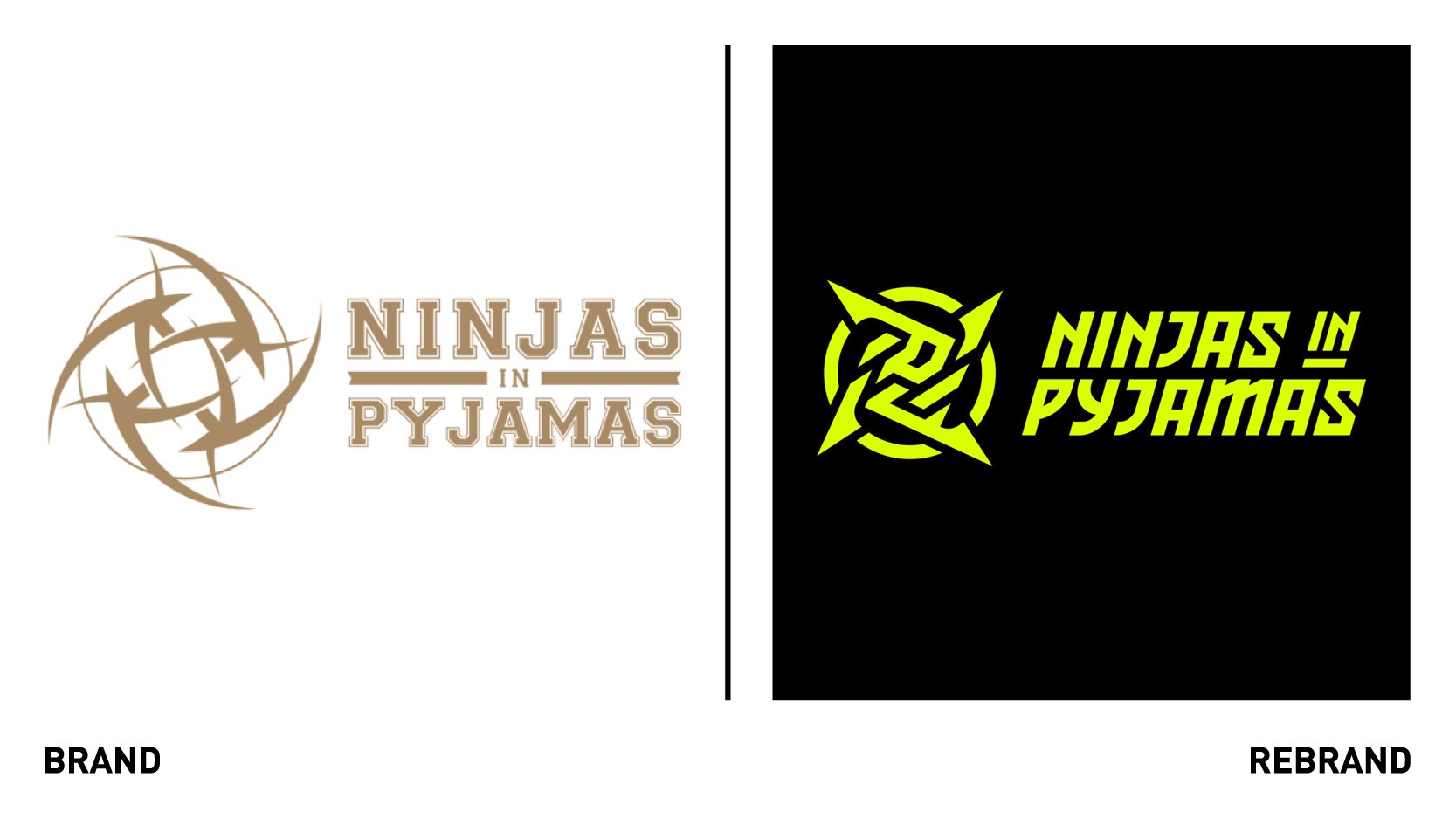
Sweden-based gaming organisation Ninjas in Pyjamas (NIP) introduced a new identity, the first since its inception over two decades ago, to further continue the brand’s purpose of creating transformational experiences that entertain, inspire and connect fans across the world. The redesign, led by brand consultancy Motto, was inspired by the Ninja and brings a total makeover that affected the entire visual identity and organisation’s culture, it consolidated a fragmented brand, giving it a powerful voice and identity. The rebrand sees the introduction of new narratives and storylines inspired by traditional Japanese emblems and Katakana – a Japanese writing character – leaning into the organisation’s purpose and ambition. The logo has been modernised, now including the the ninja weapon Shuriken and the old Japanese word for Nin, which is the beginning of Ninja and signifies ‘applying ego and heart to the edge of the sword.’ The revived colour palette, which sees the original colours of black, white and gold replaced with neon yellow, black and grey, reinforces the idea of NIP as a futuristic and mysterious brand. The rebrand, which will drive increase visibility and industry growth, can be brought straight to fans via a new digital platform and new collections of clothing and other merch.
Sparkol
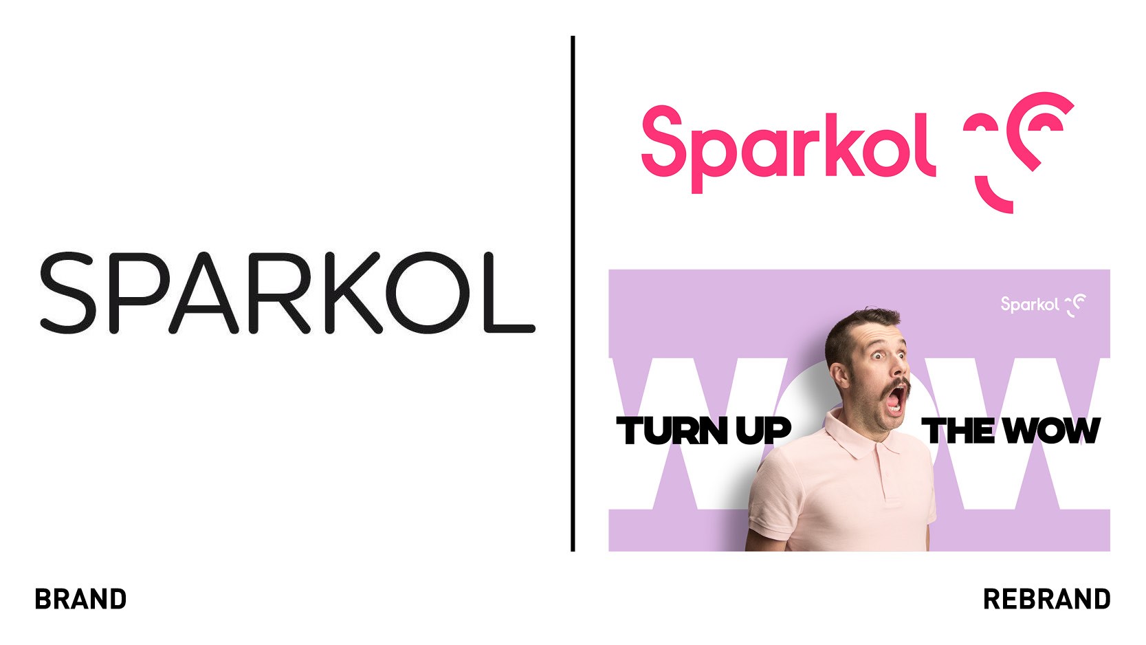
Bristol-based technology business Sparkol, which provides customers with innovative software and video tools to help create inspire presentations, worked with creative agency B&B Studio to launch a new brand positioning and identity. The idea was to increase its marketing effectiveness while retaining the established product brands as part of its portfolio. To capture the spirit of the brand and capability of its products, B&B Studio developed expressive imagery and a bold typeface and colour palette. With Sparkol products already used in over 160 countries by educators and comms professionals, the rebrand further strengthens the brand’s position as it targets a wider audience. The new identity and tone of voice is representative of Sparkol’s uniqueness, and how its innovative approach helps users achieve surprise and wonder.
“The new logo design captures the reaction to Sparkol’s products in a clever graphical way,” says senior designer at B&B Studio, Nathan Crosby.


