#TransformTuesday: 19 January

Here is this week's selection of rebrands from around the world. For more from #TransformTuesday, follow @Transformsays on Twitter.
Bulk

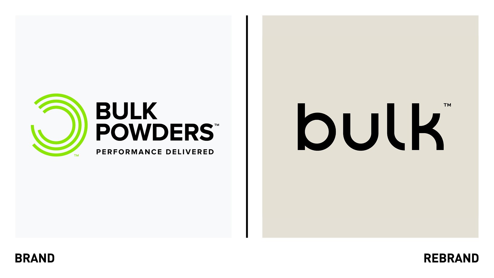
Sports nutrition company bulkTM, previously known as Bulk Powders, worked with Leeds-based creative agency Robot Food to rebrand, with the aim of breaking convention in the crowded sports nutrition category and create a more inclusive brand experience for all. To elevate bulkTM from perceived commodity to an aspirational lifestyle brand, Robot Food broke away from the confines of the category, creating clean, confident and consistent identity inspired by lifestyle fashion and contemporary health and beauty brands. The new identity centred around a common denominator between existing and potential customers, the fitness journey and the way bulkTM can help one achieve it. The lowercase wordmark, designed in-house, softens the connotation of the word bulk, while the additional wordmark, a bespoke Bulk Sans, add an ownable and technical edge to the identity and act as the lead choice for brand messaging to bolster a newly confident tone of voice. To achieve the ‘less is more’ approach while allowing for enough design freedom to clearly differentiate the ranges, Robot Food created different circular patterns, inspired by nutritional charts. Each of these is unique to a range, while the bulkTM PR has tactile print finished and textures which point to its premium positioning.
“With a complete change in appearance, comes a renewed energy and focus on creating a more inclusive experience for our customers, as well as a more sustainable brand for our planet. Health is more than protein shakes and vitamins, so we needed to take a more holistic approach – enabling our customers feel good and live well,” says bulkTM co-founder, Elliot Dawes.
Corint Media

European corporation of media enterprises offering licences for digital publication use VG Media has rebranded as Corint Media, in a bid to continue to evolve its internationalisation strategy for the private media sector. With a new corporate identity, brand tagline ‘Licensing Intellectual Property’ and digital identity, Cortint Media will take on a more European branding with a contemporary, consistent company design. The new name is inspired by the ancient city of Corinth, one of the pillars of European democracy and history, and is also an abbreviation for the company’s core activities: copyright international media.
“Both references in the Corint brand celebrate the fact that the creation, protection and implementation of intellectual property are strong pillars of any democratic society. With the means at our disposal, we will continue striving to keep private content affordable and to enforce applicable laws against all corporations, including digital ones,” says CEO Markus Runde.
Castello del Poggio

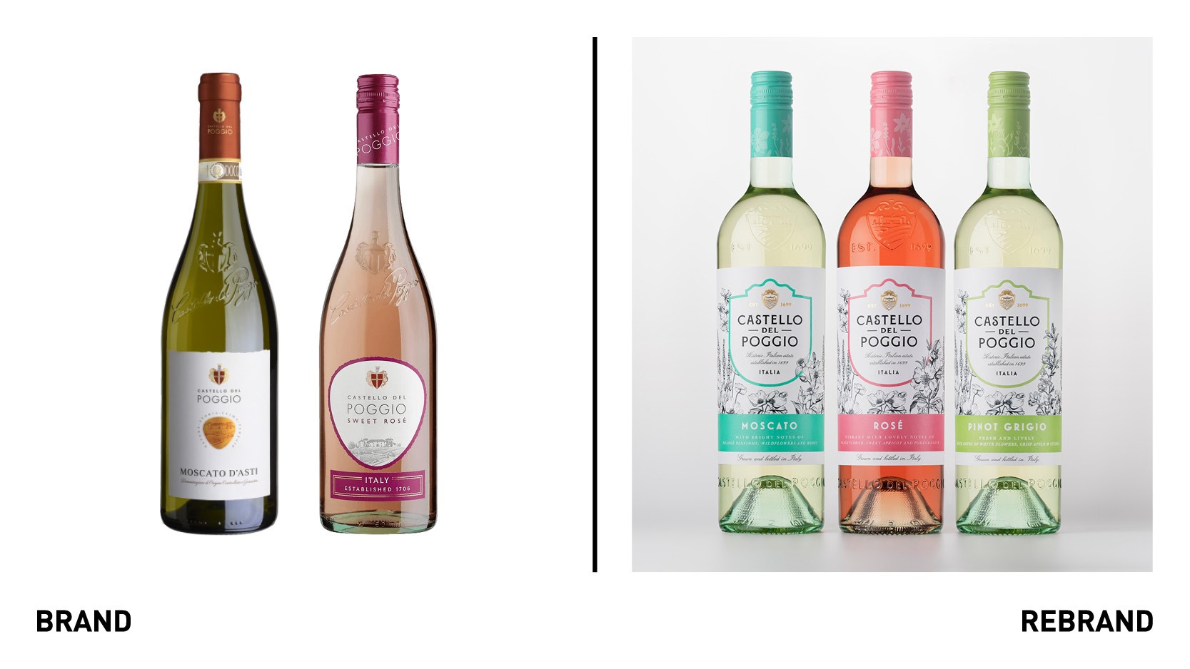
Italian wine brand Castello del Poggio worked with drinks design specialist Denomination to develop a rebrand that would elevate its position in the US market and compete with challenger brands from within the sweet wine and Italian sectors. Zonin1821, the largest private vine-growing and winemaking company in Italy and owner of Castello del Poggio, approached Denomination because it wanted to address the new challenges it faces in the North American region and reassert itself as a market leader. To solve this challenge, Denomination focused on Castello del Poggio’s Italian heritage and driven home the quality of wines with appropriate design cues. The design solution is therefore a balance of wine cues and Italian style, with the brand mark and crest contained within a shield and the crest being redrawn to hero the ‘castello,’ the castle, which appears embossed on the shoulder of the bottle, enhancing its Italian credentials. Black and white illustrations of flowers, which represent the flavour profiles of each of the wines, appear on the labels and capsules, while the colour palette has been adjusted to achieve shelf stand-out.
“Denomination has celebrated what Castello del Poggio really is – a unique Italian brand worthy of note – and has given us the tools to communicate that to our target consumers. It’s also a flexible design solution. We’ve been able to introduce new variants, which fit perfectly into the portfolio. And the Moscato d’Asti treatment demonstrates how the range can be upscaled convincingly also,” VP and seventh generation of this family company, Francesco Zonin, says.
Gray, Gray & Gray

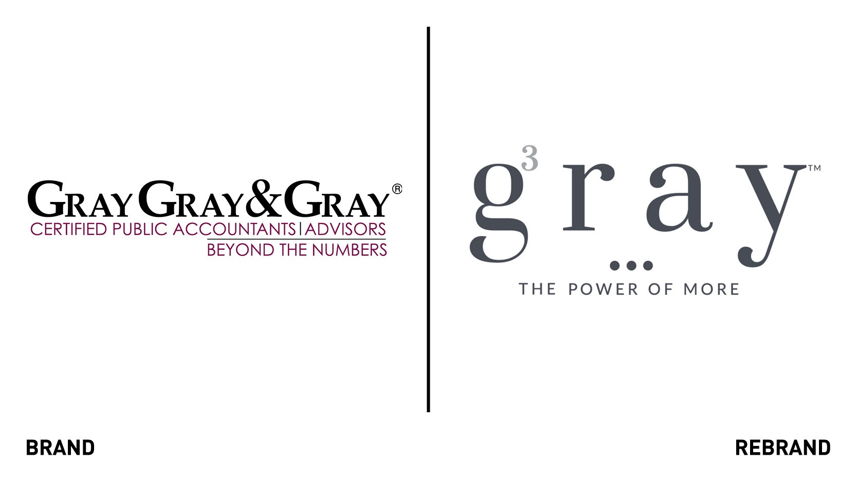
Massachusetts-based tax, accounting and business advisory girm Gray, Gray & Gray has undergone a major rebrand in response to a growing client need for consulting and business advisory services in an increasingly complex business environment. The new identity is centred around the ‘Power of more,’ a stratagem that synchronizes consulting, business advisory, strategic planning, accounting and more. The stratagem is designed to help clients find ways to add value, speed decision making and drive success. The rebrand sees the reinterpretations of the firm’s name into a single, elegant word -gray. The new logo also incorporates a tribute to the firm’s three founding brothers in the form of an exponential number 3 integrated into the letter ‘g.’ The new logo will appear on all corporate collateral, signage, the refreshed website, and social media. The logo is designed to be flexible, allowing all of the firm’s internal business units to display their own version of it. The rebrand also includes a new corporate colour palette.
“We are very excited about this new chapter in our firm’s history. The rebrand further exemplifies our commitment to providing an exceptional level of personal and professional service to our clients,” says leading partner at Gray, Gray & Gray, James DeLeo.
HeartKids

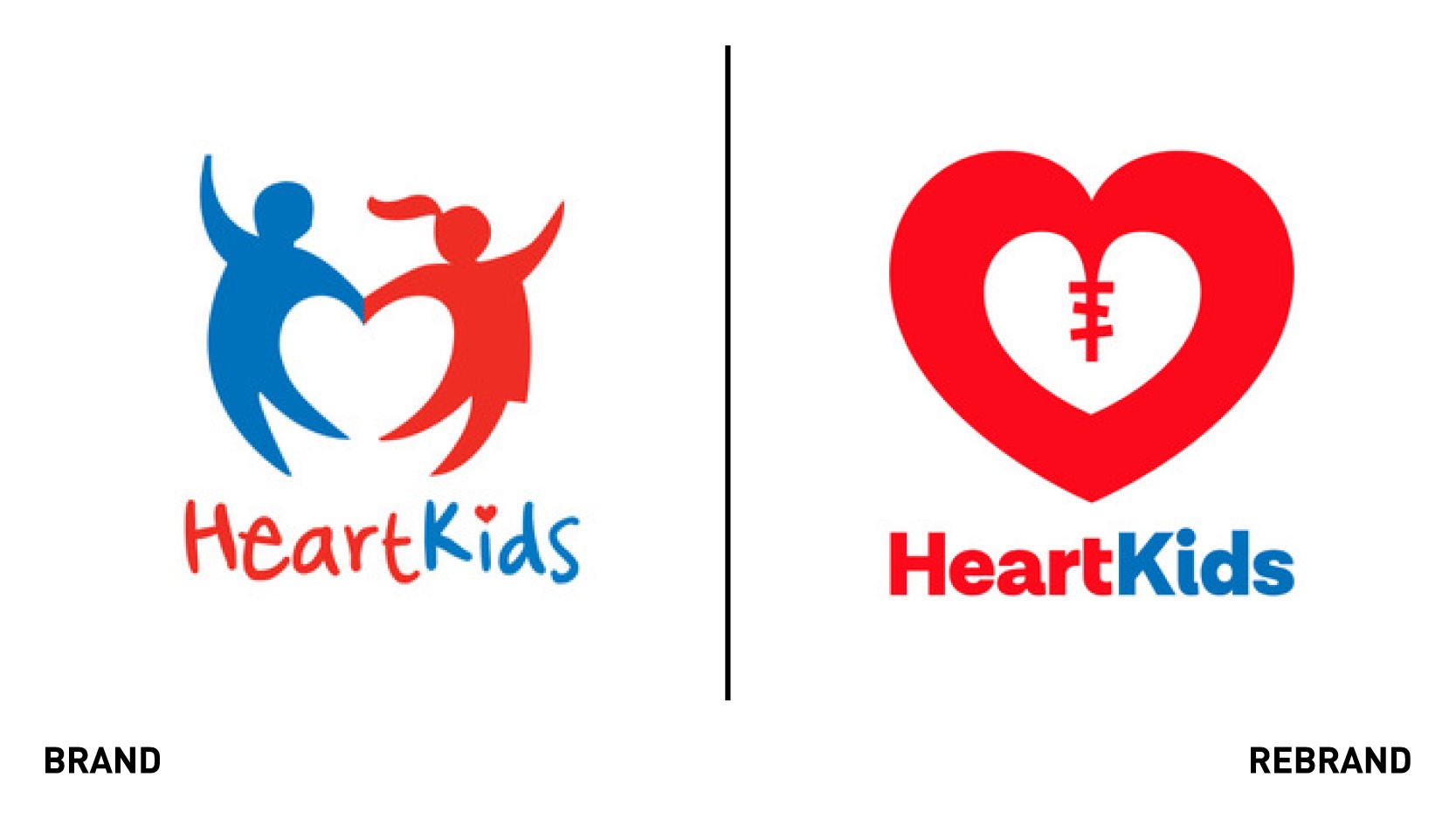
Australian congenital heart disease profit-for-purpose charity HeartKids, which aims to enhance the conditions’ profile as a health priority and encourage people to act and donate, has developed a new brand strategy, identity and logo created by international brand and design agency Hulsbosch. The new logo is framed by the concept of ‘big hearts helping little hearts,’ which is seen as a valuable connection to the community and HeartKids, and its programmes to help families impacted by the disease. The new identity seeks to fully reflect the work the charity delivers to all major Australian children’s hospitals and in the community. The heart-shaped symbol and illustrated surgical mark/scar is the core graphical element of the identity, better representing those affected by the disease and visually giving definition to the service of the charity. The vibrant colour palette of bright reds and warm blues generates support for the needs of people going through the journey with the disease and expresses optimism for the organisation.


