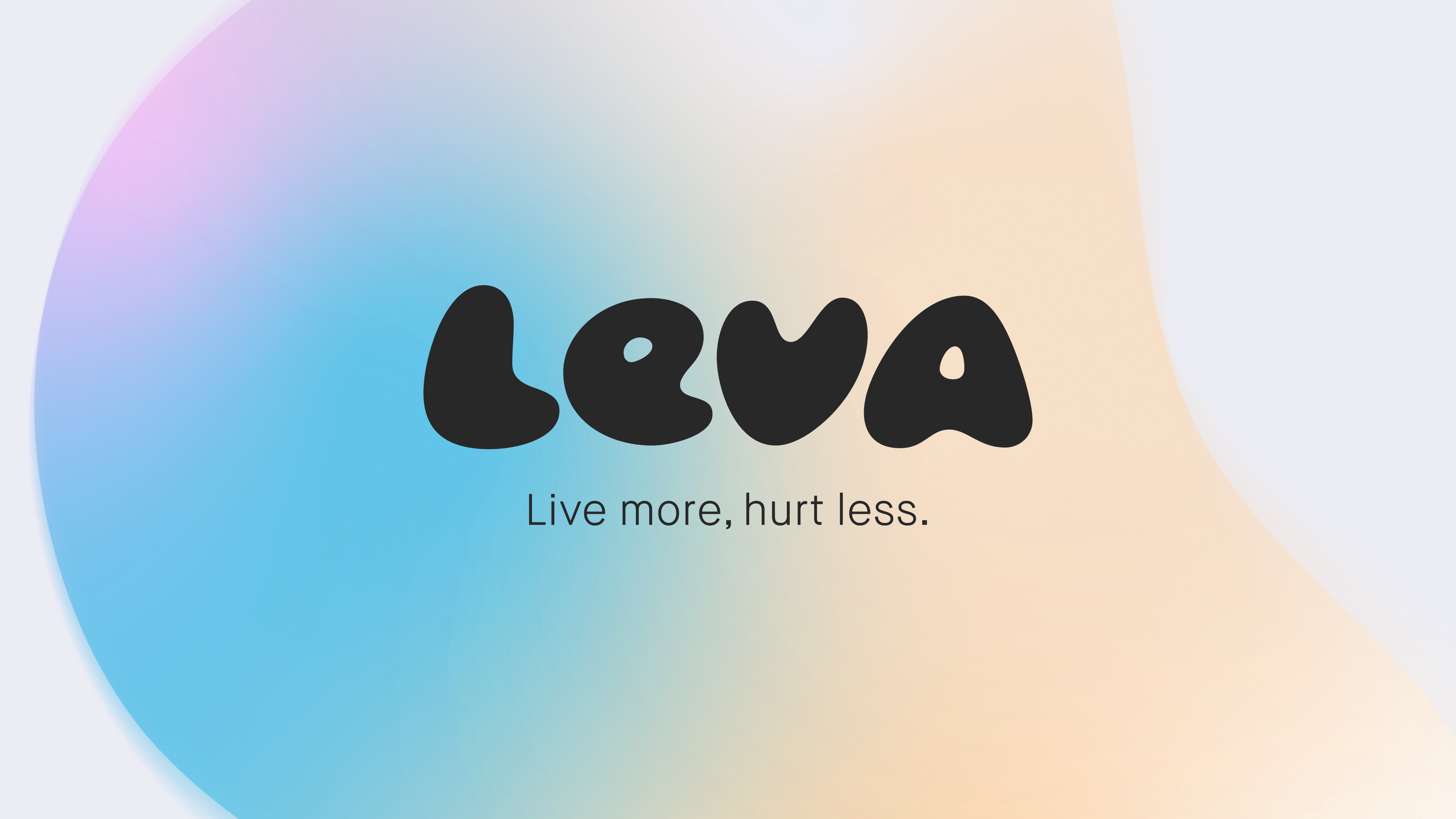
That Thing designs identity for new online clinic brand
That Thing designed a new brand identity and positioning for Leva, a new online clinic that works with people who suffer from chronic pain. Leva aims to counteract the misunderstandings around chronic pain with accessible help and realistic strategies that can be implemented at home.
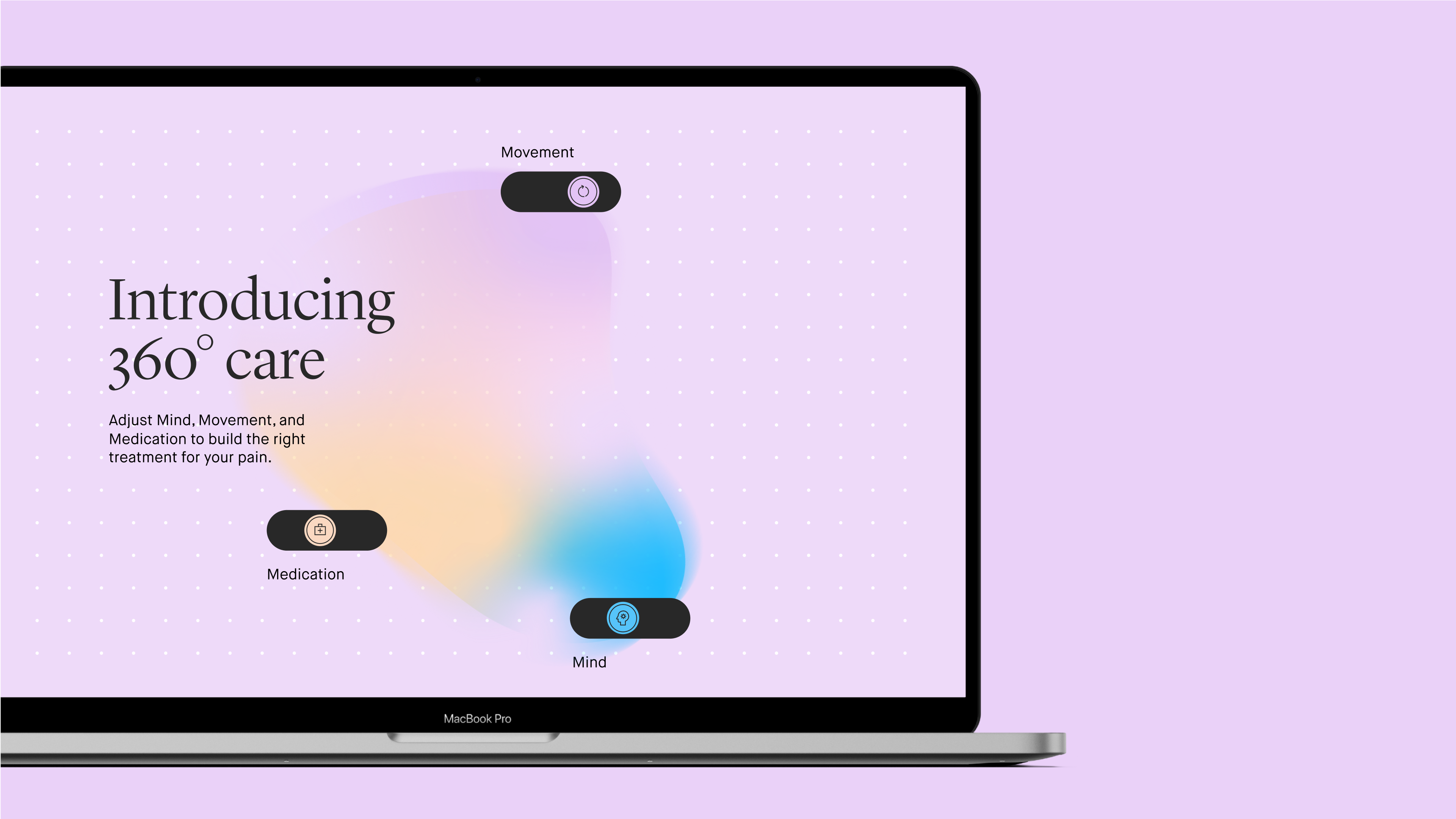
The brand was inspired by Leva’s holistic approach. That Thing named the product ‘360 care,’ and broke down the clinic’s treatment into ‘mind, movement, meds.’ The trio aims to act as a tool for medical teams to document individually tailored care plans. The triangular approach inspired the logo and every patient’s personal medical, psychological and physio therapeutical programme.
“Leva presented a great challenge. We knew it couldn’t feel too, soft, but it couldn’t feel too clinical either. The result walks the line and is helping Leva to reach an audience that needs them. It was never about promising a miracle cure, but helping people to reshape their relationship with pain and live with it in a more peaceful way. In many ways, the brand needed to feel like the first step on that journey,” says Joe Weir, co-founder at That Thing.
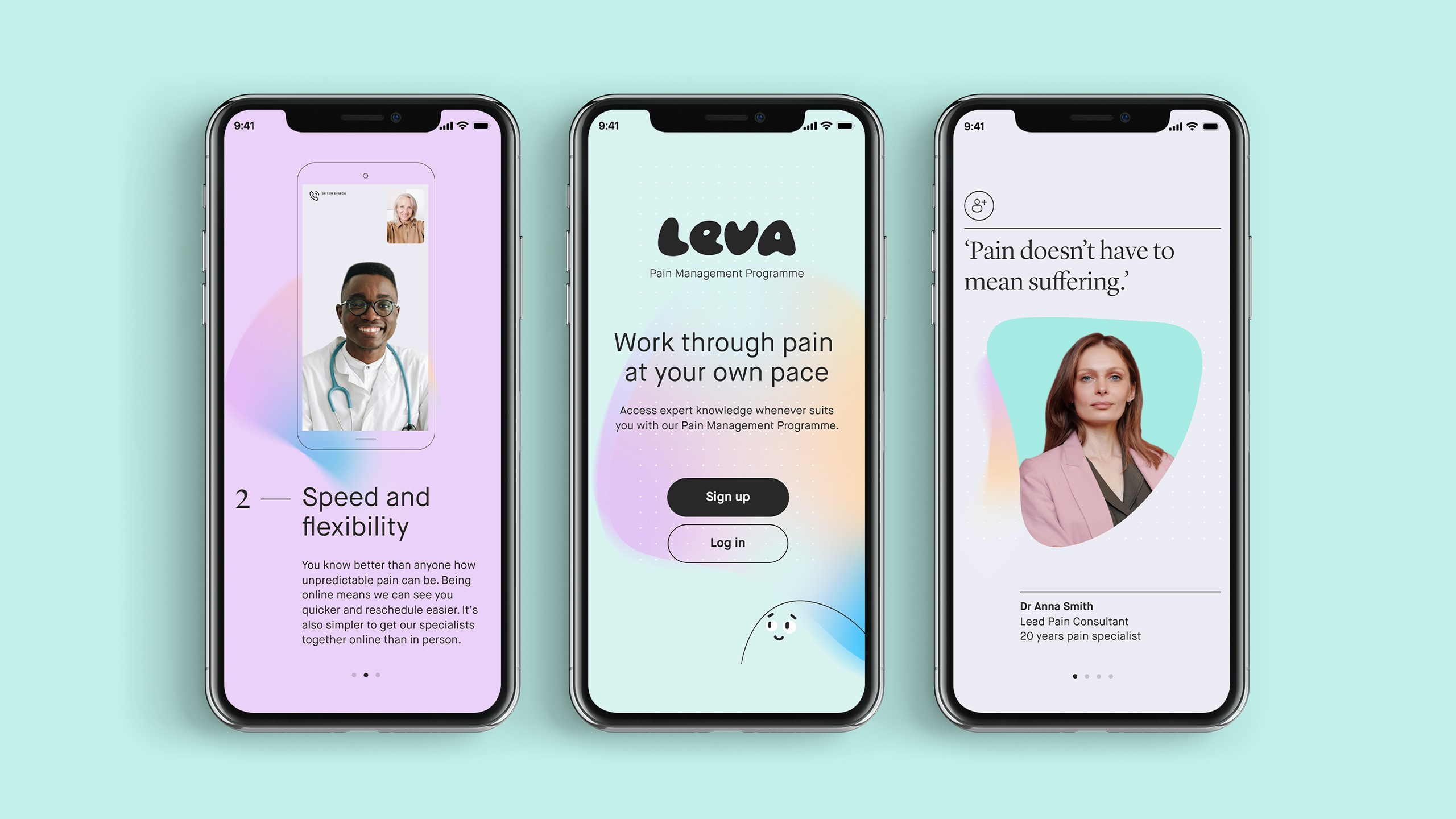
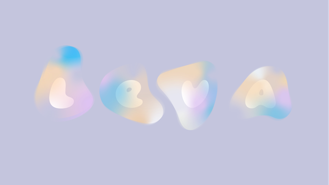
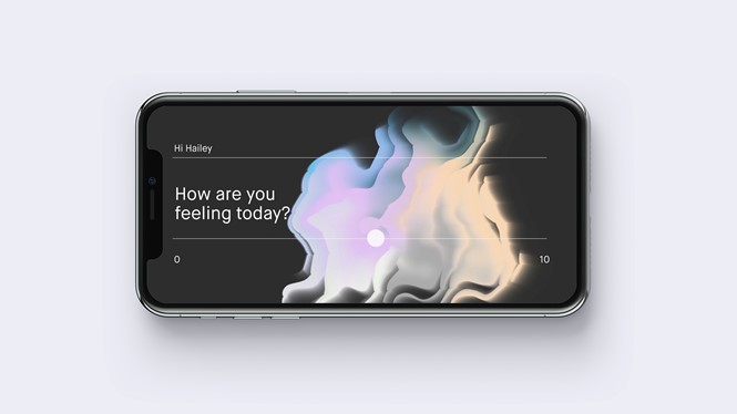
To bring Leva’s soft and caring approach to life, the agency used warm gradients and diffused auras, which can be used as background textures, holding devices for photography or explainer infographics. Leva’s scientific and clinical expertise, on the other hand, is represents by a structural dot pattern, a suit of icons and a hard-edged typeface.
That Thing also worked with Leva to create the brand’s UX and content strategy, which was designed with the needs of chronic pain patients in mind, from clear signage and guidance to empathetic language.
To introduce the still-unknown brand to the market, That Thing developed the clear message ‘Leva works with pain,’ creating stylised and spiky animations which were rooted in factual messaging about the ways Leva tackles pain. To help evoke the feeling of pain, the agency reversed Leva’s design language, designing a moody dark mode.