Swiss beer brand evolves feeling of community
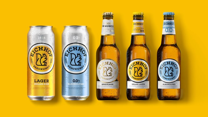
Design and branding agency Pearlfisher redesigned Heineken-owned Swiss beer brand Eichhof to evolve the brand, while driving consistency across Eichhof’s portfolio to keep the feeling of community and locality.
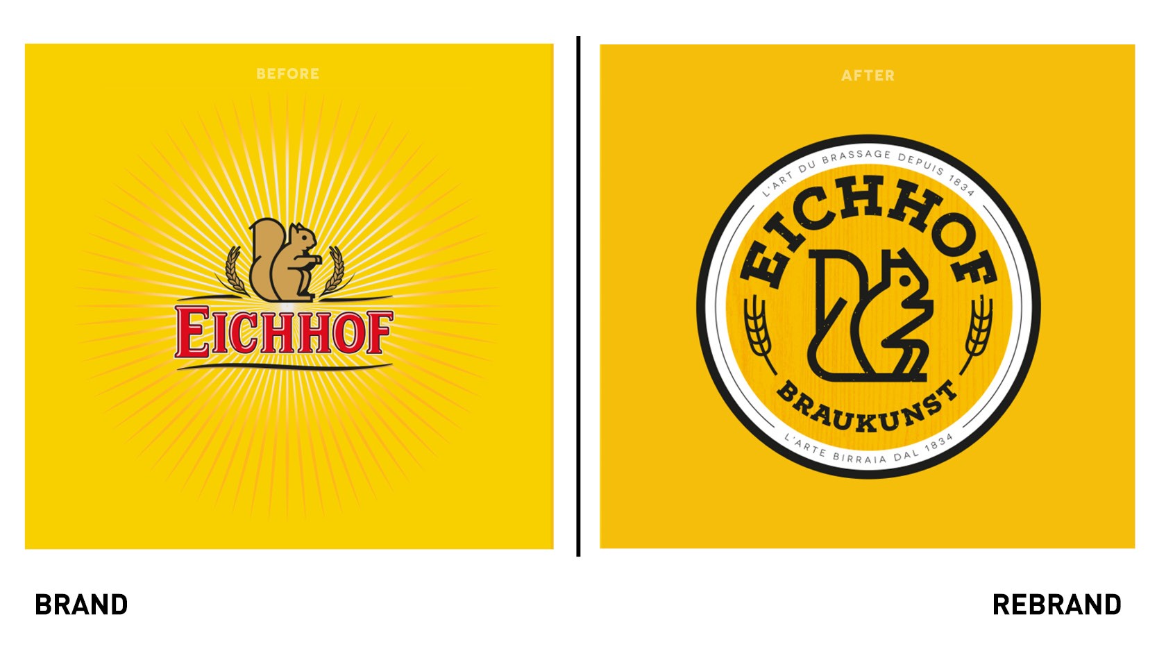
Eichhof’s current aesthetic was inconsistent and with little distinction across the portfolio and on shelf. Pearlfisher took inspiration from the brand’s name, how it evokes a sense of heritage and provenance. The brand positioning, ‘Neue Traditionen’ (New Tradition), introduces a fresh narrative that portrays both the history and innovation of Eichhof.
The label carries a modernised version of the iconic Eichhof squirrel and keeps brand consistency by recreating the word mark to match the styling of the squirrel. The brand retains its recognisable bright yellow with the label boasting details of the beer’s founder and founding date, cementing a well-established tradition and visually pushing the brand forward into a modern image, explains Sam Lachlan, design director at Pearlfisher.
“Across six variants, the black and white illustrations complemented by hits of colour include a windswept looking Barbara’ and startled ‘Pony.’ Each drawing represents the rich history and unique stories connected to the Eichhof brewery, its brewers, and the beer for people to read whilst enjoying the drink,” adds Lachlan.
“Eichhof is a loved and highly-respected beer with a proud past and its sights set on a bold future through continued experimentation with new brews. Pearlfisher’s design now pulls all these elements together in a cohesive identity and design system that connects the community of beers across the portfolio,” says Stefan Steiner, brand manager at Heineken.


