Superunion designs new brand purpose and identity for Shelter
Housing charity Shelter worked with global brand agency Superunion to create a new brand identity, inspired by the spirit of activism on which the charity was founded on in the 1960s.
The new brand identity and strapline ‘Home is everything’ was designed to positively disrupt and represent the determination of Shelter to fight for everyone’s right to a safe home.
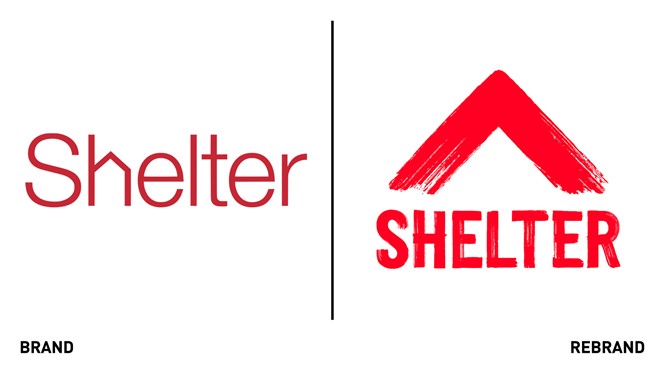
Using the visual language of protest, the new logo- visualised by a red arrow and created from red brush strokes- combines the shape of a roof with a positive upward arrow: a symbol that aims to invite participation and demands change.
“Everyone has the right to a safe home and the new Shelter brand will make sure that everyone knows this. We want to inspire people to join the fight and let anyone facing housing problems know that Shelter is on their side, protecting their human right to a safe home,” says Adrian Burton, creative partner at Superunion.
“The new symbol embodies 50 years of campaigning and a never-give-up attitude. It’s a symbol that people can recreate, make at home, share and ultimately , take the streets,” he adds.
The charity’s purpose was developed by creative transformation company WPP’s the sustainability practice at Ogilvy to equip the organisation with the framework to rebuild the movement for a safe home, redefining what Shelter stands for and creating the foundations for the new identity.
With the new brand identity, Shelter aims to call on the public to join its ‘Fight for Home’ and stand up against the injustice in Britains housing system. The idea behind the work is to move away from generic charity advertising tropes and to install a sense of urgency and fight.


