ROOK/NYC designs new packaging for Alicia’s Spice Co
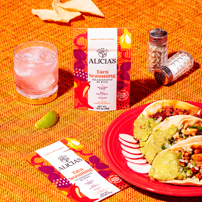
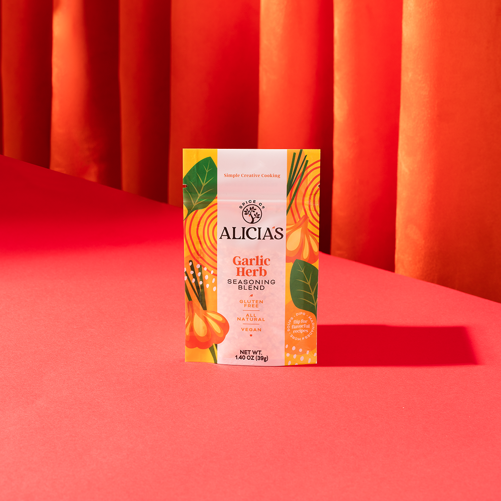
Independent creative agency, ROOK/NYC, developed a new packaging design for Alicia’s Spice Co, a natural and gluten-free spice company that aims to celebrate healthy ingredients and simple cooking.
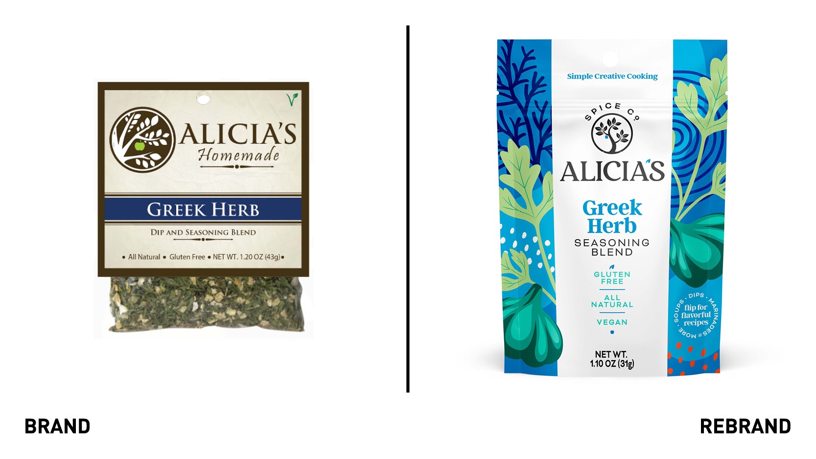
ROOK/NYC wanted to bring the traditionally functional and dull spice aisle a flavourful, colourful, and vibrant feel. To translate this to the packaging design, ROOK/NYC used bright, bold colours that reflect the aspects of cooking. This breathed new life into the brand whilst paying homage to the quality ingredients at the heart of the spice recipes.
“Our goal was to inject creativity into what is an otherwise very functional shelf set. Spices, and seasonings are fun and bring out a creative element in cooking, and the packaging is supposed to evoke the joyful feeling of cooking together with family and friend,” says Mark Christou, founder and creative partner at ROOK/NYC.
The new illustrations on pack denote the real ingredients that make up Alicia's spice recipes. The style aims to create a vision of the ingredients that then translates across stock keeping units (SKUs). For example, the use of the garlic bulb illustration in yellow, blue, and red (across multiple SKUs), is still recognisable as a classic garlic bulb.
The agency didn’t apply radical changes to the logo to maintain familiarity and recognisability. However, it developed a more modern serif typeface for the wordmark and simplified the tree and apple icons to give the brand a more contemporary feel. ROOK/NYC also designed the apple icon and the apostrophe to match the SKU colour, with the aim of adding a new depth to the identity.