Protective Life Corporation introduces new brand identity

Life insurance provider, Protective Life Corporation (Protective), a wholly owned U.S. subsidiary of Dai-ichi Life Holdings, worked with global creative consultancy, Lippincott, to launch a new brand identity. The rebrand aims to exemplify the company’s 114-year commitment of putting people first and striving to do more for its customers, business partners and employees.
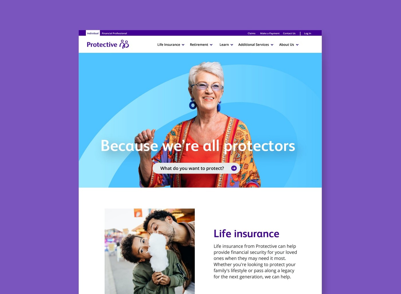
Lippincott was tasked with creating a more emotive and powerful brand story for Protective and break through in an industry saturated with well-known competitors. The new brand leverages the potential of Protective’s name and amplifies its purpose, “because we’re all protectors,” asserting the brand’s aspiration to help people achieve a sense of security and protection. This allows its many audiences to see themselves as part of the ‘protective story.’
Rich Bielen, Protective president and CEO, says, “At our core, there is a protector in each of us. At Protective, we have always believed in helping more people achieve a level of protection that makes a real impact on their lives. We’ve been putting people first for more than a century – that will never change. The Protective brand needed to evolve to capitalize on our strengths, amplify who we are today and inspire our future. Our branding positions us as protectors and reflects our unwavering commitment to stand by your side."
Protective’s brand expression needed to stand out in a saturated category that mostly follows convention, with bolder, more distinctive design that emphasises humanity and connection.
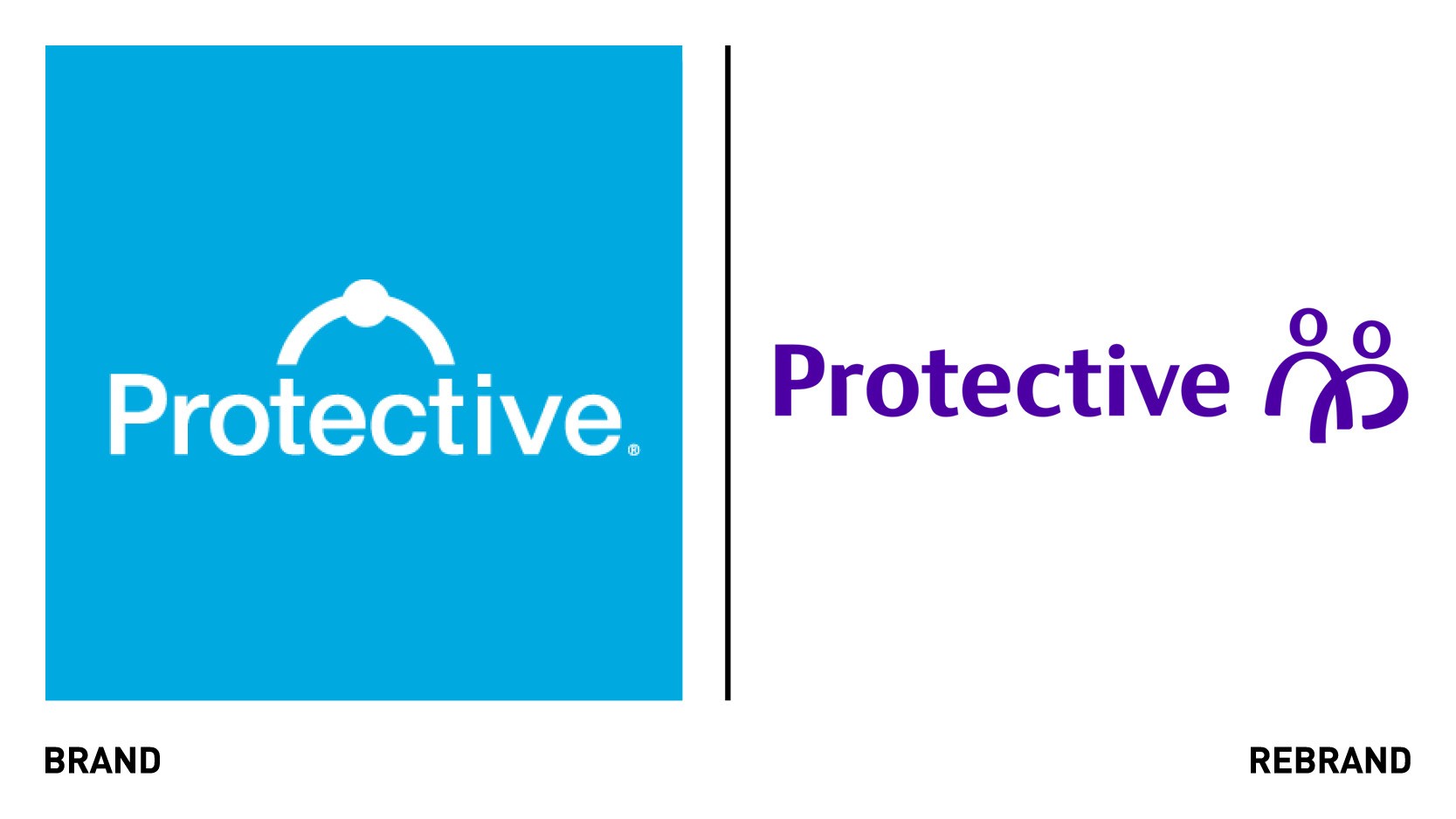
Refined values, a new story and a bold visual identity aim to reflect Protective’s purpose and conviction in helping more people attain a sense of security throughout their lives. The new logo seeks to evoke a human story of the protection felt when someone is by another’s side, whether a family member, mentor or friend. The colour palette, based around the colour puple, which combines the stability of blue and the energy of red, was chosen to set the brand apart from competitor and inject it with personality. Along with a brand voice that transforms all communications from a product mindset to a protector mindset, the entire expression aims to demonstrate that with drive and heart, Protective makes the most of every opportunity to help and protect people.
“Protective’s new brand will drive further growth by helping us better connect with employees, customers, partners and the community through a people-centric lens. Protective has embraced change and thrived through many challenges during its history. Over the past year, we have demonstrated our protective spirit through adaptability, resilience and ingenuity, and we have come together like never before. We knew this was the right time to build on our strengths in a way that would accelerate our momentum for the next 100 years and ultimately empower more people to become protectors," Bielen adds.