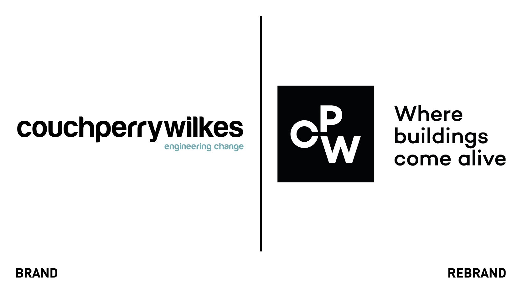
Notepad rebrands global engineering firm
Birmingham-based creative agency, Notepad, designed a new identity for global engineer firm CPW that could convey the company's experience and reputation whilst allowing it to stand out amongst competition.
To get to the heart of the brief, Notepad conducted a full brand validation, beginning with a series of team workshops and customers and staff interviews. By doing so, the agency realised CPW is sustained by three core pillars that needed to be reflected in the new brand: a balance between people, buildings and the environment.
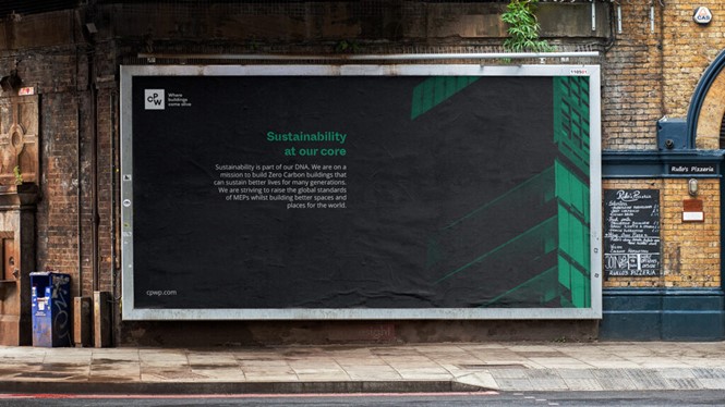
Notepad built the organisation around a new mission, to build zero-carbon buildings that help sustain better lives for many generations. This brand positioning was balanced with COW’s engineers, the people behind the buildings, through the purpose statement ’to minimise the impact buildings have on the world, whilst maximising the enjoyment people get from them.’ The tagline aims to reflect the importance of people, buildings and the environment in CPW’s approach.
After having laid the strategic foundations for the new brand, the team set about designing an identity that could encapsulate the brand’s ambitions. The logo seeks to prioritise the firm's innovative approach to sustainability through a visual cantilever, a representation of the balance it looks to create with the three pillars in each project.
The typeface, Whyte Inktrap, aims to convey the confidence and authority that comes with CPW’s many years of consulting experience, whilst the colour palette makes use of greens and slates to communicate the brand's endorsement to sustainability.


