Nomad creates new identity for Let’s Do This
London-based creative branding agency, Nomad, designed a new positioning and brand identity for outdoor experience brand, Let’s Do This.
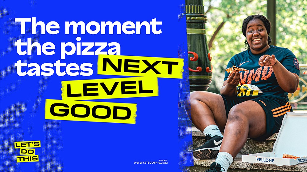
As a discovery and booking platform for events like swims and obstacle races, Let’s Do This aims to break down the barriers surrounding endurance events and celebrate the moments individuals experience when they participate.
“Our ambition together was to take running, cycling and swimming events to the masses. There was and is a great buzz around them as a company and as a group of individuals, but there was also a huge lack of understanding as to what they do,” says Terry Stephens, executive creative director at Nomad.
Although the brand had big ambitions, it “lacked personality and any sense of cohesion,” explains Dom Goodrum, VP of product design at Let's Do This.
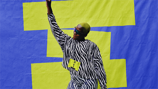
Following a number of workshops led by Nomad with the Let’s Do This team, a new strategy was created around the brand idea ‘Moments Make Us.’ With lockdown coming to an end, and exercise no longer limited to people’s homes or doing laps of a local park, Let’s Do This positions itself to help people move beyond ‘lockdown laps’ and demystify the world of endurance sports. In doing so, it aims to make endurance sports accessible to everyone, whatever level they are at.
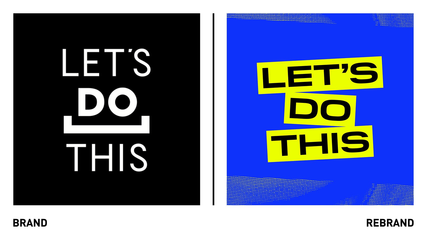
The new logo removes the underscore and instead hones in on a route based on the concept of bringing “moments” to life through an approach dubbed “the voice of the people.”
This approach looks to honour the ideas and rituals of the communities around endurance sports, using designs inspired by the signs people make to support event participants. “The bold hand-written messages, the vibrant coloured card, and tape that holds it altogether. This had an authentic feel that felt right,” says Goodrum.
The new colour palette is centred around a bold ‘Volt Yellow,’ aiming to make the brand distinct and recognisable. For the new tyopograhy, the designers decided to use a combination of sans serif fonts Bossa and Pilat, which seeks to create a modern aesthetic to help the brand deliver key messages across touchpoints.
“The juxtaposition of the two styles had an edge that created an energy when applied across applications,” Goodrum says.