#NewBrandMonday: 8 February
Here are this week's selection of newly launched brands from around the world. For more from #NewBrandMonday, follow @Transformsays on Twitter.

Cannify
Cannify Pharma Gmbh, a fully licensed importer and distributor of medical cannabis products currently operating in Germany, is expanding towards a standalone pharmaceutical manufacturer by developing branded medical cannabis products. Cannify Pharma worked with design and branding studio Alphamark to communicate the positive, joyful aspects of a healthy and the possibilities offered by reducing physical and mental limitations rather than the patient’s clinical picture and healing process. This is encompassed in the brand’s strapline ‘a better health solution.’ Alphamark created a simple and linear yet distinctive visual identity system, based around geometric figures and a black and green colour palette, which resonates with the company’s wider development and is designed to fit in perfect balance between a pharma and a lifestyle brand. The logo is composed of the combination of cannabis flower and cannabis bud, to reference the industry; executed with simple and geometric shapes to stand out as a timeless and iconic symbol.
“The process began by first identifying the company’s DNA, and from there on, the process of developing the visual identity was coherent. After several creative iterations, we can say that they [Alphamark] managed to create a really outstanding and unique creative direction that greatly aligns with the evolution of our business,” says founder of Cannify Pharma Gmbh, Lars Moehring.
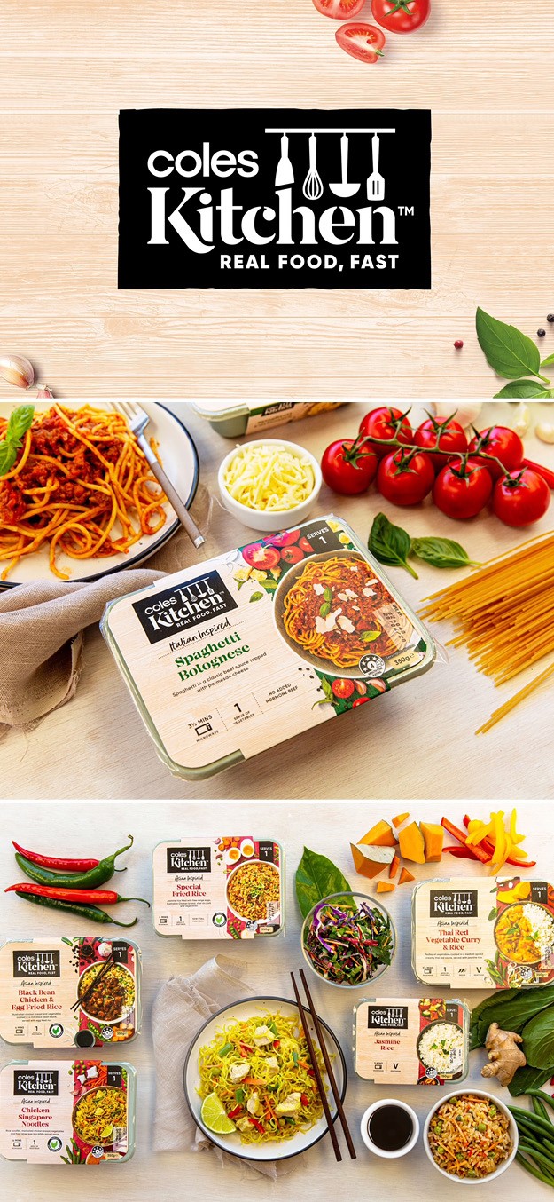
Coles Kitchen
International branding agency Hulsbosch created the brand identity and style guide for a Coles Kitchen, the biggest fresh convenience range for the Australian supermarket chain Coles’. The introduction of the range solidifies Coles’ fresh convenience offer across many different product ranges and addresses the consumer tension between being time poor yet still anting to eat healthy food. The affordable range offers everyday snacks and meals to special dishes for sharing. The challenge was to create a bold brand that could scale across hundreds of products yet never loose its identity. The master logo consists of components including an illustration of common kitchen utensils and an all-inclusive brand word mark. The strapline ‘real food, fast’ represents the idea behind the brand, of a quick to prepare meal-time solution that provides all the quality and taste. The packaging hero is the food, depicted through delicious photography of fresh, raw and colourful ingredients and a finished meal, to drive appetite appeal and help consumers make a quick and simple decision at point of purchase. The new typeface, iconography suites and navigation colour ways distinguish cuisine and product types.
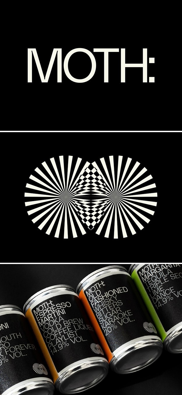
Moth
Creative agency Pentagram developed a brand identity for Moth, a new range of hotel bar quality cocktails in a can. Moth- an abbreviation of mix of total happiness- was launched by cocktail lovers Rob Wallis and Samuel Hunt, who aimed to turn all preconceived ideas about canned drinks on its head. The new brand produces a range of classic cocktails using the highest quality ingredients, carefully sourced rom independent suppliers. Pentagram focused on rejecting the snobbery that often surrounds premium drinks brands, embodying the concept of ‘social alchemy,’ which acts as a generous host encouraging people to share one life’s most simple pleasures: connecting through cocktails and conversation. The brand’s symbol is a graphic reinterpretation of the moth animal, a kind of nocturnal butterfly; its geometric shapes make it appear to flutter. Gradient Type’s Polysans Slim is used in uppercase, complementing the symbol and echoing MOTH’s refreshingly no-nonsense approach and celebrating the integrity of the ingredients. What at first glance looks like a straightforward list of ingredients also reveals an unexpected suggestion such as ‘Talk Forever’ or ‘Dance’ while the colon acts as a brief pause and creates a sense of expectation for the good things to come. ‘Conversation Starters’ are shared on social media and there are playlists to accompany each cocktail, adding to a playful touch to the overall fun brand personality. Each cocktail has a set of representative and bold colours.
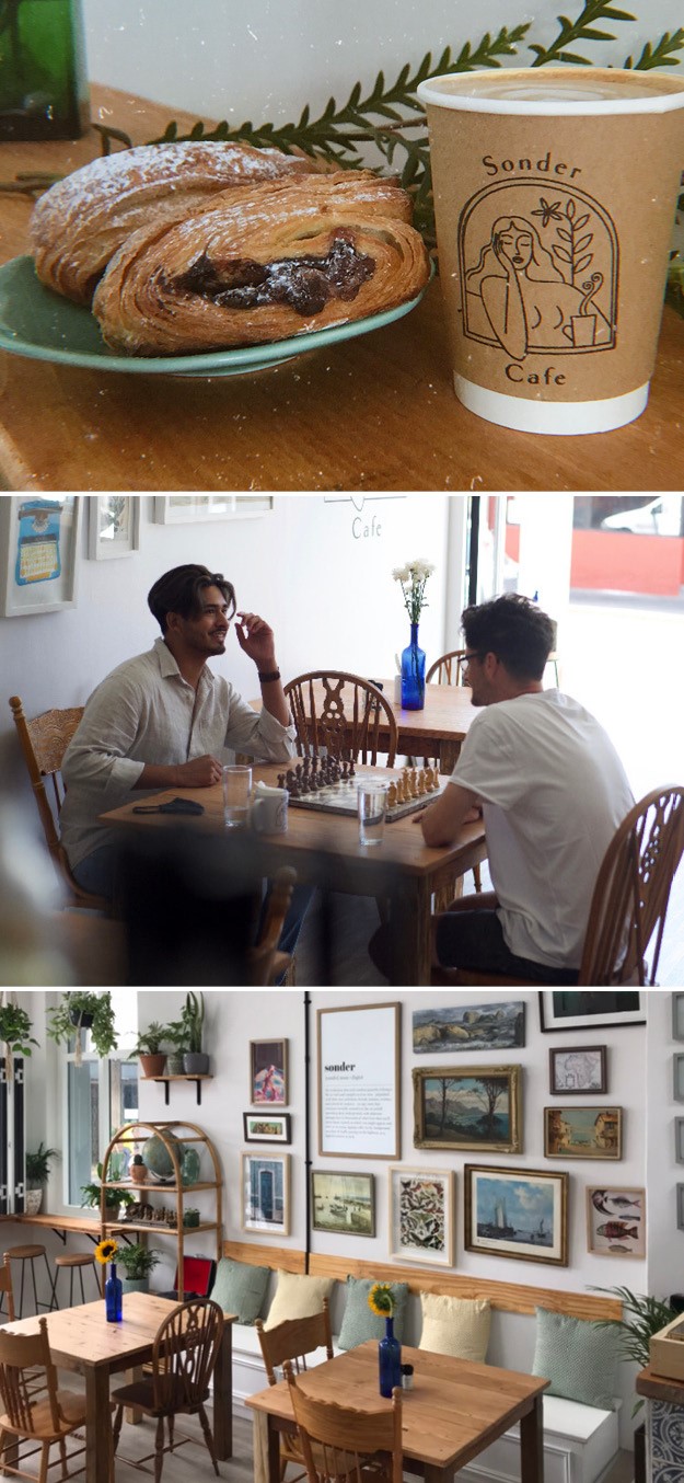
Sonder Cafe
Sonder is a newly opened cafe in Cape Town, South Africa. Its name, which takes inspiration from the neologism of the Dictionary of Obscure Sorrows meaning ‘the realisation that each random passerby is living a life as vivid and complex as your own,’ represents the idea behind the cafe, of encouraging people to recognise the inherent similarities and humanity in other people even in a period of deep isolation. The logo, which depicts a woman sitting and staring out the window with a cup of coffee, further emphasises the humanness of the individual, with the act of looking out the window representing everyones’ experience over the past year, as well as people’s individual and internal complexity. The cup of coffee symbolises people’s similarities and universal love for a nice warm drink. This theme is also reflected in the strapline ‘every stranger has a story.’ The internal design of Sonder is a mix of antique furniture and old electric decor, with modern finish like Portuguese tiling, wooden bars and tables, all of which give off a clean energy and allow customers to feel at ease and welcomed, as they would in their own homes.
“The cafe began as a daydream over the long and solitary periods of isolation that made up the year 2020. My partner and I both wanted to create a community-based space where people could come together and feel a sense of comfort and connection in a very estranged time. We wanted the space to not only be a cafe, but an exhibition, gallery space, and home away from home,” says co-founder of Sonder, Michelle Fredman.

The C-List
Launched on World Cance Day, The C-List is the first of its kind platform that curates cancer-kind beauty products and provides a welcoming space for people going through treatment. Founder of the platform Helen Addis, former cancer warrior, worked with creative studio Honest to create the brand strategy and design, from concept to virtual shop front.The platform sorts through potentially toxic ingredients to identify what products are gentle enough for people with cancer to use, who can deal with different treatment side effects, including dry eyes, dry hair or lack thereof. The C-List is a welcoming place for people to feel like themselves again, with product recommendations, beauty tips and bit of humour. Users can buy glitter that is safe for treatment sensitive skin or sore stories with each other.
“One of the first bits of advice I got after my cancer diagnosis was that I had to replace many of my favourite beauty products and toiletries with gentler ones - but what does that even mean? Going through treatment is a lonely and scary time and there’s nowhere to go for advice or even to reclaim a bit of yourself with a new lipstick or fake tan that you don’t need to worry will cause problems,” says Addis. “We wanted to communicate the brand’s warmth, life and energy, designing a positive brand with an uplifting attitude. The approach we took has given Helen the opportunity to connect directly with brands and start a bigger conversation about what The C-List could become,” says Julia Leckey, CEO and founder of Honest.
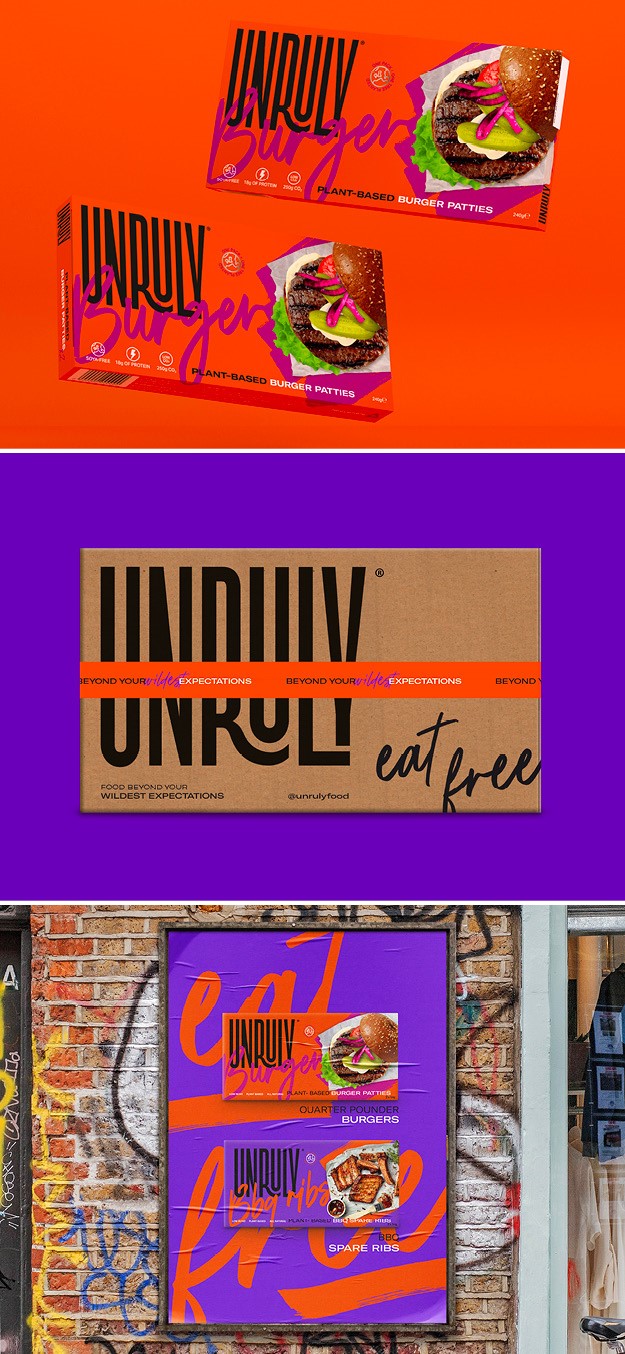
Unruly
Design agency the Clerkenwell Brothers devised a strategy, name and identity for new 100% plant-based food brand Unruly Food, which produces alternative food products aimed at full-time plant munchers, part-time Flexi kids and animal-loving carnivores. The brand is guided by strong environmental values, with all products being soy and GMO free. To create something completely different from everything else on the market, Clerkenwell brothers designed a ‘free-from constraints’ brand positioning and identity. A bold logo lock-up, a combination of type variants, a vibrant colour palette and layering created a feeling of good food. The visuals embody the unruly attitude through expressive typography and bold colours, from fuchsia to bright orange. The strapline ‘eat free’ nods towards the variety and choice an offer with Unruly Food, along with its non-judgemental approach to what could be considered guilty pleasures.
“Plant-based is a category that’s becoming super-saturated and noisy. So when we were looking for an agency to partner and bring our ideas to life we needed to find a team at the top of their game, creating original, edgy, and out-standing branding and positioning,” says Jasob Gibb, co-founder of Unruly.