#NewBrandMonday: 22 March

Here are this week's selection of newly launched brands from around the world. For more from #NewBrandMonday, follow @Transformsays on Twitter.

Castrol ON
Brand agency Williams Murray Hamm helped lubricant brand Castrol create the name and identity for new umbrella brand, Castrol ON, that will cover its range of e-Fluids for the electric vehicle market. Focusing on the desire to position Castrol as pioneers in e-mobility, WMH created a brand that was forward thinking, bright and futuristic. Positioning Castrol as a business that helps the global switch to electrification, the name ‘ON’ fit the brief.
Easily recognisable, the physical movement is represented on the graphic, as the ‘O’ comes from a colour gradient going from dark blue, through vivid blue to bright fluorescent green communicating its e-mobility credentials. The silver ‘O’ and ‘N’ at a slight angle shows a brand forever in motion and always moving forward whilst emitting a future-focused feel.
“The launch of Castrol ON is a clear indication of the work we are doing at Castrol to help drive the electric vehicle sector forward. The new name and identity are crucial to position Castrol as a credible player in this future market,” says Phil Neck, global marketing lead for Castrol e-Fluids.

Hilo Life almond flour tortilla chips
Pepsi Co's in-house design team developed a new brand extension, the almond flour tortilla style chips, to the keto-friendly lifestyle brand Hilo Life. The brand aims to to make foods a source of joy for carb counters, bringing the flavors and textures that keto consumers know and love back into their lives. The Hilo Life almond flour tortilla style chips marking the first major brand to launch a keto-friendly chip made with almond flour, available in Nacho Cheese, Ranch and Spicy Salsa flavors. The new almond flour tortilla chips have a bold graphic design that includes fun illustrations combined with mouthwatering product photography. The mouth illustration hints at the brand’s crunch and flavor, while the hands and illustrations cue quirkiness and fun.The brand photography and design expresses movement and excitment, helping the brand stand out within the keto-friendly snacking category, while the colour palette is used to communicate seasoning and flavour. The brand is approachable, punchy and friendly, with the speech bubble expressing individuality and the empowerment of the consumers.

Hi Veg
Leeds-based creative agency ilk created the messaging, brand principles, brand guidelines, packaging and website design for Hi-Veg, a new food brand that offers a range of vegetable-based recipes. With the meat-free category rapidly growing, the brand needed to be as vibrant as the product and deliver shelf standout. To do so, ilk used vibrant visuals by combining lively colours in orange, reds, browns and greens and appetising shots of food, such as stacked veggie burgers, fries and condiments.
“We’re really excited about Hi-Veg. We knew way back when we were doing initial tastings that we were onto something in terms of the recipes, but in some ways the quality of the product puts even more emphasis and importance on getting the brand right. I think ilk has done a great job in building a visual personality in-sync with the key messages we want to get across to shoppers,” says Nikki Stanfield, brand coordinator for Hi-Veg.
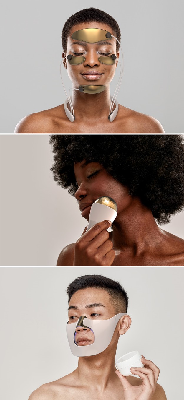
Morrama
Industrial design agency Morrama has launched a series of future skincare concepts inspired by premium-grade salon treatments catered for the home-pampering era. The Future Skincare range includes three unique, technology-inspired treatment concepts which aim to showcase how skincare products and habits will evolve in a post-coronavirus landscape.
Morrama’s ambition for the range was to imagine how the world of technology and design could come together to provide more accessible, high-quality solutions to skincare issue. Future Skincare use a pastel colour palette with a neutral look, a deliberate choice from Morrama to give the products a premium and luxurious feel. Morrama founder Jo Barnard believes that the world is moving toward an era of DIY beauty, and argues that if brands can create easy-to-use products that deliver premium-grade pampering experience at home, they could give beauty professionals a run for their money, and claw back lost earnings from cosmetic sales amid COVID.
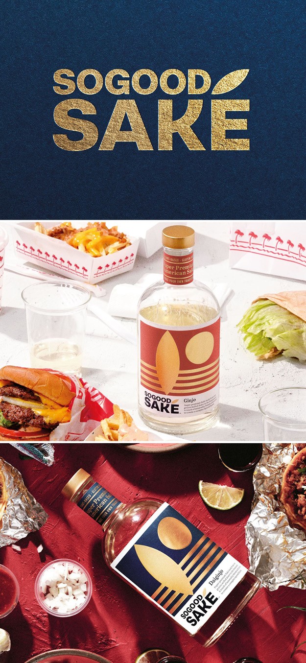
So Good Sake
Liquor brand SoGood Saké partnered with brand design agency Pearlfisher to introduce the traditional Japanese spirit to the American market. With a vision to move saké beyond the restaurant and attract adventurous and easy-going drinkers alike, Pearlfisher’s new identity and design system tells a layered and symbolic story of saké with a bold American-made offer. Pearlfisher’s design journey began using saké’s main ingredient as inspiration, the rice grain. They celebrate the rice grain by activating it as the accent above the ‘e’ in sake. On the front-of-pack the labels’ graphics build a scene from the makings of the drinks, where fields of rice are depicted as waves and a rice grain stands upright like the silhouette of a surfboard. The setting sun represents the milled grain of rice after fermenting saké.
The brand wanted to tell a simple story that made saké more approachable to American consumers, explains Peter Geiszler, strategy director at Pearlfisher. “We wanted to create something that was respectful of saké heritage and tradition, while in a way distancing ourselves from the typical visual cues that American consumers have come to expect. For us, it was important to create new associations and emotional triggers, so maybe a person doesn’t go to the beach and think ‘Corona,’ instead they think ‘saké,” says Geiszler.


