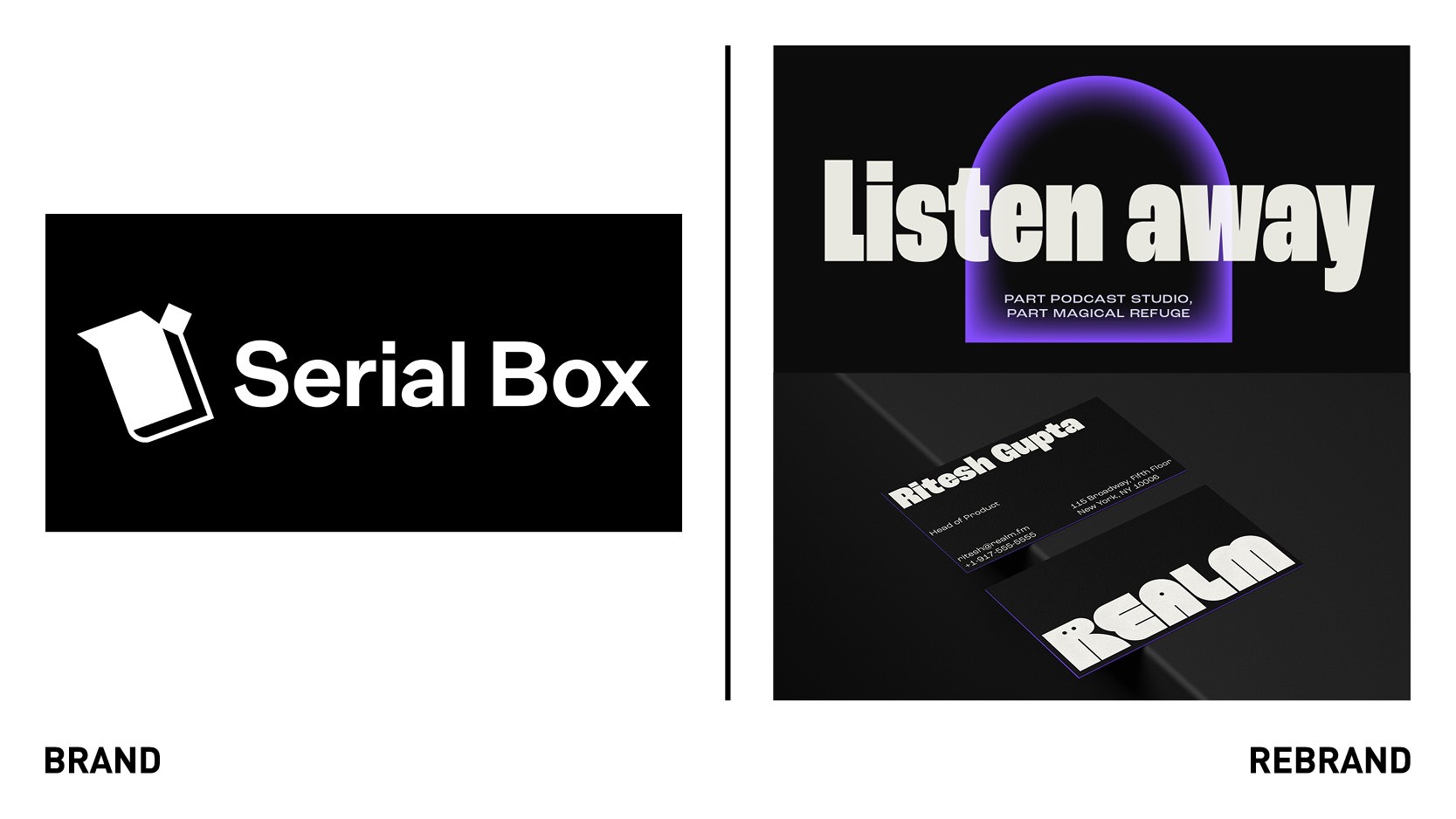
Mother Design rebrands #1 U.S. fiction podcast
The U.S. team of creative agency Mother Design has created a new identity for the number one fiction in the U.S., Realm, which triumphs inclusivity and fluid expression to reflect today’s modern worldview.
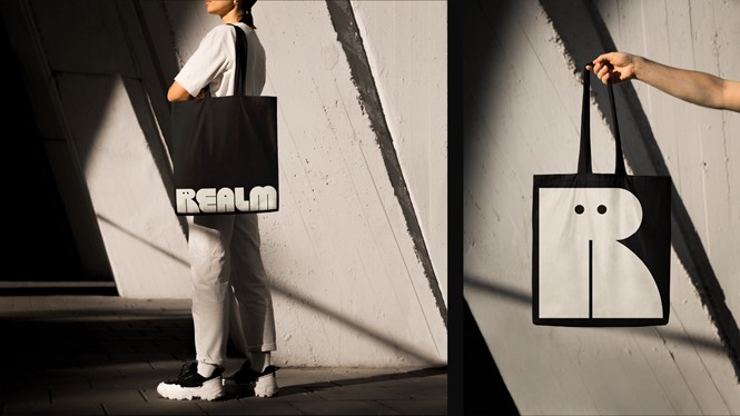
The inclusivity was inspired by Realm’s sci-fi genre, which is used as a tool to dismantle traditional Western cultural bias in favor of literature imitating reality. The fluid mindset is reflected in Realm’s new sonic and static logo, which brings the Realm experience to life. The goal of the sonic logo is to prepare the listener for a new experience through a dramatic sound, quick with punctuation.
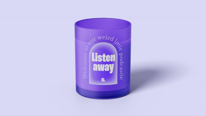
The main colour purple represents inclusivity, magic, spirituality and creativity, in addition to creating a uniquely ‘sci-fi’ aesthetic when paired with the near-black background. Complimentary colours like orange and off-white help make the visual world vibrant and friendly.
Portal graphics symbolise entrances to another world, or magical refuge, while the inner glow effects aims to create mysterious sci-fi vibe, adding magic and energy to te overall visual language.
The typography, Roc Grotesk, is a bold and condensed typeface which shares similarities with the word mark but also aims to give off a friendly feeling. It also has many weights and styles, so it’s versatile and flexible depending on purpose and usage.


