Magnum rebrands to position as ‘liberated force of pleasure’
World-renown ice-cream brand Magnum worked with design studio Sunhouse to refresh its visual identity, evolving the idea of pleasure as as a liberation to be enjoyed by all.

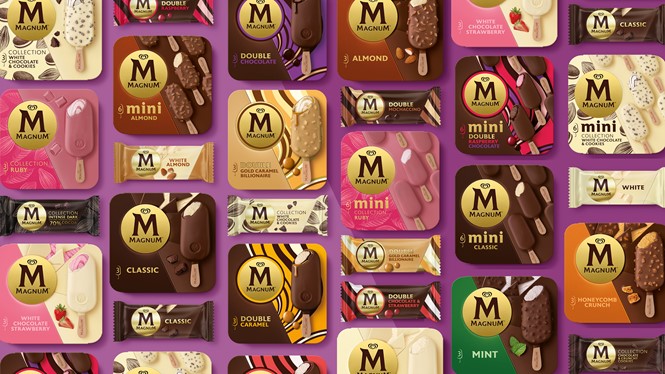
The rebrand was driven by the need to recapture the brand’s distinctiveness and address challenges from competitors. Sunhouse was briefed to strengthen the brand from the inside out, defining strategic brand principles that would inspire Magnum’s brand world as well as redesigning current packaging to align with is new positioning as a ‘liberated force of pleasure.’
“All the incredible work over the past ten years has successfully positioned Magnum as a genuine lifestyle brand. But as the democratisation of culture and fashion begins to shift our perception of luxury, the brand ran the risk of becoming stiff and contained. Our challenge was to set it free by pushing it off its pedestal without losing any of its aspirational allure and desirability,” says Sally Knapton, senior account director at Sunhouse.
Magnum’s new liberated expression is guided by principles that inspire fearlessness, confidence and sensorial indulgence. The gold and brown of the M-Stamp have been flipped to elevate its iconicity beyond the product. The bling is gone, but what remains aims to be singular, contemporary and completely self-assured. The wordmark has been redrawn for optimal balance and elegance, while the introduction of the new M-Angle seeks to amplify the brand’s most powerful asset : the ‘crack-and-cream’ experience.
"It wasn’t about inventing something new. It was about unlocking what was always there and always true. In this way, we were able to find alignment with what consumers intrinsically love about Magnum and then evolve it for relevance and impact,“ says James Giles, creative director at Sunhouse.


