Jollibee announces new store design to cater to European audience
Philipino fried chicken restaurant chain announced an updated visual identity and new restaurant design to support the company’s growth plans across Europe. The flagship store will open this month in London, followed by others across the UK.
Jollibee has worked with several partners, all London-based, including architect and interior design firm Applied Studio; branding agency ico Design Partners; and market research company Jigsaw Research, to reimagine Jollibee for the UK and European audience.
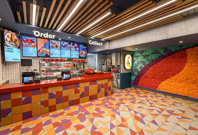
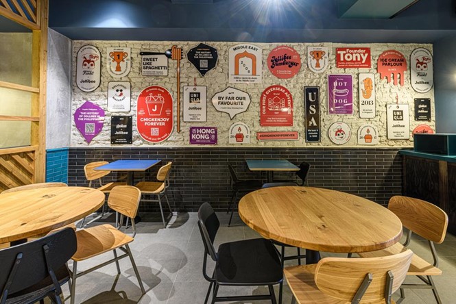
Within the competitive UK market, Jollibee is looking to stand out to engage with the British audience, especially among 18- 30-year-olds who expect a lot more than the traditional fast-food experience. The layout of the restaurant is designed for optimum customer flow and caters to a wide range of customers, with varied seating areas. Booth seating is located around the restaurant for small get-togethers with friends and family. The communal area exists as a place to come together and socialise - which speaks to the heart of the brand.
“When restrictions are lifted, demand will return for social experiences. As community spirit and hospitality are central to both Jollibee as a brand and the Filipino culture, it was important for us to build a restaurant that is based on shared experiences and family values. With the new store design, we wanted to create spaces that feel like home, where customers can relax, feel comfortable, and enjoy the atmosphere with family and friends,” says Adam Parkinson, business head for Jollibee Europe.
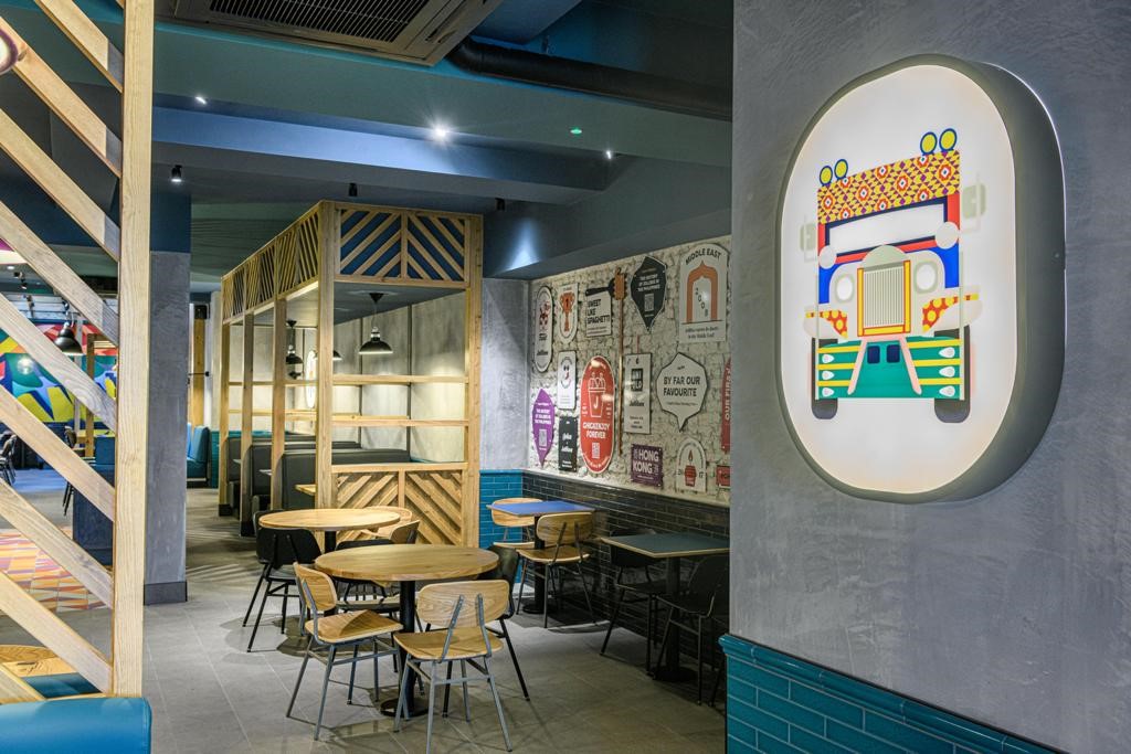
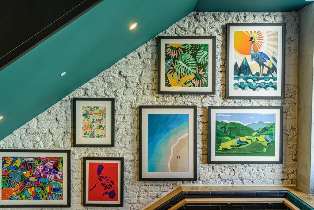
To cater to the 18-30-year-old demographic, there are several ‘key moments’ throughout the store which provide ‘Instagram-able’ features, all inspired by Jollibee’s Filipino heritage. From a dramatic gallery hung wall, with Southeast Asian style artwork, to the upbeat and colourful tiles and traditional Filipino fabric designed in the Philippines.
“The standard, formulaic design has been completely rethought and we hope it will be disruptive. It’s a step up from the competition and provides customers with an unparalleled experience. Customer satisfaction and providing premium hospitality was the priority through all facets of our design,” says Patrick Abrams, managing director of Applied Studio.
The space had to be contemporary, feel modern and fresh, whilst also being comfortable, homely, warm, and friendly. The restaurant design also needed to be eye-catching to increase brand visibility on the high street while catering to Jollibee’s existing customers.

Jollibee refreshed the brand identity, working with ico Design to introduce a new color palette, purple, while elevating one of the brand’ secondary colours, orange. The graphic shapes used in the visuals reference both the islands that make up the Philippines and the shapes of fried chicken.
“An upbeat, modern tropical twist’ became the strategic foundation that informed all aspects of the brand expression – imagery, colour, graphic language and headline messaging,” says Vivek Bhatia, creative director and partner at ico Design.


