Inter football club rebrands crest to ‘Internazionale Milano’
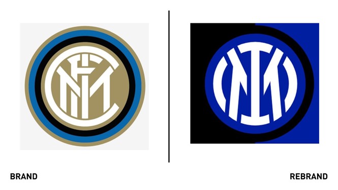
Milan’s football club, Inter, worked with Munich-based graphic design studio Bureau Borsche to develop a new, innovative and minimalist logo that would appeal to younger generations. The new crest focuses on the two letters that symbolise the ‘soul’ of the Inter brand: I for ‘Internazionale,’ (international) and M of Milano. The two letters also harness the English expression ‘I am.’
The Club has moved to revamp its visual identity to open up to an audience that is increasingly digital and sensitive to aesthetics, to reach global targets and different age groups, and establish itself as an icon of culture as well as sport. The aim is to make the Inter brand relevant and recognisable beyond its fanbase and to allow a younger and international audience to identify with the values of inclusion, style and innovation that have characterised Inter since its foundation.
The new design has a 90% similarity to the Club’s very first crest, with the latest one being more suited to digital devices as it’s simpler and can be clearly viewed on smaller devices like mobile screens. The story of the club’s new visual identity is to be told through a collection of photographs accompanying the expression I M, read as “I am”, which seeks to contextualise Inter’s new visual identity with contemporary language: I M Football Club Internazionale Milano.
“The idea is to look towards the Club’s future, with this new logo also representing Inter’s close bond with the city of Milano. We want to increasingly link the historical identity of Milano with that of our Club. At the same time, we’re projecting it towards a future that we hope will be as glorious as our past,” says Alessandro Antonello, corporate CEO of Inter.
The shape of the letter I is a reminder that the letter F that is no longer present in the new crest. The design of the letter M remains very recognisable and similar to the one that appeared on the original logo. As per ‘Nerazzurri’ tradition, the letters are framed by the classic concentric circles.
“We started this journey years ago. Our objective is to remain focused on football and, through our new visual identity, better penetrate the digital, entertainment and lifestyle worlds. The I M narrative plays on our two main initials, the essence of our brand. The story of Inter is told through Milano and what the Club has represented in the 113 years of its existence,” says CMO Luca Danovaro.
The intense of more vibrant and intense blue makes the new crest more noticeable and recognisable. The core colours, remain the of those originally developed in 1908 but appear brighter. The aim was to make the Club’s bade more visible on computers and digital media. The gold will be used mainly on the most iconic physical pieces so not to impair visibility in digital environments.


