Fourpure unveils ‘refreshingly simple’ identity
London-based crafts beer brand Fourpure worked with Glasgow-based strategic drinks packaging agency Thirst Craft to create a new brand identity that would reflect the brand’s big ambitions to be one of the top craft beers in the UK. The idea was to make Fourpure’s identity like its name: ‘refreshingly simple.’
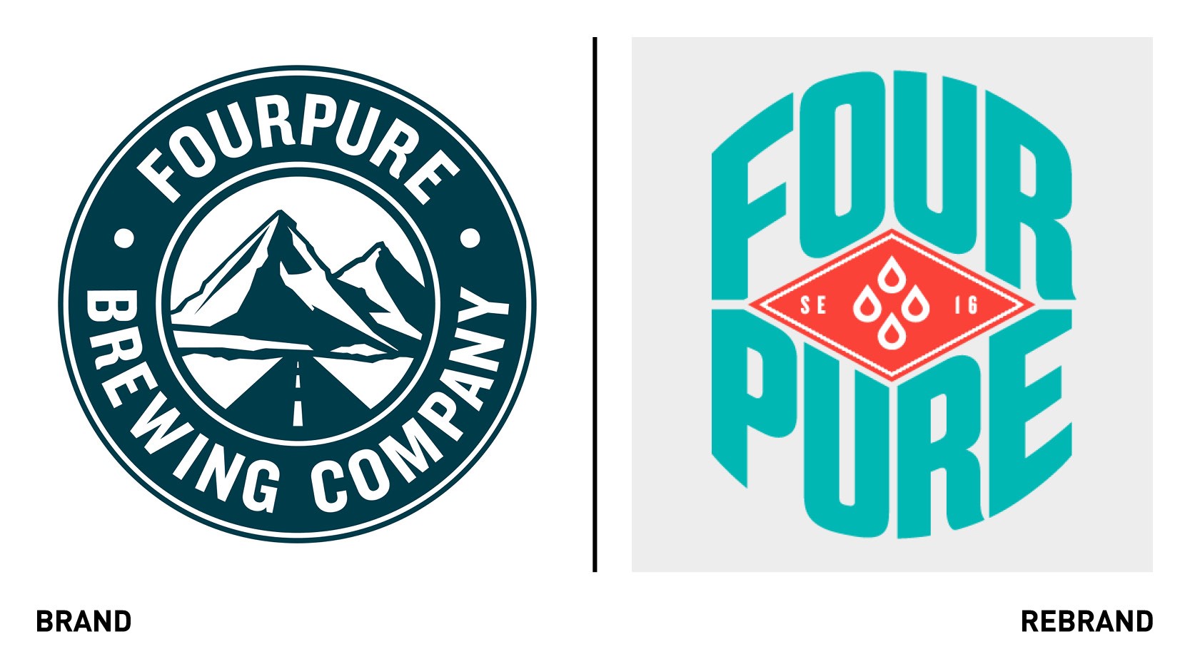
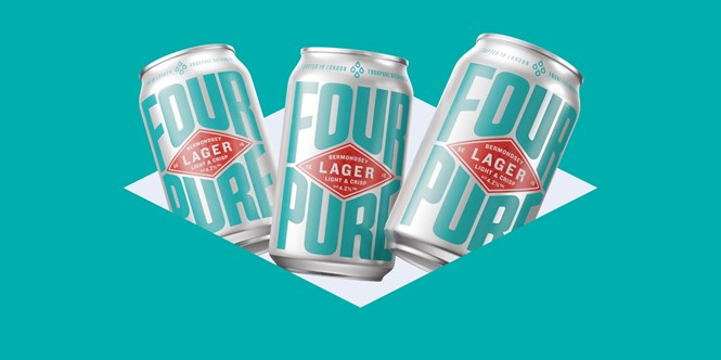
At the heart of the new brand is a distinctive red diamond logo, with Bermondsey’s, Fourepure’s home, postcode SE16 clearly written in the middle with bold white letters. The postcode surrounds a simple ‘four drop’ icon that symbolises the brand’s name and alludes to each beer’s four base ingredients.
The logo on the packaging is surrounded by industrial lettering that flex to fill the canvas. A subtle nod to Bermondsey’s textile past are added through edged detailing around the diamond. The new contrasting colours of red, white and turquoise and the scalable assets allow for a shelf standout in any environment.
The aim of the new brand is a return to Fourpure’s fundamentals: great beer meets Bermondsey attitude, pure and simple.


