Bloom refreshes Penguin’s visual identity
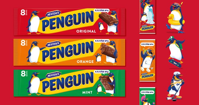
Penguin, a UK lunchbox and biscuit tin staple since the 1930’s, worked with international brand and innovation agency Bloom to refresh its visual identity. Bloom has reimagined Penguin for today’s family, with new packaging and a suite of assets to work across all touchpoints.
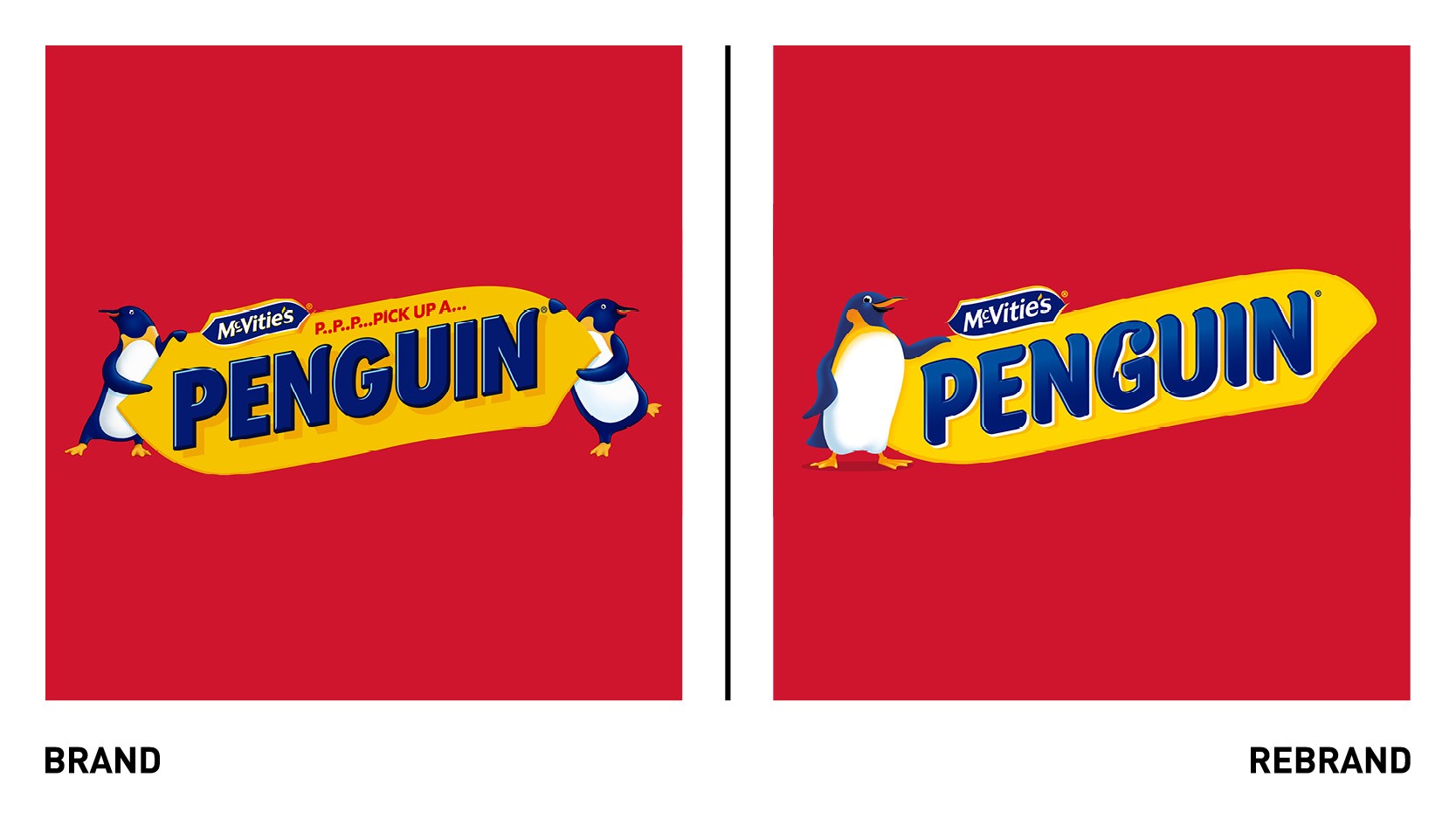
Bloom’s rebrand aims to bring Penguin’s adventurous spirit to life, through the characteristics in both the logo and the penguin itself. The two together seek to communicate the brand’s promise of a ‘chocolatey chuckle.’
Bloom used the letter ‘G’ in the word mark as a holding device for the Penguins silhouette, explains Michael MacNaughton, creative director at Bloom.
“Our design team scoured the archives and looked to Penguins of the past for design inspiration ensuring that the design of today was a faithful evolution and respected the rich heritage of the brand,” he says.
The Penguin characters were created by Bloom’s in-house digital illustrator, Stuart Witter, who designed them to work across multiple touchpoints and all throughout the consumer journey, from digital and pack to in-store.
The iconic colour palette of bright red, yellow and blue was retained to maintain brand recognition.
“McVitie’s Penguin is an iconic British brand and we couldn’t be prouder of the new look and feel which has been designed with respect to the past in order to encourage a new generation of consumers to fall in love with the brand,” says Jon Bull, marketing director at Pladis, owner of Penguin.


