Battle of the Burgers - Burger King vs McDonalds
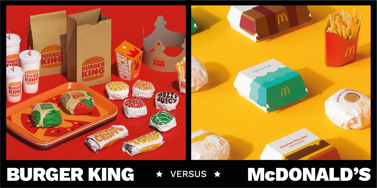
In the month when the two titans of the burger world revamped their packaging design, we asked experts from brand agencies around the world to take sides in the most epic head-to-head of them all: McDonald’s vs. Burger King

For the record, both redesigns, do a brilliant job at amplifying the existing equity each brand already has. BK’s hark back to their golden years with the revival of an old logo, beautifully crafted for today, is commendable.
For me that’s always been great.
And the new snack-size B icon is just, well, deliciously brilliant.
JKR’s work for Burger King is jovial and smacks of a ‘street style’ more at home with a Shoreditch independent than a global chain. Perhaps that’s what they’re going for. We’re living trend driven time.
And BK have always been good at playing the maverick.
They’re the Pepsi of the burger world. Challengers.
However, I’m here to fight in the corner of red & yellow. McDonald’s, or Maccas as it’s known here in Australia, have an approach to branding that I’ve always admired.
In the 10 years I’ve been a designer, the burger behemoth has been ‘rebranded’ more than once. Wolff Olins, Turner Duckworth and now Pearlfisher have all given a fresh coat to the golden arches in some way, and each one builds on from the last.
This is where I believe McDonald’s have really got their secret sauce right.
They continue to innovate and elevate. Instead of reinvent.
They’re on a constant march forward, shedding the bits that don’t work as they go, to emerge in a form purer than the last.
We’re living in a time where fast–food plays a massive role in dining and hospitality experiences, especially in places like the UK and America where people still can’t go out for a meal.
We’ve fallen deeper into the Deliveroo lifestyle. Takeouts are at an all time high thanks to coronavirus and lockdowns, and now is the time when takeout food packaging matters most and bold moves will win hearts, minds and bellies.
What the new McDonald’s packs do so brilliantly is two-fold — firstly they evoke nostalgia (so does Burger King, I hear you cry) with a graphic style not dissimilar to days of old, but above all, they are indisputably identifiable.
Take the words off and you still know exactly what you’re getting and who from. That’s the true power of brand. And McDonald’s continue to smoke the competition.
*Full disclosure — I’m in love with the new typography work for Burger King, it’s utter genius. I had to pick a side. And my heart is always with Ronald.

While many see these two brands as head to head — financially they are miles apart: WIki tells me that it’s a Mc$21billion vs a BK $2 billion picture. That’s quite a gap. It also seems to me that these two casually dining giants are striding in opposing strategic directions.
McD’s has made great inroads into a broader menu portfolio. Their vegetarian selection is now considerable, and I hear they are one of the largest suppliers of salad and fresh fruit to the UK. Reports of children insisting on eating carrots from a McD’s branded bag does not surprise me, such is the pull of the Clown. A savory, and sometimes, sweet streak of Innovation runs, drips and is layered through the products and menu. New McD = Modern fast food of surprisingly varied types.
BK is on another trip to satisfaction entirely. Through flame grilled veins, vegetarian options languish limitedly in irregularly supplied BeanBurgers (sometimes on the highstreet, rarely in stations, often missing in airports) and slabs of hearty, squeaky halloumi cheese. The core Burger is strong. BK = Burger, Burger and more BURGER. That’s pretty much it and it shows in the brand work — as frankly, it should. While the Golden Arches lean towards progress, low calorie options, wraps, salads, Mozzarella dippers and Toffee Latte... the well padded King sits firmly on a slightly baggy throne of Burgers and shock horror… chicken! So it should come as no surprise the visual brand identity for BK wallows in nostalgia. It does it well - the BK mark is annoyingly good. If all you want is a whopping dose of Whopper & Fries, wrapped in charming graphics from Haight Ashbury, Bob Dylan yesteryears, fill your boots, Man.
My argument with Dabs here is not that one is better than the other… it’s that each have chosen a strategic path. One of a possibly cleaner, more McDigital and McVaried (and possibly, whisper it, ‘healthy’) future. The other of flame grilled firepower aimed squarely at the ‘Back in the Day’ OG squad… As JKRs ECD for BK said ASAFP in PR launches — "We explored a lot of different design territories, but kept coming back to the brand's original iconic logo from 1969 and 1994 when Burger King looked at its best." Simply put, one brand is strategically looking ahead — simple, cleaner, fresher, and one is looking behind, to rosy tinted views of California... Both are valid, both work, both look tasty — and from a branding point of view, both seemingly amplify very different strategic positions that have been carefully considered.
As Dabs said, both look delicious, and the BK work is a bigger job for a smaller brand, with logo’s and illustrations and all sorts. The McD work is an artful pack update globally applied. So it’s not really a fair comparison, but for a light bit of fun, and for the very few readers who will actually get this far… and for veggie menu selections alone, I must steer towards the McOption — The McStrategy seems more appealing to me, while the BK charm and visual gags of yesterday is as appealing as a delicious stolen chip (ie: VERY appealing), surely as those shaping the conversations around tomorrow’s brands and their customers, we should be supporting healthier choices and more progressive thinking wherever possible.

Well. This was obvious.
Whereas McDonalds moves away from their signature brand elements to introduce a new and modern “happy place”, Burger King does the opposite.
Burger King celebrates their heritage by revamping the identity with a visual concept based on their core brand concept; flame grilling since 1954.
Nostalgia can be a powerful tool, and the design invites us through a bold, sensual joyride with a mix of 70s psychedelia and pure burger love.
Burger King's nostalgia displays a trendy yet classic front, with a tasty tone-of-voice that makes the tummy rumble.
The packaging focuses on well-crafted typography and colors that evokes excitement – exactly how it should be when you’re hungry and about to treat yourself with a good ol’ flame grilled burger - meat or plant based.
One might argue that in all the fun and childlike happiness of the new brand, McDonalds might have lost sight of what the true role of the brand- and packaging design is; to provoke hunger for burgers.
An easy win for the King.

Burger King’s revamped brand identity system and packaging strike a great balance between simple modernity and nostalgic playfulness. The brand is quite smart at choosing a design direction that has a bit of depth and texture and not something that’s overly simplified or geometric. This refreshed design system helps Burger King to modernize its brand yet not losing its special spark, or ‘flame’ in this case. The key color palette was said to be inspired by the brand’s grilling methods and the overall vibe looks great on their digital touchpoints and uniforms. The color palette also has a bit of “earthiness” to it which echoes a sense of raw and naturalness and signals environmental friendliness.
I’m a fan of their new proprietary font called “Flame” as well – it brings you back into a burger joint instantly but is modern and playful. The entire visual identity system tells a great story about Burger King’s brand heritage, its uniqueness and characteristics.
Ultimately, we’re looking at the fast-food industry. Whether it’s online or offline, the brand must trigger a craving among consumers to make that purchase decision. Through vivid and humanistic details, Burger King’s refreshed design system definitely helps to strengthen this aspect. The food industry is seeing digital innovations and eco-friendly ideas and Burger King has successfully leveraged its design codes to associate itself with such commitments without sacrificing its tasty image.

I think McDonald's did a great job with their new packaging design.
It may seem too simple or boring at first glance, but it solves a big problem compared to their old packaging. Their old packaging was a set of patterns based on the names of each product. Visually right, but considering they are a global company, some markets may not be very communicative if their language is not English.
The new packaging solves this problem with simple illustrations. These illustrations describe each product perfectly, making it easily recognisable in any market for both consumers and employees.
McDonald’s goal for this new packaging seems to focus on practicality rather than pure aesthetics. This approach has always been one of their main ingredients of success, together with speed and efficiency.
A brand like McDonald’s should always be thinking globally and try to systemise all core products. A standardised design for their primary products makes room (in terms of time and budget) for localised products or special limited items.
Burger king, on the other hand, did the opposite. their new brand identity has a specific style that may work in some mature markets but may not be the very best way to market globally. Each market has a different perception of that style, meaning that would affect their brand positioning.

Firstly, I’m honoured to comment on these two brilliantly clever design projects. Well done to both client and agency teams for bringing this work into the world at a time when we’re all in need of a little pick-me-up. In my mind they are both winners.
I love the holistic approach taken by Team Burger King. By considering all touchpoints simultaneously, from digital, to packaging to livery, they’ve launched a very strong, distinctive rebrand. It’s a great example of honouring a brand’s heritage while simultaneously broadening its appeal. The bold, contemporary execution balances a retro feel with modernity perfectly. Strategically, the aim was to improve BK's quality and taste perception through design. I would argue they have evoked much more than just the great taste of the food; by heroing their heritage they’ve carved a unique and ownable position in the market that clearly differentiates them from their competitors.
Team McDonald’s, on the other hand, are building on Turner Duckworth’s 2019 visual identity work. This puts more parameters around the approach, forcing their creative to work a little harder. The last time McDonald’s updated their packaging was in 2016. The strategic intent at that stage was rather functional, intended to create noticeable change for… customers in the hope that it makes them feel better about their choice of going to McDonald's. This time round the strategy was far more emotive; to embrace joy and reflect McDonald’s playful point-of-view. This emotive stance has led to vibrant and personality driven iconography, creating a universal language that frames the products as a simple joy, no matter where in the world you sit. This is ingenious.
The primary purpose of a redesign is to force reappraisal. I haven’t eaten from either Burger King (or Hungry Jack’s as it’s known in Australia) or McDonald’s for quite some time but after writing this article I suddenly feel like a burger… a Big Mac in fact. Perhaps this is the surest sign of success.


