American meats brand works with BrandOpus for a ‘never square’ rebrand
American meats brand Oscar Mayer has worked with global creative agency BrandOpus to unveil a new look that unites the brand’s entire portfolio of products, bringing it into a fresh, modern area.
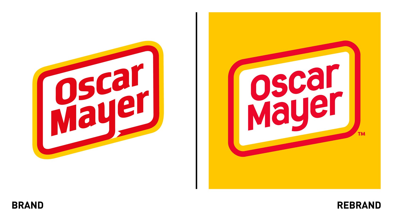
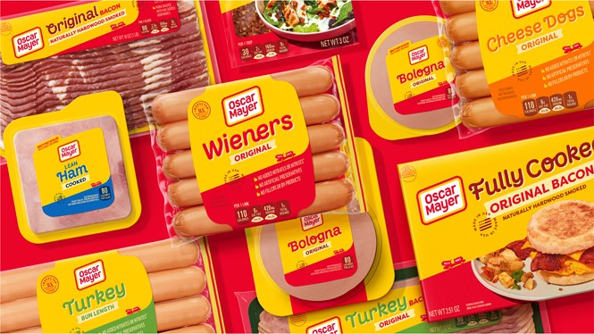
Oscar Mayer realised its products had taken on very different looks and tones as time went on and wanted the brand to better reflect the world today. As part of the rebrand, the brand has updates its logo and refreshed its packaging designs, celebrating the brand’s ‘never square’ logo shape.
“Our task was to articulate everything that the public knows and loves about Oscar Mayer’s 138-year-old brand story into a unified and distinctive narrative, which, just like its logo, is never square. The new brand identity celebrates the iconic rhomboid logo with a bold and straightforward design – exemplifying the brand’s uncomplicated approach to meats with a similarly uncomplicated aesthetic,” says Nir Wegrzyn, CEO and founding partner at BrandOpus.
The brand’s distinctive shade of yellow was retained and is featured prominently, driving recognition across all brand touchpoints. Highlighting the playful nature of the Oscar Mayer brand, the custom light-hearted typeface has been integrated into all packaging designs.
The iconic Wienermobile symbol will unite the entire portfolio of products while figuratively driving the brand forwards into more modern times.


