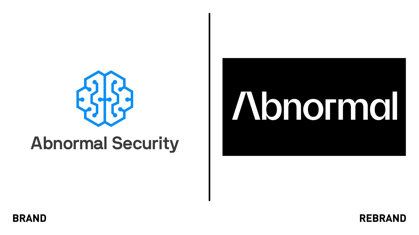
A LINE designs new brand identity for Abnormal Security
Brand design consultancy, A LINE, worked with cybersecurity company, Abnormal Security, to develop a new brand strategy, tone of voice and visual identity.
A LINE worked to create an identity that would reflect the brand’s ambition of becoming a leading unconventional technology company taking an 'uncommonly precise approach' to solve cybersecurity challenges.
To do so, A LINE focused the brand strategy and identity on the idea of precision, which is at the heart Abnormal’s core technology and in the organisation's total focus on customers’ needs. To create this sense of precision, A LINE built the entire identity system on a grid, which also represents the AI inherent in Abnormal’s technology.
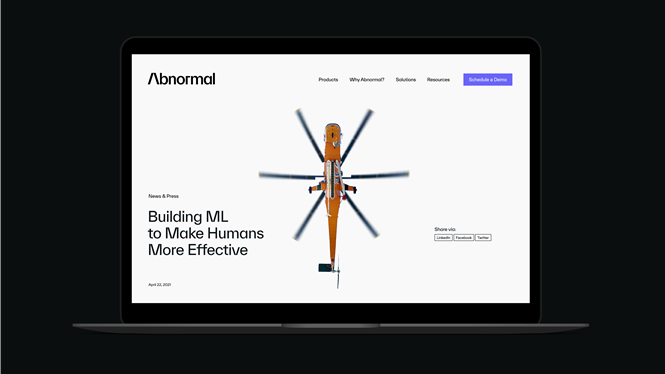
The agency used the balanced and fresh Everett typeface to create a custom-designed wordmark, which aims to establish the brand identity. The abstracted ‘A’ symbol uses a triangular outline and acute points to represent the company’s accuracy, acting as a shorthand in situations where the full wordmark would be too large or too small. The forms in the logo also informed the iconography and illustrations, which use keylines and geometric shapes that aim to feel technical and precise yet simplify the platform.
The theme of precision is further enhanced in the photography and imagery, which features a combination of portrait and environmental photography, and 3D renders. A LINE added the grid as an overlay to create brand consistency while also representing the way technology scans and protects users.
To differentiate from cybersecurity competitors who use reds and blues to evoke danger or signal trust, A LINE selected colours that seek to balance the technical and approachable side of the brand. The restricted primary palette of black and white, with purple for CTA’s, which aims enhance technicality and precision, was balanced with a warmer and more human secondary palette of yellow and greens.