#TransformTuesday: 6 October

Here is this week's selection of rebrands from around the world. For more from #TransformTuesday, follow @Transformsays on Twitter.
AmeriCorps
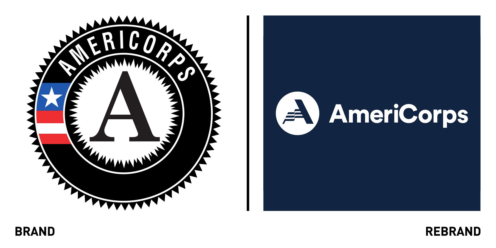
Global brand consultancy Brandpie created a new visual identity and brand strategy for AmeriCorps, an organization that brings people together to serve communities. Brandpie worked to create a new brand architecture system that makes the relationships between AmeriCorps, AmeriCorps Seniors, and the programs and initiatives clear, in order to increase brand awareness with the general public and help individuals navigate opportunities within the organization. The repositioning of Senior Corps to the supporting brand AmeriCorps Seniors will build recognition in the public sector for the AmeriCoprs name and eliminate confusion around how the organisation and its programmes relate to one another. Brandpie also created a new modern logomark for the brand, created by three stripes which together form the crossbar of the ‘A’ incorporate the flag symbolism into the mark, while the negative space creates something unexpected and distinct. The rebrand also includes an updated colour palette and contemporary typeface that reflects the approachable, welcoming nature of the organization. The new tagline ‘The Best of America’ encapsulates the brand’s core values of service and volunteerism, which also represent the best of qualities of America. Brandpie and AmeriCorps also worked together to develop meaningful and specific brand pillars for the organization: “Unite, Strengthen, Impact, Lead.” Each of these brand pillars were then used to guide photography selection, provide direction on video production, and round out the details of the new identity elements.
Bristol Beacon
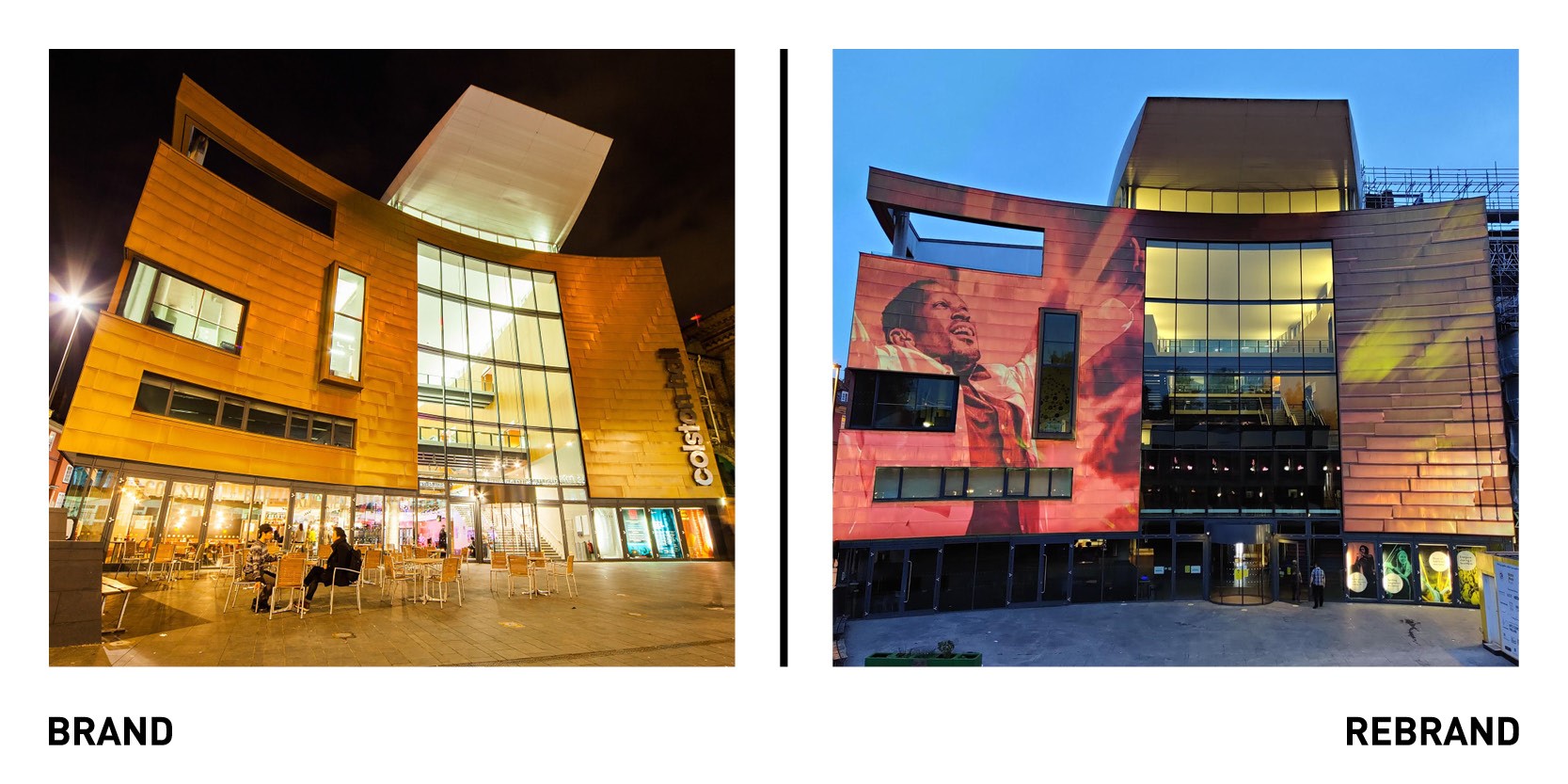
Branding agency Saboteur lead the rebrand of Bristol’s concern venue Colston Hall, named after a slave-trader. After images of Bristol flashed all around the world on June 7th when protestors pulled down the statue of local slave-trader Edward Colston, it was Colston Hall’s turn. Saboteur worked with schools and creative organisations, strategic consultancy Morris Hargreaves McYntyre and the Bristol Music Trust to come up with Bristol Beacon, a name the community feels is adequate to describe a focal point, place of gathering and source of inspiration. Bristol Beacon will now be a place visible beyond the boundaries of the city, and set music free.
“The more I see ‘set music free’, the more I like it and the more it makes me think that is exactly what this process is doing for us,” says head of marketing at Bristol Music Trust Andy Boreham. “This project is about much more than renaming a venue - the conversations around it have been about the identity of the city itself. We had to set this great venue free. Free from the murky clouds of a name with a dark history,” adds Nick Eagleton, co-founder and creative director at Saboteur.
East London Liquor Co.
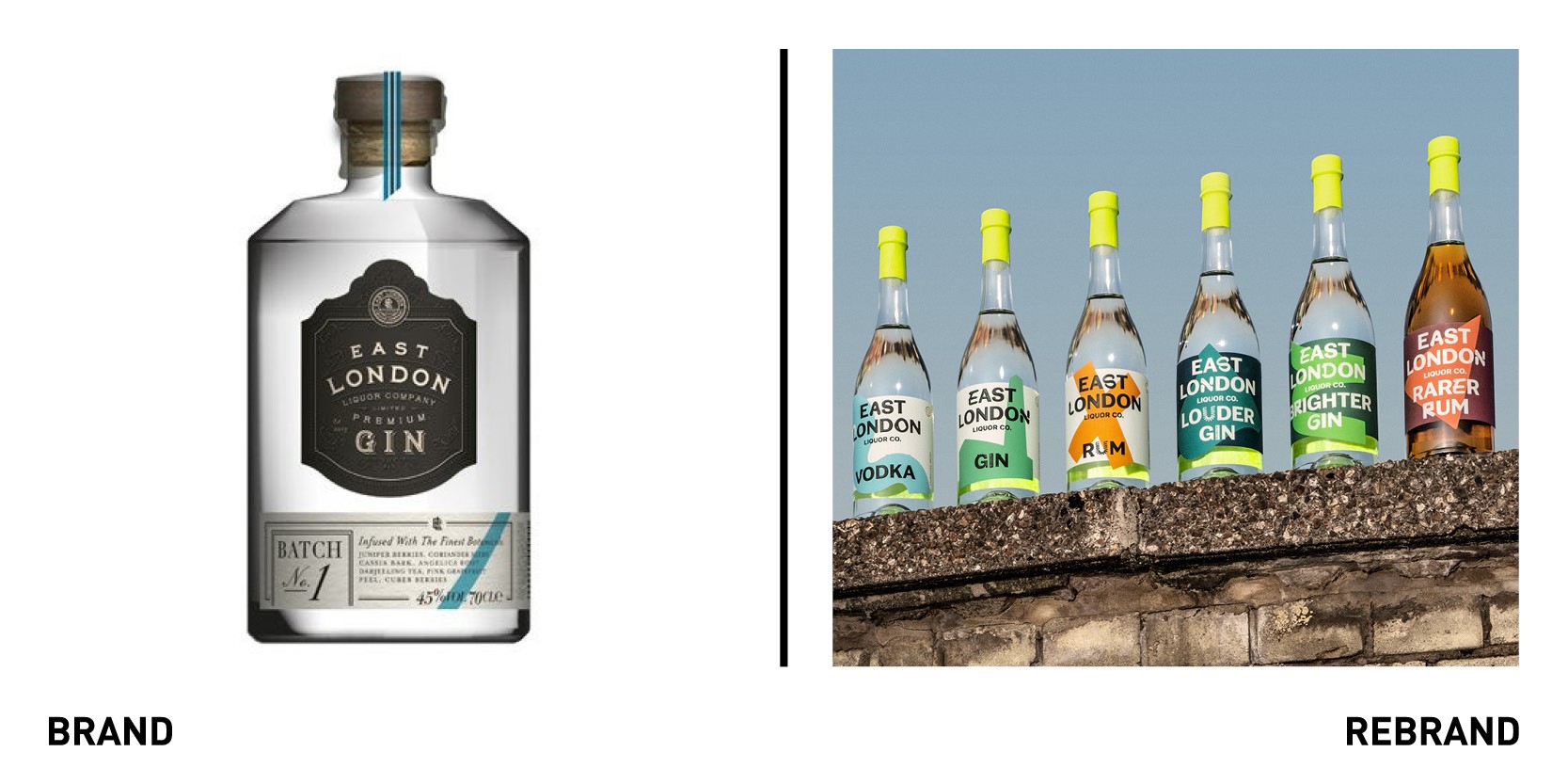
Design agency Ragged Edge worked with East London Liquor Co. to create a new brand that speaks directly to drinkers everywhere, is unapologetic and transcends it category. This went beyond just the redesign, with Ragged Edge focusing on revolutionising the liquor’s company whole approach so it flowed with fighting spirit. With the holistic brand strategy complete, the agency transformed the visual and verbal identity. That meant moving away from a much-loved design language rooted in craft, to an unapologetically bold identity bristling with East London spirit. This included developing a custom typeface in collaboration with NaN Foundry, using glyphs inspired by the local area, the distillery, and the production process, and a ‘smiler’ icon, inspired by an old crest found in nearby Victoria Park, and incorporates the Thames to make a smiley emoji. The abstracted graphics referencing each liquid’s story form a recognisable visual language, aimed to disrupt both the optic lineup and the supermarket shelf, while the RTD (ready-to-drink) and hard seltzer ranges ignore emerging category codes to form a contrast to anything else in the market.
“We have a simple proposition: great spirits at great prices. But our ambition is huge. We came to Ragged Edge because we knew we needed more than a new identity. We needed to lead a fundamental change in a category that has got lost in its own hype,” says Alex Wolpert, founder of East London Liquor Co.
Idox
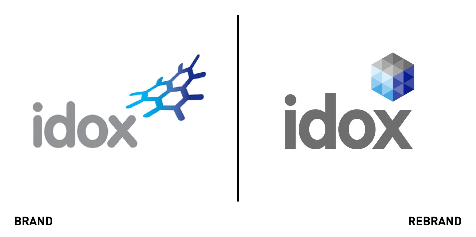
Developer of specialist software for government and industry Idox launched a new brand identity created by strategy brand consultancy Industry. The rebrand, which includes the launch of a new website, will consolidate Idox plc’s main operating business under a single brand and cement the brand’s online presence, making it easier for customers to navigate the full range of services on offer. The new strapline ‘Idox. Do more,’ reflects Idox’s mission whereby its software helps its government and industrial customers to improve productivity and address the growing pressure of delivering more for less.
“Idox benefits from a powerful short name. This is complemented by a new three-dimensional cube symbol, creating a clean, modern and dynamic image, appropriate for a leading software business,” says James Packer, Creative Director at Industry,” says creative director at Industry James Packer. “Our new brand signals the changes that have been going on here behind the scenes and marks the conclusion of our business transformation process. The integration of acquired businesses under a single Idox brand will enhance our brand presence and further strengthen our market position,” says Douglas Quigg, head of marketing at Idox.
Kahleen Crawford Casting
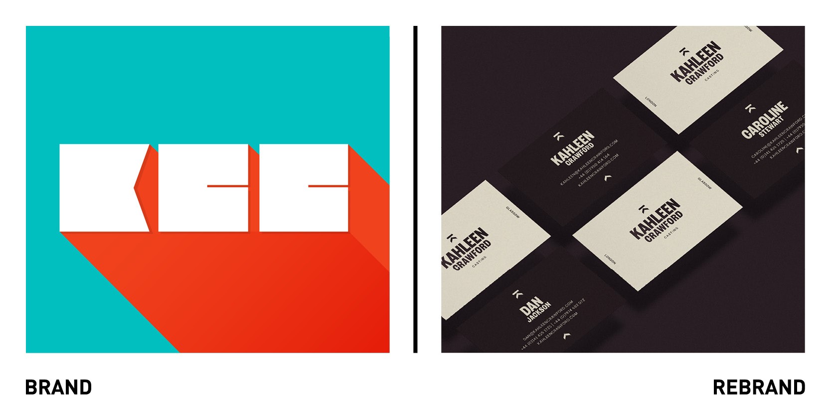
London-based studio Thisaway’s worked with London and Glasgow-based Kahleen Crawford Casting to create a rebrand with visuals inspired by the rolling credits at the end of movies and TV shows. The old brand identity didn’t live up to the high profile projects the agency is now involved in, such as ‘I, Daniel Blake and ‘His Dark Materials.’ The aim of the rebrand was to reflect the profile of these big-name productions while staying true to the agency’s independent film roots. Taking inspiration from scrolling credits allowed a direct link to the casting subject matter while also giving a strong typographic approach to play with across the brand. Thisaway also developed an iconic ‘K’ symbol made from an upward pointing arrow and rectangle, representing the cast member’s name or production title.
Masons of Yorkshire
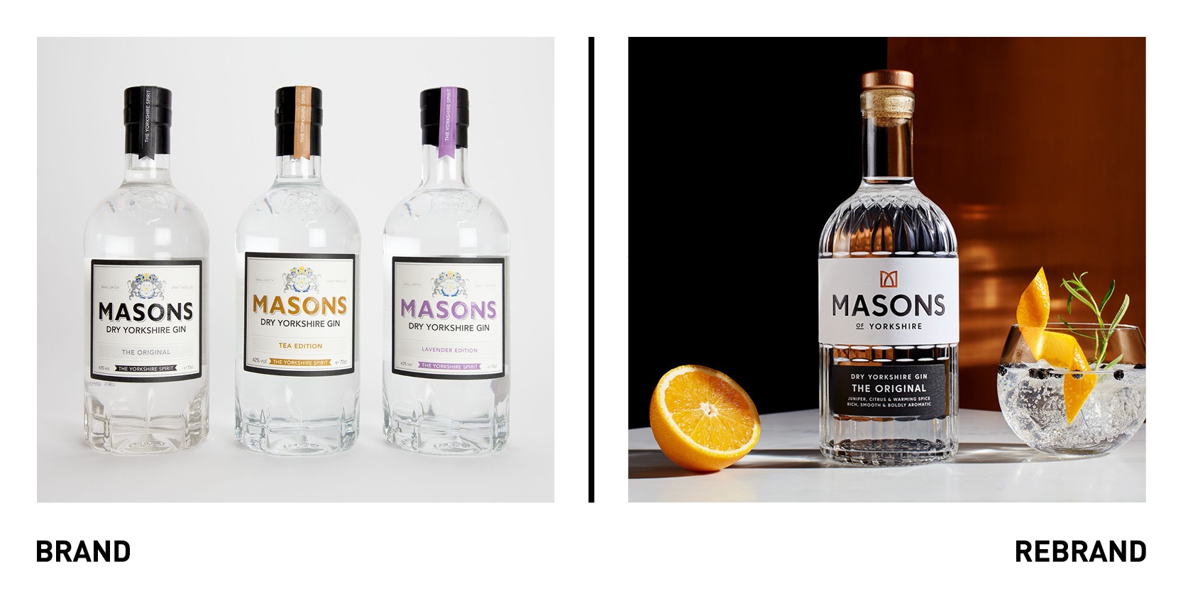
First specialist gin distiller in Yorkshire Masons of Yorkshire worked with Leeds-based strategic branding agency Robot Food to launch a rebrand to make it the ‘definitive gin brand.’ After a fire destroyed Masons’ distillery in 2019, the founders seized the opportunity to come back with a stronger and more distinctive brand. To cement their position as the genuine article in a saturated market, Masons needed a brand that would stand the test of time and allow room for future growth. Robot Food was Inspired by Mason's dedication to their distilling process, developing a passionate tone of voice that celebrates their commitment to making gin the right way. For the visual Identity to convey a look and feel of a timeless modernity, Robot Food developed a copper 'M' crown logo that reflects the essential presence of two founders and Influences every facet of the brand, including the intricate pattern on the new bespoke bottle that showcases and celebrates the purity of Masons gins.
“We wanted to create something that felt so distinctly Masons, it couldn’t be replicated or mistaken. Each element on the bottle and beyond embodies the Masons’ story, from the founders themselves to their Yorkshire roots. Every detail makes an impact – even something as nuanced as splitting the label and adding ‘of Yorkshire’ to the word mark. It anchors the brand to its heartland, makes it prouder, and opens Masons up to a breadth of opportunity," says Richard Robinson, senior designer at Robot Food.
Sportex
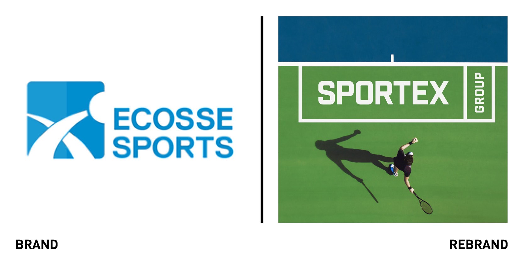
Creative agency Designhouse has launched a dynamic new name and visual identity for Scottish sports brand Ecosse Sports, which matches their ambitions for growth in the UK artificial sports surfacing and recycling market. The new name, derived from ‘sports’, ‘texture’ and ‘technical,’ has appeal across the whole UK market, beyond the location of the company headquarters in Scotland. The rebrand seeks to modernise the look and feel of Sportex, which installs, maintains and recycles artificial sports surfacing. The new minimalist logo works well in black or revered out white and is designed to be used in ways associated with sporting apparel brands. A flexible shorthand version allows for customisation using colours from the secondary palette to reflect the three key service disciplines: install, maintain, recycle. The typography is sporty and clean, while the new graphic grid system is based on the markings of different sports’ surfaces.
“Our creative challenge was to deliver a new name and visual identity that reflected the established build expertise of the business but also capitalised on the allure of the sports market that it serves. We have designed a new brand identity that hints at lifestyle sports brands, while putting a stamp on the sustainable sports surfaces market,” says Designhouse creative director Peter Dobie.
ZDF-Morgenmagazin
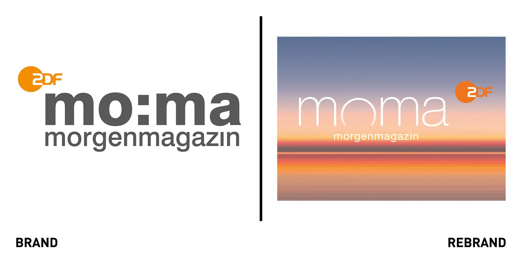
Amsterdam-based media design agency CapeRock developed a redesign for ZDF-Morgenmagazin (ZDF-Moma), the German public-service television broadcaster ZDF’s morning news and information programme since 1992. ZDF Moma offers the German audience in-depth reports and discussions from the fields of politics, business, sport and culture. The rebrand includes a new logo design, on-air package and studio graphics which all give the morning news programme a fresh new look, making it future-proof. The ‘o’ in Moma shows the shape of a rising sun, a visual highlight of the dawn of a new day. The logo, typography, shapes, colours, which reflect those of a sunrise, and motion design work together with the studio elements to create a pleasant early morning atmosphere that makes listeners want to start their day with the ZDF-Moma news show.


