#TransformTuesday: 4 February
Here's this week's selection of rebrands from around the world, from the rebrand of a 200 year-old visual identity to an animated logo for a Gen Z-targeted brand. For more from #TransformTuesday, follow @Transformsays
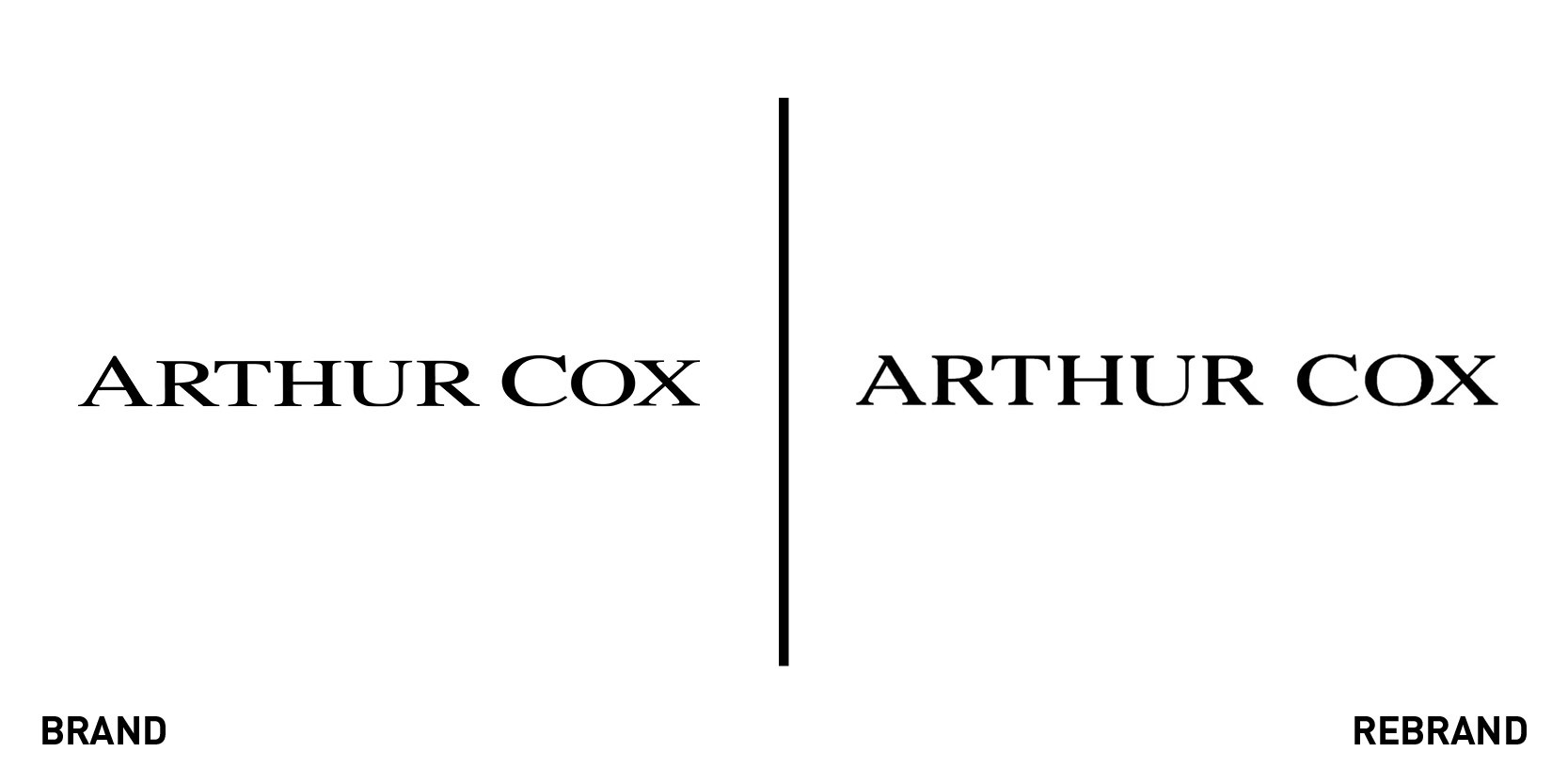
Arthur Cox
Irish law firm Arthur Cox has partnered with Dragon Rouge, a global brand consultancy, to update its identity and rebrand its website. To mark its 100th anniversary, Arthur Cox sought a brand that reflected its progressive spirit, while still curating the firm’s important history. Becky King, creative director at Dragon Rouge says, “It was a great opportunity working with Arthur Cox to evolve its identity to reflect its progressive outlook and quiet confidence. We really wanted to create an identity that celebrates the diverse, friendly culture at Arthur Cox whilst being agile, timeless and set it apart from those in the sector.” To do so, Dragon Rouge refined the logo, created a new font to combine the Celtic influences in a contemporary way, and added new photographs to the website, showcasing the cu. The tones of the website are warm, with opaque oranges, shades of blues and abstract floral patterns as the background to the bold tagline ‘Your world never stops moving forwards. So neither do we,’ reminding viewers of the firm’s innovative character.
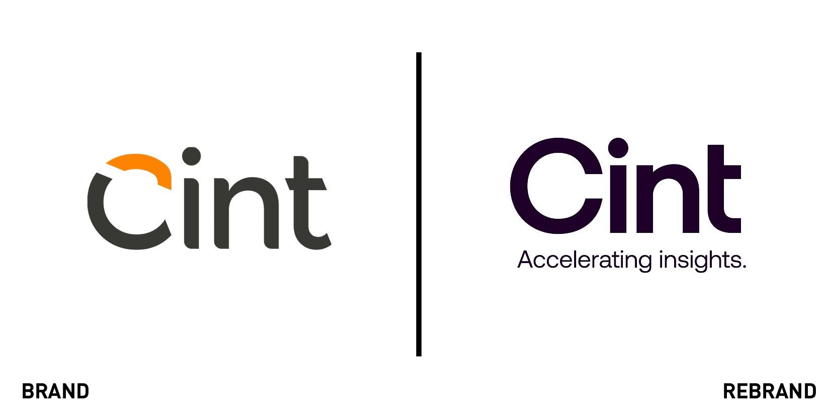
Cint
Swedish technology giant Cint has undergone a rebrand to better represent the company’s commitment to innovation through its rapidly expanding global footprint. The logo, written in bold, dark purple letters, is accompanied by a new tagline ‘accelerating insight,’ which evokes Cint’s pivotal role in helping companies access accurate consumer insight. The rebrand also serves to emphasise the company’s incremental year-on-year growth, which peaked with its recent acquisition of sample technology company, P2Sample. Tom Buehlmann, CEO of Cint says, “Over the last few months, we’ve solidified our commitment to providing our customers and partners with an automated platform that provides a best-in-class, future-proof solution for gathering insights faster, more cost-effectively and at scale. We took a huge step toward this goal when we joined up with P2Sample last year, and our new branding reflects our continued mission of helping our customers transform the way they do business in market research.”
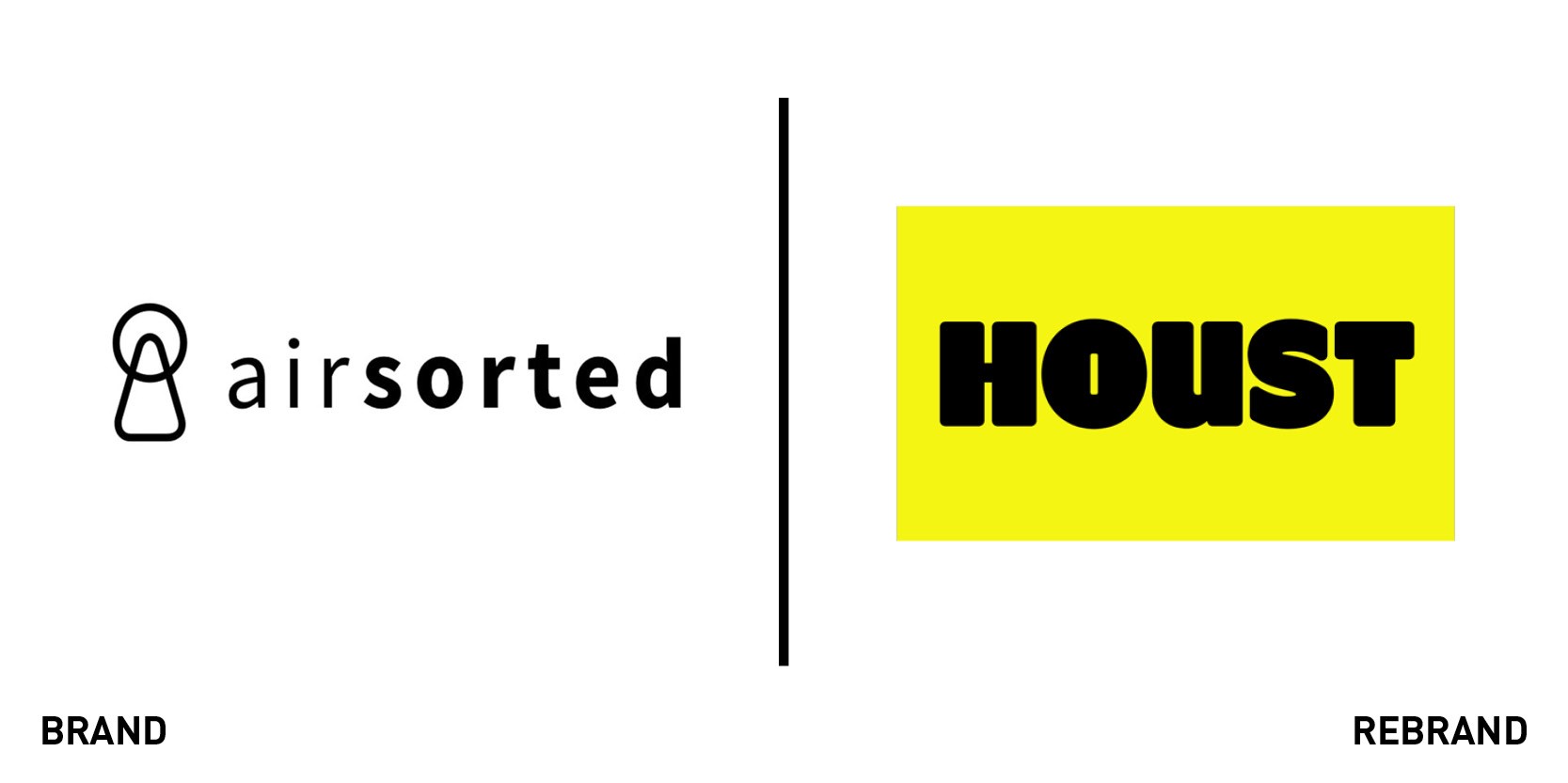
Houst
Goodbye Airsorted, hello bold, yellow Houst. The professional property hosting service underwent a total makeover, changing everything from its name to the logo and the website. London-based branding agency Ragged Edge began by changing the name to a combination of ‘house’ and ‘host,’ which became so abstract it “could be imbued with its very own meaning.” Though abstract in name, the new identity is also well defined. The is imposing space and attracts immediate attention, with its chunky, all-capital bright yellow letters, while the graphic shapes take up space as they constantly change, inspired by floorplans. Ragged Edge says, “All professional hosting services looked the same, had similarly descriptive names, and pushed the same ‘hassle-free’ message. We rebranded Airsorted so it could stand apart, and stand on its own from Airbnb.” The website, publicity posters and gadgets all retain the trademark yellow and black colours, definitely leaving the subtleness of Airsorted’ behind.

Royal Astronomical Society
For centuries, the Royal Astronomical Society (RAS) held dearly to its legacy symbol of an engraving of a telescope designed by the society’s first ever president. But now, preceding its 200th anniversary celebration, the RAS has rebranded, opting for a more modern logo inspired by the society’s motto ‘Let whatever shines be observed.’ The creators of the new brand, the London-based design studio Johnson Banks, said the previous mark “didn’t reproduce well in small sizes or on screens.” The new logo features stepped spokes arranged to form a circle turned 23.5 degrees, to reflect the Earth’s angle as it orbits around the sun. The symbol, however, is open to interpretation, says Johnson Banks, as it could be a stylised eye as much as a planet with an orbiting moon. Another important part of the new brand identity is the core colour palette of black, white and grey, superimposed by richer-coloured images of the sky, planets and geological formations.

So Satisfying
Brand design agency Vault49 unveils a new logo for IMGN Media’s So Satisfying, a global provider of autonomous sensory meridian response (ASMR) content. ASMR relates to the general feeling of physical and psychological wellbeing often in response to a particular sound. Capturing these feelings in a simple logo proved to be a challenge for Vault49’s team, but one it was able to overcome by focusing on the letter O, and using animation. Considering So Satisfying’s digital presence and its target audience, it made sense to create a logo that worked well on the web. “We used our in-house CGI artists and animators to create bespoke ASMR content to inspire and work in conjunction with our identity. Playfully animated statements describe the ASMR experience, and surreal, captivating 3D scenes mesmerise the viewer.” ‘So’ is also an emotional, descriptive word, therefore we wanted to give it more emphasis – it’s not just satisfying, it’s sooooooo satisfying,” Leigh Chandler, partner and creative director at Vault49 says. The stretched O mirrors the feeling of gratification felt by So Satisfying’s audience.


